
… with blackjack, and hookers! (ref)
Introduction and Requirements
A while ago, I created a small and simple flexbox-based grid system for use in the projects we make at work. The developed Grid System inspired upon how Bootstrap works:
- it divides the grid into 12 columns (configurable).
- it supports gutters in between columns (configurable).
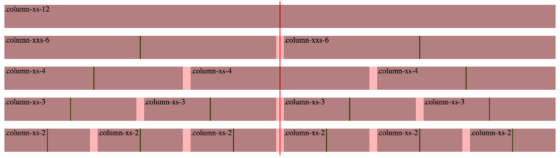
- it supports different viewport sizes, linked to keywords:
XXS,XS,SM,MD, andLG(configurable). - it allows columns to adjust size based on the viewport size.
Eg..column-xs-12applies only to theXSlayout,.column-md-6only applies to theMDlayout,.column-lg-4… - it allows offsetting of columns, also reliant upon the viewport size.
Eg..offset-md-4,.offset-lg-6. - it allows nesting of grids, keeping the defined gutter in place.
Along with that, a few extra requirements/features were added:
- it must be standalone
- it must use flexbox – not floats – for layout.
- it must use
em-based units – notpx-based units – for sizing (where appropriate). - it must support viewport-unreliant column sizing. Eg.
.column-8. - The columns must fill up the entire width of the wrapper/row. E.g. no (half-)gutter to the left of the first column, and no (half-)gutter to the right of the last column.
- (added 2016.10.18) it must support auto and stretch columns in case you want to go off-grid
Demo
Embedded below is the source and the demo pen. The CSS is written in Stylus, our CSS preprocessor of choice.
See the Pen Flexbox Grid by Bramus! (@bramus) on CodePen.
TIP: You might want to check out the pen in a standalone tab/window, so that you can resize it.
How to use
To get started, add .has-columns onto the wrapper. For each column add .column along with one ore more size specifications such as .column-xs-4 and (optional) an offset specification such as .offset-xs-2.
Column size names are based on portions/units. A column .column-xs-4 for example is 4 units of the total of 12 columns, resulting in a column of approximately – depending on the gutter size – 33% in width.
<div class="has-columns">
    <div class="column column-xs-4">.column-xs-4</div>
    <div class="column column-xs-4">.column-xs-4</div>
    <div class="column column-xs-4">.column-xs-4</div>
</div>
See the pen embedded above for some examples.
Columns with the classname .column-auto will not take up a given portion, but will only take up the space their content requires. This kind of column is typically used in combination with a column .column-stretch. An example would be for a message-component that consists of an avatar and a content:
<div class="message">
    <div class="has-columns">
        <div class="column column-auto">
            <img class="message__avatar" src="avatar.png" alt="" title="" />
        </div>
        <div class="column column-stretch">
            <div class="message__text">Lorem ipsum dolor sit amet, consectetur adipiscing elit.</div>
        </div>
    </div>
</div>
How it works
tl;dr: the width of each column is adjusted – using calc() – to take the defined gutter into account.
Say you have 2 columns that you want to display, each being 6 units wide (e.g .column-6). We can safely state that their base-width is 6/12, or 50% each.
<div class="has-columns">
    <div class="column column-6">.column-6</div>
    <div class="column column-6">.column-6</div>
</div>
In between those two columns a gutter of 1em is injected, using margin-right on the first column. There’s no gutter to the left of the first column, nor to the right of the second column (put differently: all columns, except for the last one, get a gutter applied using margin-right).
Given our 2 columns of 50% width each, this yields of a combined width that exceeds 100%: 50% (base-width) + 1em (gutter) + 50% (base-width) + 0em (no gutter for the last column!) = 100% + 1em = too wide.
Columns without adjusted width = too wide
To not exceed 100%, the actual width of our columns need to be adjusted by (in this case) -0.5em each, neutralizing the 1em gutter in between. With the adjustment applied, this yields a combined width of exactly 100%: 50% (base width) – 0.5em (adjustment) + 1em (gutter) + 50% (base width) – 0.5em (adjustment) + 0em (no gutter for the last column!).
Columns with adjusted width= perfect fit
For 3 columns (each being 4 units wide, or 4/12, or 33.3333% base-width each) a total gutter worth of 2em is injected. The adjustement for these 3 columns therefore is 0.666666667em.
If one would derive a formula to calculate the $gutterAdjustmentPerColumn, it’s this:
$gutterAdjustmentPerColumn = $gutterSize * (1 - ($columnWidthInUnits / $totalNumberOfColumns))The same logic – albeit a tad different – is used to calculate the $offsetAdjustmentPerColumn