Dissecting a React Component built by Jamie Kyle, Stefan Judis provides us with an easy to use CSS class that adds a “Natural Shadow” to any element. He does this by inlining the SVG <filter> in a CSS filter.
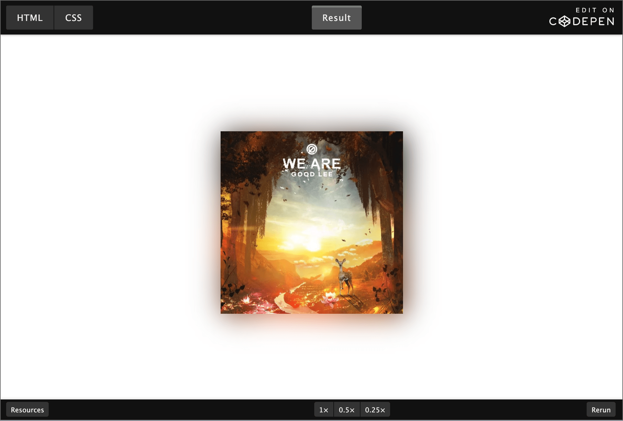
💁♂️ You can think of this “Natural Shadow” like a “Ambient Lighting” (Ambilight) option on a TV, where the TV casts a colored light that changes colour depending on the on-screen action. And yes, you can totally throw a video at it too, it’ll work (while melting your CPU)
In the pen above, I’ve tweaked the .natural-shadow class a bit:
- The shadow now also extends at the top and bottom, by tweaking
x="0" y="0" width="2" height="2"on the<filter> - The shadow was made bigger, by tweaking the
stdDeviation="5"on the< feGaussianBlur>
As Stefan notes, Safari has some issues with the inline filter …