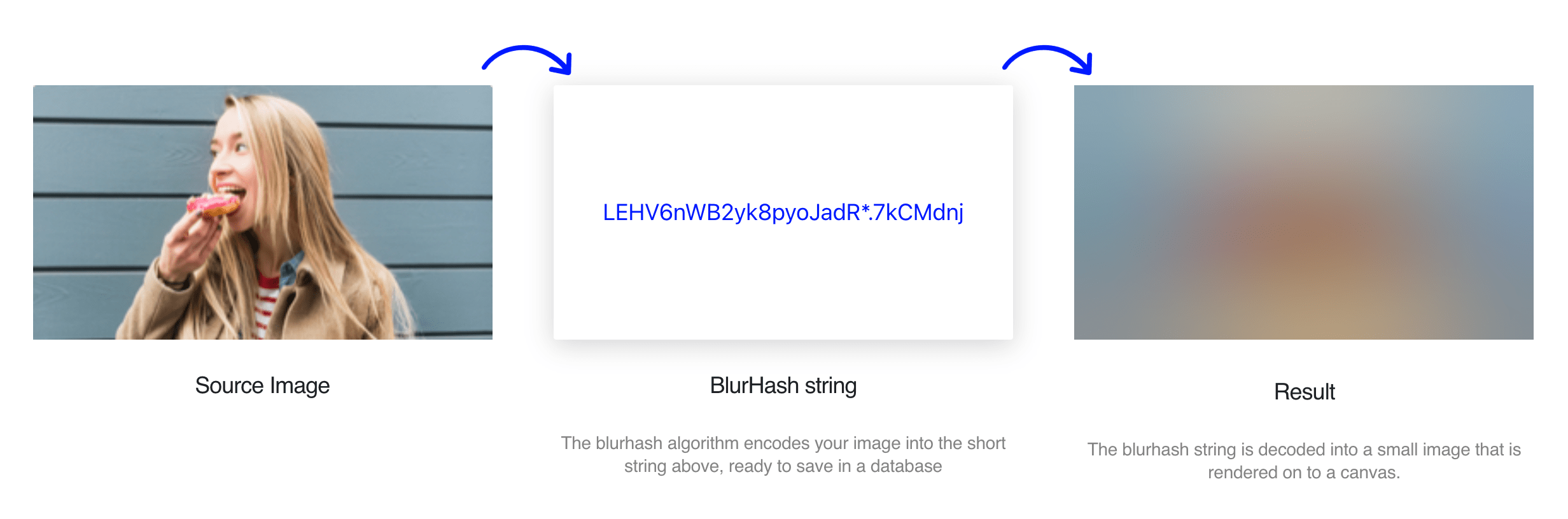
If you want to display Blurhash Placeholder Images on your site you need a JavaScript solution to do so. The blurhash-to-css package bypasses that, as it allows you to convert a Blurhash to a set of CSS properties that need to apply.
import { blurhashToCss } from "blurhash-to-css";

const css = blurhashToCss(
  "eCF6B#-:0JInxr?@s;nmIoWUIko1%NocRk.8xbIUaxR*^+s;RiWAWU"
);
{
"backgroundImage": "linear-gradient(90deg, rgb(139,153,96) 10%,rgb(153,160,118) 10% 20%,rgb(170,172,142) 20% 30%,rgb(177,180,151) 30% 40%,rgb(174,180,146) 40% 50%,rgb(162,172,130) 50% 60%,rgb(148,162,114) 60% 70%,rgb(136,150,104) 70% 80%,rgb(131,145,95) 80% 90%,rgb(130,144,91) 90% 100%),linear-gradient(90deg, rgb(109,129,65) 10%,rgb(117,131,80) 10% 20%,rgb(130,138,101) 20% 30%,rgb(142,148,113) 30% 40%,rgb(146,150,114) 40% 50%,rgb(136,144,103) 50% 60%,rgb(116,130,88) 60% 70%,rgb(102,119,75) 70% 80%,rgb(104,118,71) 80% 90%,rgb(112,123,72) 90% 100%),linear-gradient(90deg, rgb(110,122,70) 10%,rgb(114,122,85) 10% 20%,rgb(126,129,106) 20% 30%,rgb(143,140,122) 30% 40%,rgb(151,147,128) 40% 50%,rgb(144,142,122) 50% 60%,rgb(123,126,107) 60% 70%,rgb(106,111,90) 70% 80%,rgb(108,109,83) 80% 90%,rgb(118,117,83) 90% 100%),linear-gradient(90deg, rgb(134,133,102) 10%,rgb(141,138,120) 10% 20%,rgb(155,150,144) 20% 30%,rgb(172,164,161) 30% 40%,rgb(179,173,168) 40% 50%,rgb(173,168,162) 50% 60%,rgb(156,151,146) 60% 70%,rgb(137,132,127) 70% 80%,rgb(127,124,110) 80% 90%,rgb(128,124,101) 90% 100%),linear-gradient(90deg, rgb(116,124,95) 10%,rgb(125,129,112) 10% 20%,rgb(143,141,135) 20% 30%,rgb(160,156,153) 30% 40%,rgb(169,164,160) 40% 50%,rgb(165,161,155) 50% 60%,rgb(148,145,141) 60% 70%,rgb(124,125,118) 70% 80%,rgb(107,110,97) 80% 90%,rgb(99,106,82) 90% 100%),linear-gradient(90deg, rgb(95,105,51) 10%,rgb(99,105,66) 10% 20%,rgb(110,111,88) 20% 30%,rgb(125,122,107) 30% 40%,rgb(136,131,115) 40% 50%,rgb(134,129,111) 50% 60%,rgb(120,116,98) 60% 70%,rgb(97,97,77) 70% 80%,rgb(78,84,51) 80% 90%,rgb(70,78,30) 90% 100%),linear-gradient(90deg, rgb(109,106,21) 10%,rgb(109,104,44) 10% 20%,rgb(112,104,67) 20% 30%,rgb(122,109,83) 30% 40%,rgb(131,114,88) 40% 50%,rgb(130,112,83) 50% 60%,rgb(119,103,70) 60% 70%,rgb(104,91,51) 70% 80%,rgb(93,84,34) 80% 90%,rgb(92,84,24) 90% 100%)",
"backgroundPosition": "0 0 ,0 16.666666666666664%,0 33.33333333333333%,0 50%,0 66.66666666666666%,0 83.33333333333334%,0 100%",
"backgroundSize": "100% 14.285714285714286%",
"backgroundRepeat": "no-repeat",
"filter": "blur(24px)",
"transform": "scale(1.2)"
}Integrate this conversion on build/upload time and you’re good to go 🙂
Installation per NPM:
npm install blurhash-to-css