Robin Rendle writing for CSS-Tricks, on leveraging Variable Fonts when implementing a Dark Mode:
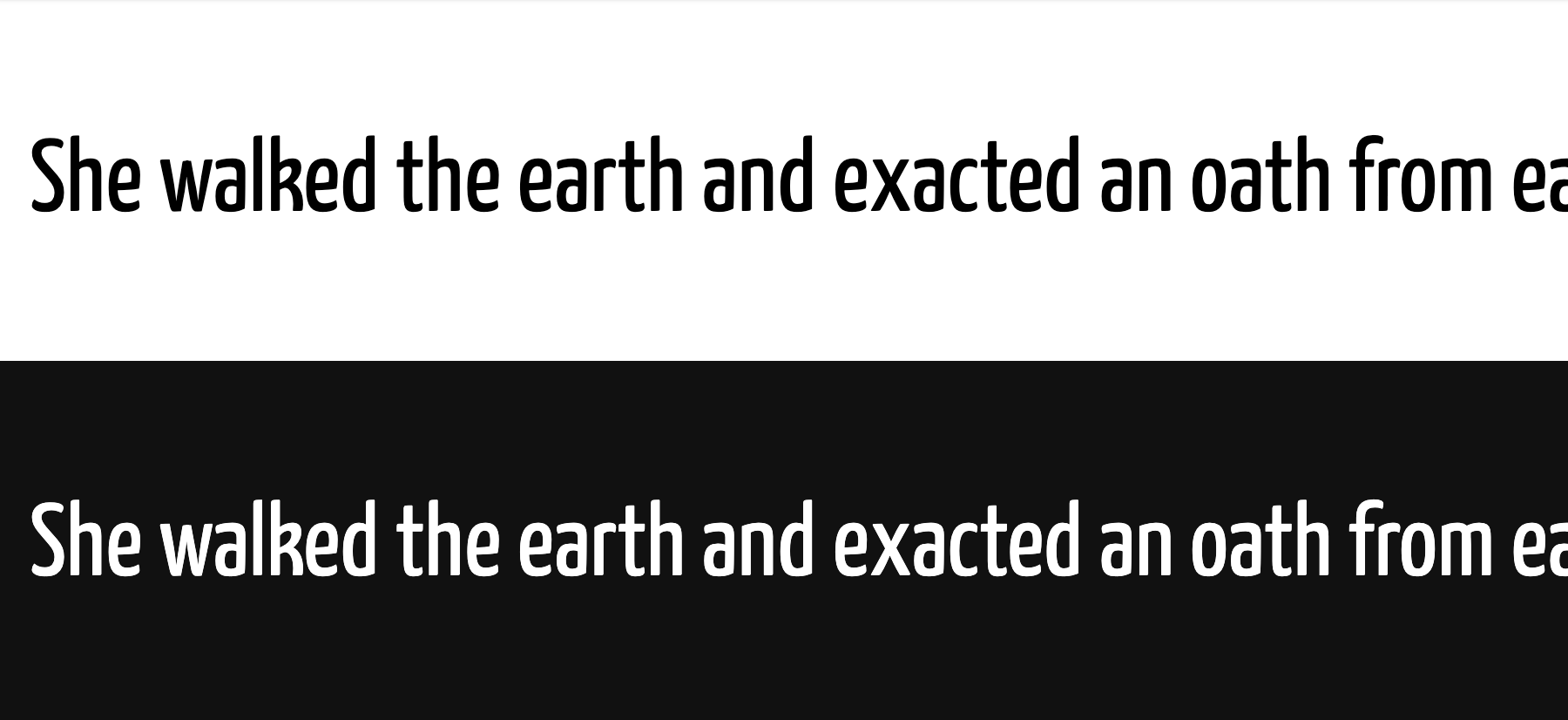
Oddly enough, these two bits of text [shown above] are actually using the same
font-weightvalue of400. But to my eye, the white text looks extra bold on a black background.How do we fix this?
Well, this is where variable fonts come in! We can use a lighter font weight to make the text easier to read whenever dark mode is active
Like so:
body {
  font-weight: 400;
}

@media (prefers-color-scheme: dark) {
  body {
    font-weight: 350;
  }
}
Sidenote: 😍 Yanone Kaffeesatz — Back in 2005 we used this as the company font for the company I then worked at. Liked it from the moment I first saw it.
~
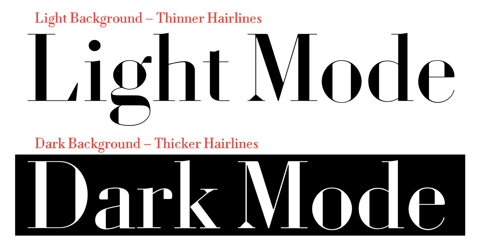
Depending on the design, there’s more you can do to adjust for dark mode with variable fonts besides adjusting weight. The Louvette font for example has an explicit passage on this:
With the Louvette variable fonts you can adjust the hairline axis (yopq) independently. The is particularly useful if you have light text on a dark background and need to thicken the hairlines to avoid ink from filling in, or on screen for “dark mode” settings.
~
Dark Mode and Variable Fonts →
💡 Besides tweaking colors and fonts, you might also want to tweak your images and even your favicon for Dark Mode display.
Leave a comment