At the City Intelligence unit at City Hall almost anyone can create a data visualisation. To keep everyone in line they created Data Design Guidelines:
Effective communication of evidence and data through information design and data visualisation, is obviously important to help inform policy internally, but it is also just as important to help boroughs and individual Londoners better understand their city.
With this in mind, over the past year, we have been thinking more about how we can improve the clarity, consistency and accessibility of our data visualisation output.
The guidelines, which focus principally on chart design, cover the following areas:
- Design Principles
- Practical Steps
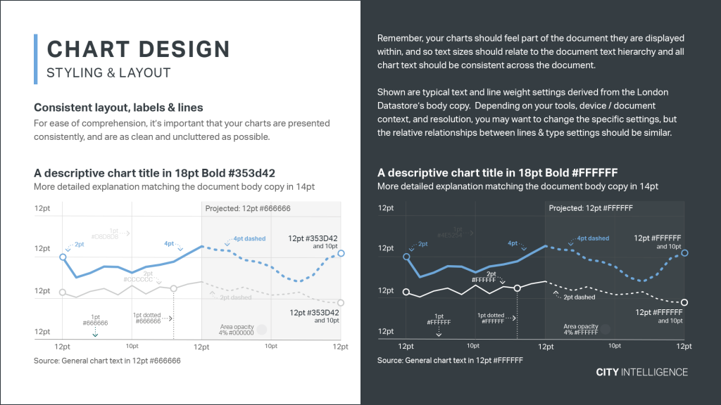
- Styling & Layout
- Using Colour
- Categorical Colour Palettes
- Find & Test Your Own Colours
- Introducing GGLAPlot
- Chart Examples
- Further Reading
Nice!
City Intelligence Data Design Guidelines →
Via Janne Aukia on Twitter