As seen at the most recent CSS Day. I’m quite sure this will help many developers to make their POCs/experiments visually more interesting:
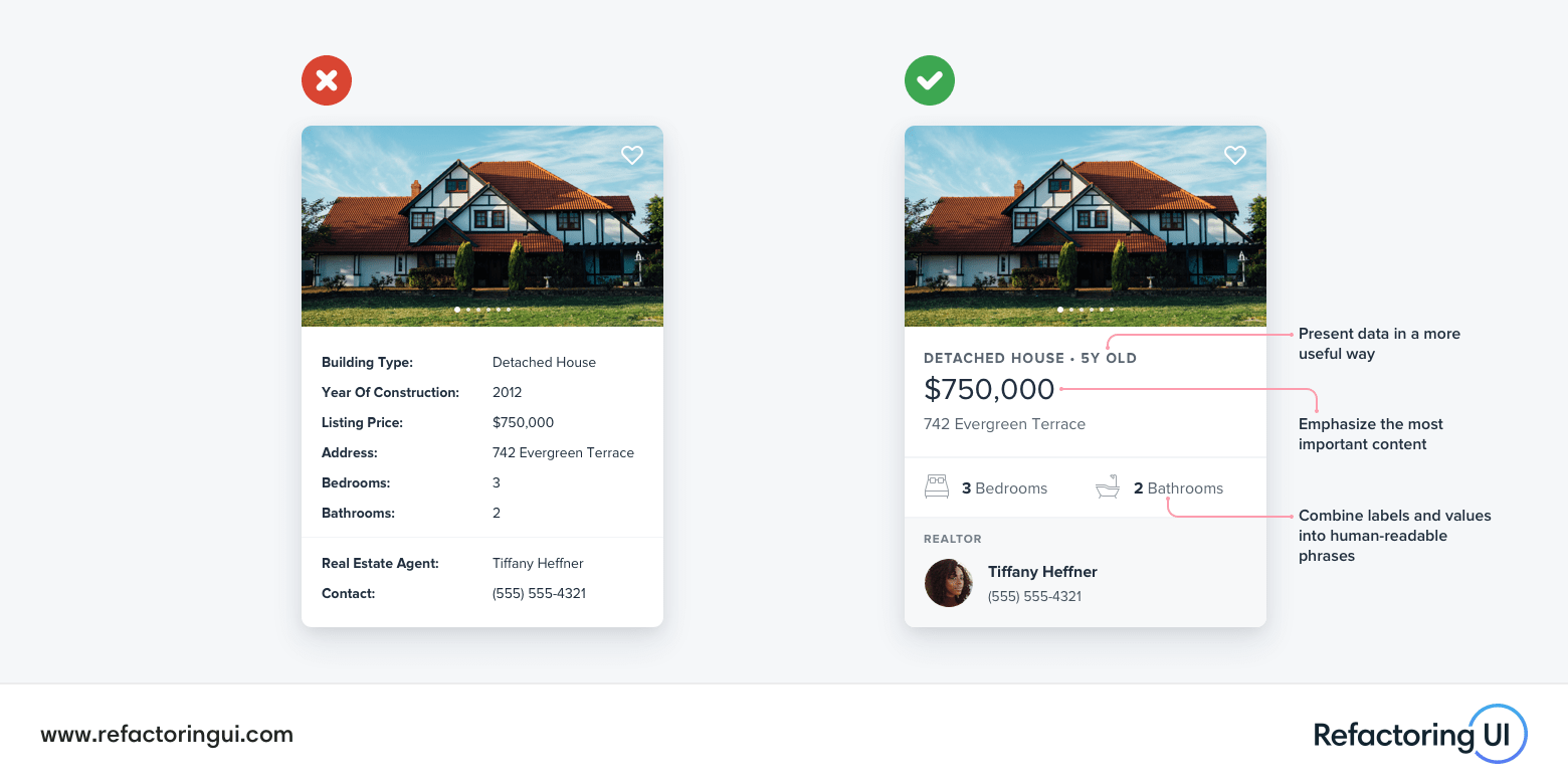
Sometimes when we look at a polished interface we can acknowledge that it looks good but it’s hard to articulate why it looks good. In this practical session, Steve will be explaining the why. He’ll be looking at a poorly designed UI and refactoring it while providing some of the strategies and techniques designers use to give an interface that polished look.
We’ll be looking at some of the more common problems faced by designers and developers—from simple forms to complex data—showing what a difference a few small cosmetic changes can do to bring design to the next level.
I know many designers will shrug when seeing this, but keep in mind that it’s intended for developers to make sure their POCs and demos look “good enough”. The guidelines/changes are simple, and make a huge difference … I wish my students from back in the day had seen this video.