One of the core ideas covered in my talk named “Geoshizzle” on mapping is that the Mercator projection is way overdue. It’s main feature of preserving angle measurements is no longer feasible in this time and age (it was back when you were sailing a boat to get somewhere), and it’s distortion of areas has affected how we perceive the size of the world (e.g. Greenland and Antarctica really aren’t that big).
Michael Davis has created a really good article on this, filled with visualisations using Tissot’s indicatrices demonstrating the effects of each projection.
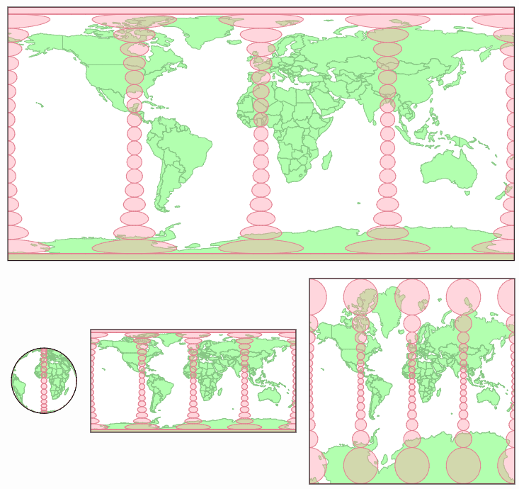
Pictured above you can see Tissot’s indicatrices drawn onto a globe, an equirectangular projecten, and the Mercator projection
A Frenchman named Tissot came up with something fancy. The general idea was to characterize local distortions; To show you what a small circle would look like when moved from the globe to the map.
The coolest part of the article/site is that the visualisations are interactive: you can give each globe a spin and simultaneously see how (the distortion of) the linked projection is affected by it.
👉 Want to see how the Mercator Projection affects the shape of a country when drawn on a map? Play the interactive Mercator Puzzle to find out.
Leave a comment