For a recent project we did at work I needed outlined text. Using text-shadow you can achieve the desired effect, but one must admit: it’s ugly.
Some browsers however (Webkit) support the text-stroke property which gets a much nicer result. Here’s a demo pen:
See the Pen CSS Transparent and Outlined Text by Bramus! (@bramus) on CodePen.
The code above uses @supports to apply text-stroke when supported. If not supported it falls back to the (ugly) faux outline technique.
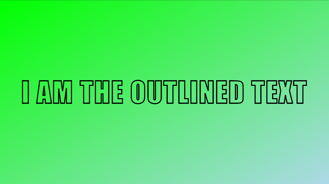
This is how it looks like in browsers that support text-stroke:
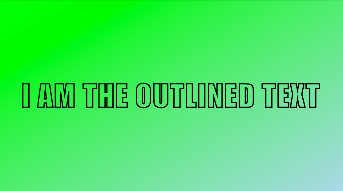
And this is how it looks like in browsers that don’t support text-stroke (note the ugly outline around the letter A):
Note: Unfortunately this technique does not work on emoji (cfr. Emoji Silhouettes and Emoji Outlines with CSS)
Consider donating.
I don’t run ads on my blog nor do I do this for profit. A donation however would always put a smile on my face though. Thanks!
Leave a comment