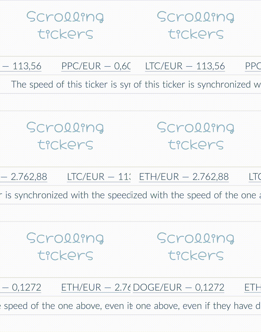
These Scrolling Tickers by Fabrizio Calderan are quite nice. By calculating the rendered width (via JS, passed to CSS using a Custom Property) and taking that into account to calculate the animation-duration he’s able to synchronise their speeds.
~
What I like most though is how the repetition of the ticker’s content is achieved. Where I’ve seen many tickers before that simply duplicate their contents in markup — or by use of data-* value that gets injected using ::after/::before — Fabrizio here uses a text-shadow.
.scrolling-tickers ul {
   text-shadow : calc(var(--ticker-width) * 1px) 0;
}
Note that if the content becomes too short for, you can use some extra text-shadow entries.
.scrolling-tickers ul {
   text-shadow : calc(var(--ticker-width) * 1px) 0,
                 calc(var(--ticker-width) * 2px) 0,
                 calc(var(--ticker-width) * 3px) 0,
                 calc(var(--ticker-width) * 4px) 0;
}
~
To make any repeating-links clickable, Fabrizio does resort to some ::before which injects a transparent block at the position where the text-shadow is.
.scrolling-tickers a::before {
   content: "";
   font-size: 10px;
   position: absolute;
   z-index: 1;
   inset: 0;
   border-bottom: inherit;
   transform: translateX(calc(var(--ticker-width) * 1px));
}
Note that this link-repetition won’t play nice when having multiple text-shadow entries, as you’re limited to injecting one two blocks using generated content (1 ::before and 1 ::after).
