Things have been going hard for CSS in 2021. The CSS Working Group has cranked out a ton of work, polishing existing CSS features and specifying lots of new ones too — with experimental implementations already having landed in several browsers.
Apart from supporting new features, browser vendors also focussed on fixing the top 5 browser compatibility painpoints (#compat2021) to make our dev-lives easier.
With 2021 coming to an end, let’s take a look at which CSS language features we can expect to land in browsers in 2022.
~
Table of Contents
~
# Before we dive in …
To be clear: The list you’re about to read contains my personal predictions. I don’t have any private/inside information, nor do I have a Crystal Ball. What I do have, however, are some public sources to base these predictions on: by closely monitoring the CSS Working Group Issue Tracker and by following along in the various Browser Vendor Issue Trackers, I have enough information for compiling this list.
As with all predictions, though: they could be wrong. I am, however, pretty confident that I’ll get most of it right in the end 🙂
Also note that I’m only covering language features that are entirely new or still lack widespread browser support. That’s why features such as logical values and properties or aspect-ratio or Space-Separated Functional Color Notations are not included in this list. Even though they’re fairly new or not commonly used, they already have proper browser support.
~
# The Hotlist (Cross-Browser Support)
I’m quite confident the following features will see support across all browsers sometime in 2022. Some features already have support in one or more browsers, with others to follow. Learning one of the following CSS features listed below in 2022 will pay off.
~
# Container Queries

Container Queries — part of css-contain-3 — allow authors to style elements according to the size or appearance of a container. For size-based container queries this is similar to a @media query, except that it will evaluate against the size of a parent container instead of the viewport.
For style-based container queries, you conditionally apply styles based on the calculated value of another CSS property.
main, aside {
  container: inline-size;
}

.media-object {
  display: grid;
  grid-template: 'img' auto 'content' auto / 100%;
}

@container (inline-size > 45em) {
  .media-object {
    grid-template: 'img content' auto / auto 1fr;
  }
}
More info: CSS Container Queries: A First Look + Demo →
Relevant Issues:
- Blink/Chromium: Issue #1145970
- Gecko/Firefox: Issue #1744221
- WebKit/Safari: Issue #229659
~
# Cascade Layers
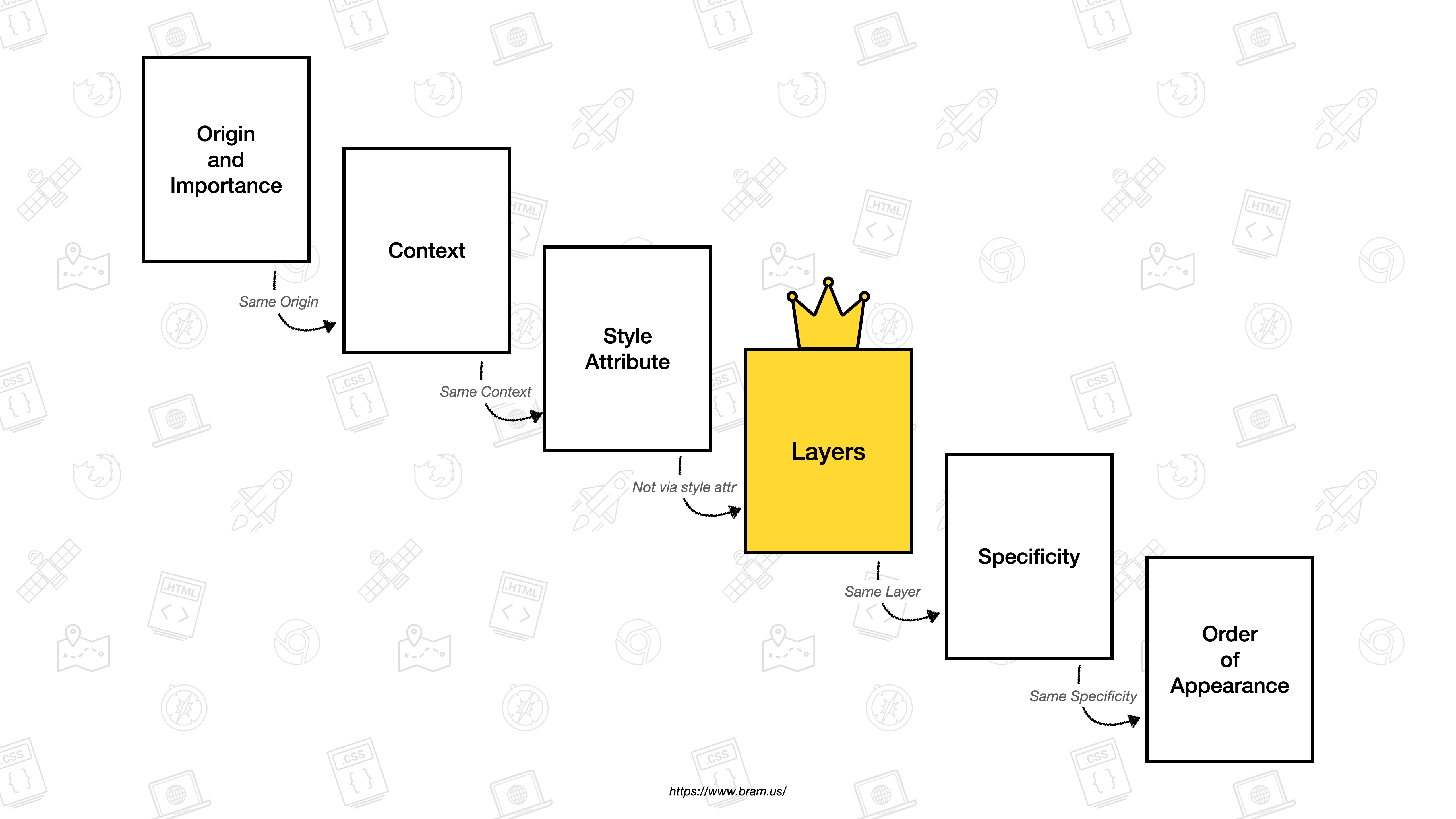
With Cascade Layers, you can control cascade ordering for same-origin rules properly. You do this by layering your styles using the @layer at-rule. Layers appear before specificity and order of appearance in the cascade.
@import(reset.css) layer(reset); /* 1st layer */

@layer base { /* 2nd layer */
  form input {
    font-size: inherit;
  }
}

@layer theme { /* 3rd layer */
  input {
    font-size: 2rem;
  }
}
Cascade layers will be supported in Chromium 99 and Firefox 97. They’re also supported in Safari TP 133 (behind a flag), and I expect them to ship in the first quarter of 2022.
More info: The Future of CSS: Cascade Layers (CSS @layer) →
Relevant Issues:
- Chromium: Issue #1095765
- Firefox: Issue #1699215
- Safari: Issue #220779
~
# Color Functions
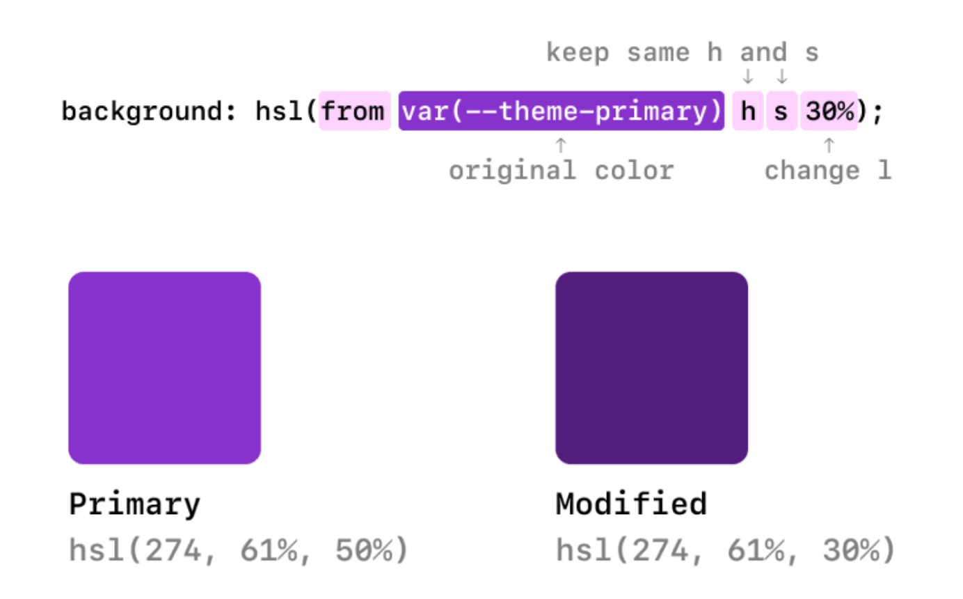
The css-color-5 specification comes with a few niceties when it comes to working with color. It adds two new functions: color-mix(), color-contrast(), and extends existing ones with relative color syntax.
-
The
color-mix()function allows you to mix two colors in a given color space..text-primary-dark { color: color-mix(var(--theme-primary), black 10%); } .text-primary-darker { color: color-mix(var(--theme-primary), black 20%); } -
The
color-contrast()function allows you select the best color from a list of colors that meets or exceeds the contrast criteria when compared to a certain base color./* Compares wheat against tan, sienna, and #d2691e */ /* Sienna will be selected as it has a contstast of 4.273 against wheat, which exceeds the threshold of AA-large (3) */ color-contrast(wheat vs tan, sienna, #d2691e to AA-large) -
With the relative color syntax you can manipulate and convert any color to any format.
:root {
  --color: #ff0000;
}

.selector {
  /* change the transparency */
  color: hsl(from var(--color) h s l / .5);

  /* change the hue */
  color: hsl(from var(--color) calc(h + 180deg) s l);

  /* change the saturation */
  color: hsl(from var(--color) h calc(s + 5%) l);
}
These additions plug functionalities typically provided by CSS Preprocessors. Already supported in WebKit/Safari.
More Info:
- Create a color theme with CSS Relative Color Syntax, CSS
color-mix(), and CSScolor-contrast()→ - Dynamic Color Manipulation with CSS Relative Colors →
Relevant Issues:
~
# New Viewport Units
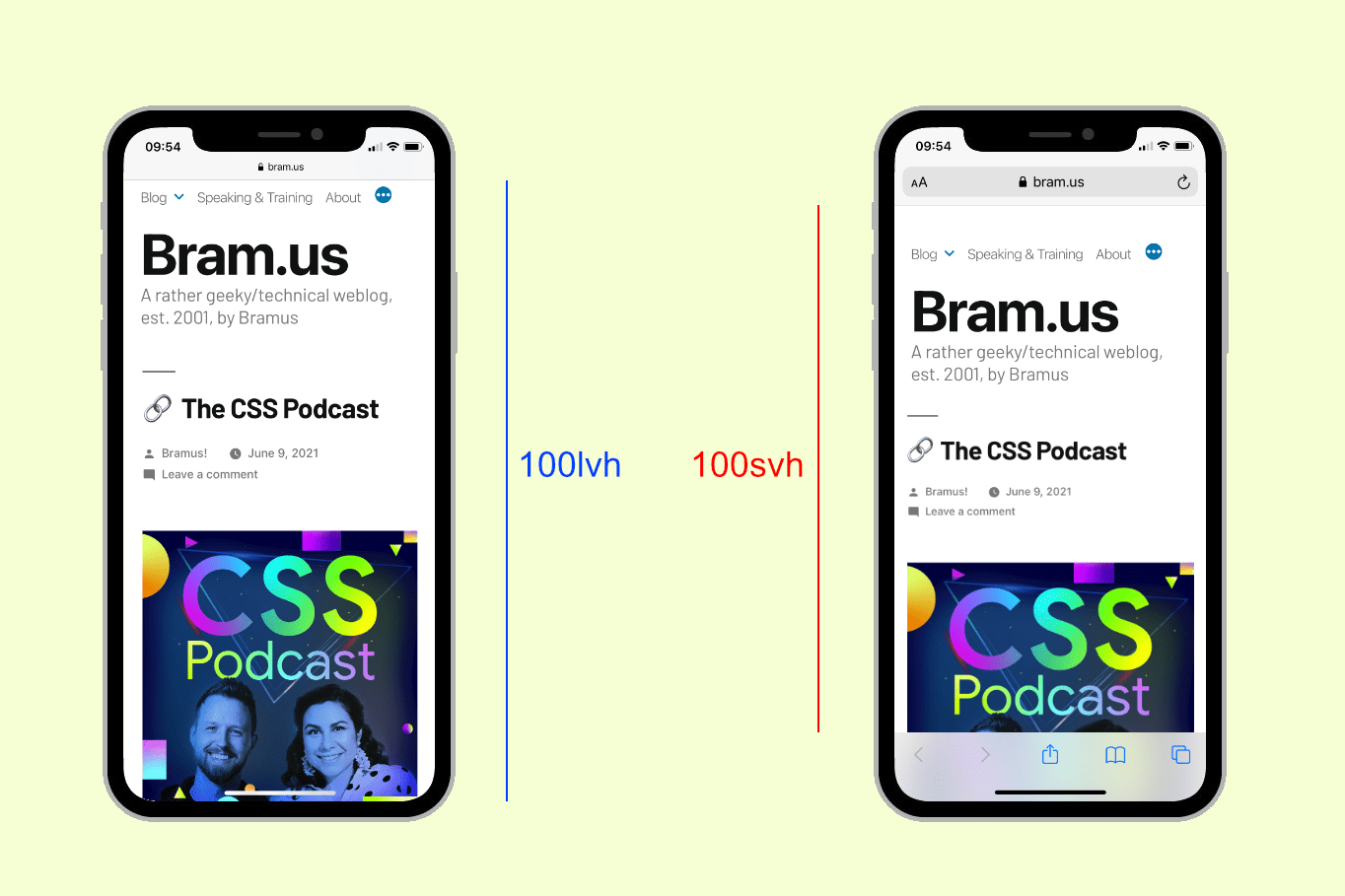
When working with Viewport Units there’s this longstanding and extremely annoying bug in Safari on iOS where it does not play nice with the vh unit. Setting a container to 100vh will result in an element that’s a wee bit too tall: MobileSafari ignores parts of its UI when calculating 100vh.
Leaving the vh unit as it is, the CSS Working Group introduced several new viewport definitions and accompanying new viewport relative lengths in the css-values-4 specification:
svh/svw: 1% of the Small Viewport height/widthlvh/lvw: 1% of the Large Viewport height/widthdvh/dvw: 1% of the Dynamic Viewport height/width
Also available as logical variants, such as svi/svb
More Info: The Large, Small, and Dynamic Viewports →
Relevant Issues:
- Blink/Chromium: Issue #1093055
- Gecko/Firefox: Issue #1610815
- WebKit/Safari: Issue #219287
The same spec also introduces logs of new mathematical functions to use in calculations. Definitely worth checking out.
~
# :has()

The CSS :has() relational pseudo-class is part of selectors-4. It allows you to more finely select elements, as an element will only match if any of the extra selectors passed into :has() matches at least one element. It’s often dubbed “the parent selector” but it’s way more than that.
/* Matches <a> elements that contain an <img> child */
a:has(img) { … }

/* Matches <a> elements that directly contain an <img> child */
a:has(> img) { … }

/* Matches <section> elements that don’t contain any heading elements: */
section:not(:has(h1, h2, h3, h4, h5, h6))

/* Matches <h1> elements only if they have a <p> element directly following them */
h1:has(+ p) { … }
More Info: The CSS :has() selector is way more than a “Parent Selector” →
Relevant Issues:
- Blink/Chromium: Issue #669058
- Gecko/Firefox: Issue #418039
- WebKit/Safari: Issue #227702
~
# Overscroll Behaviour
With the CSS overscroll-behavior property you can override the default behavior when “overscrolling” a container. With it, you can prevent a full reload when a pull-to-refresh gesture is performed, disable rubber banding, contain scrolling within one layer, etc.
See the Pen overscroll-behavior: contain by Aaron Iker (@aaroniker) on CodePen.
Long supported in Firefox (version 36) and Chromium (version 63). Safari is — finally! — catching up.
More info: Customizing Pull-to-Refresh and Overflow Effects with CSS overscroll-behavior
Relevant Issues:
- WebKit/Safari: Issue #176454
~
# Subgrid
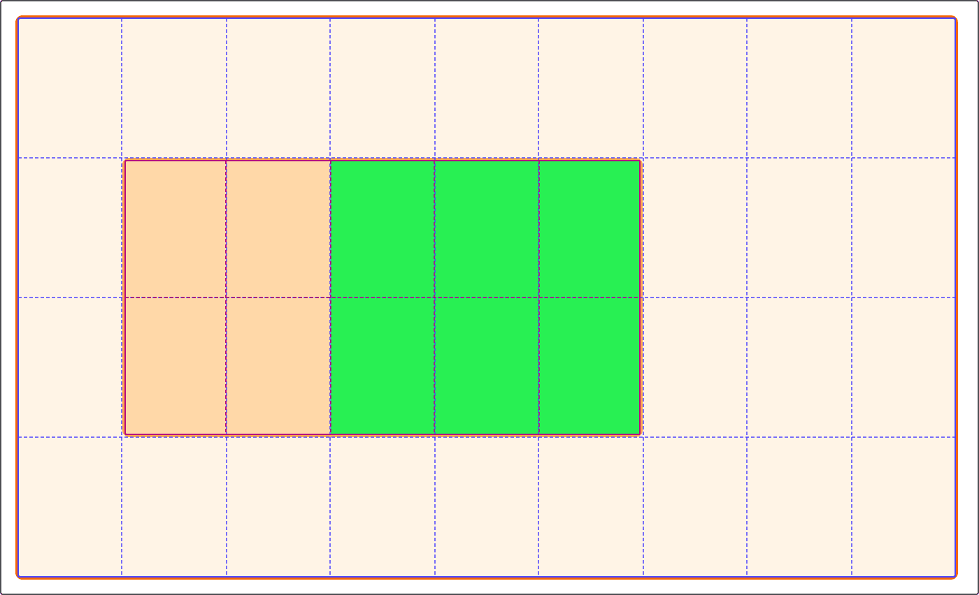
When nesting Grids it’s difficult to line nested grid items up with the main grid. That’s where subgrid comes in: by setting grid-template-columns or grid-template-rows to subgrid, it will line up with the parent grid.
.grid {
  display: grid;
  grid-template-columns: repeat(9, 1fr);
  grid-template-rows: repeat(4, minmax(100px, auto));
}

.item {
  display: grid;
  grid-column: 2 / 7;
  grid-row: 2 / 4;
  grid-template-columns: subgrid;
  grid-template-rows: subgrid;
}

.subitem {
  grid-column: 3 / 6;
  grid-row: 1 / 3;
}
Already supported in Firefox. Chromium is a WIP.
More info: Practical CSS Subgrid Video Tutorials →
Relevant Issues:
- Blink/Chromium: Issue #618969
- WebKit/Safari: Issue #202115
~
# Accent Color
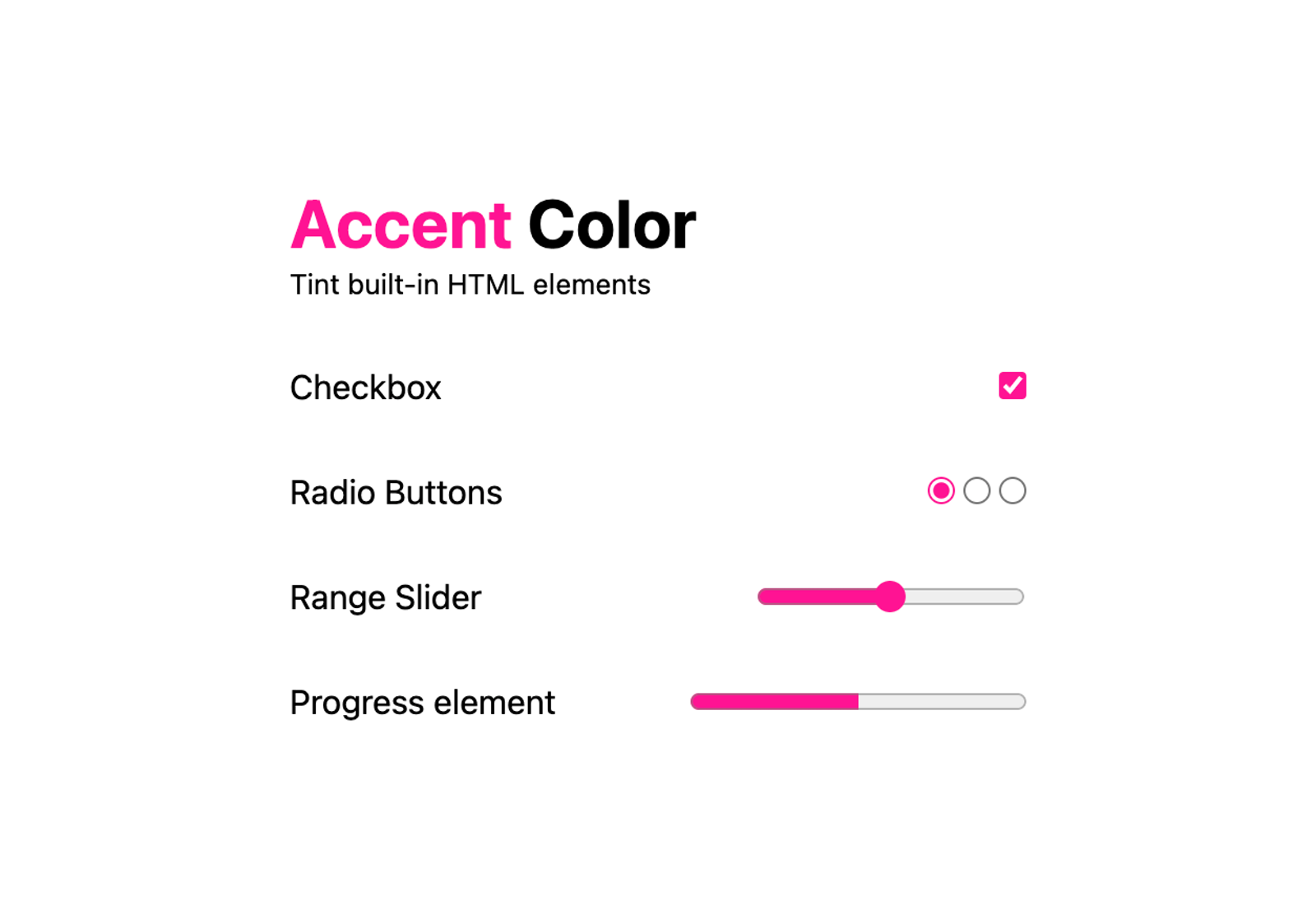
Part of css-ui-4 is accent-color
CSS accent-color from the CSS UI specification is here to tint elements with one line of CSS, saving you from customization efforts by providing a way to bring your brand into elements.
form {
  accent-color: hotpink;
}
Using it, you can even create some pixel art using checkboxes 🙃
Supported in Chromium 93+ and Firefox 92+.
More info: CSS accent-color →
Relevant Issues:
- WebKit/Safari: Issue #227587
~
# Media Query Ranges
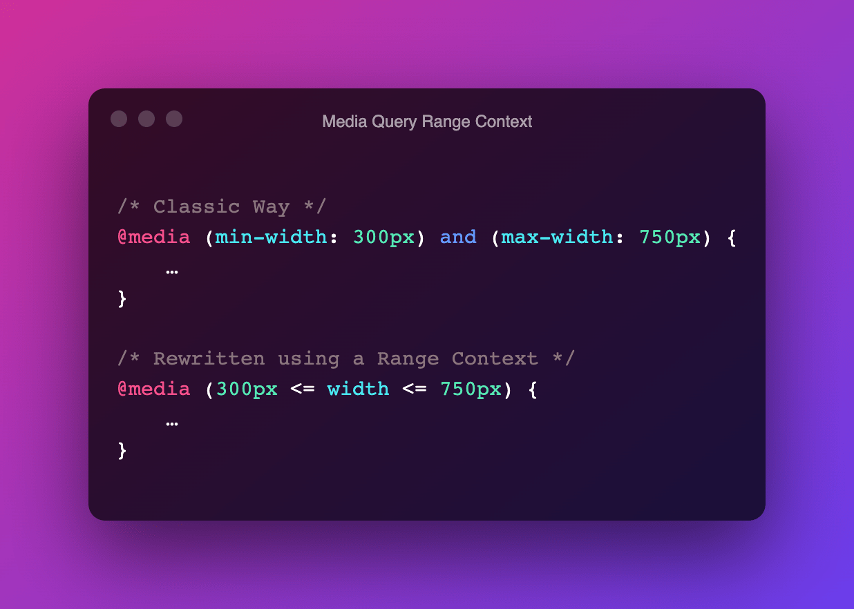
Thanks to new additions in mediaqueries-4, certain media queries can be rewritten using Media Query Ranges, a syntax that uses ordinary mathematical comparison operators.
/* Old Way */
@media (max-width: 750px) {
	…
}
/* New Way */
@media (width <= 750px) {
	…
}
I didn’t pick up any signal that Safari is actively pursuing this, but let’s assume I’m wrong on this one …
More info: Media Queries Level 4: Media Query Range Contex →
Relevant Issues:
- WebKit/Safari: Issue #180234
~
# The “Not yet” list (Experimental / Single-Browser Support)
I have a feeling that the following features won’t be supported in all browsers by the end of 2022. They most likely will be in some, mainly behind feature flags. You can invest your time in them if you want, but do understand that you’ll only benefit from using them in a few browsers until broader support lands (and everyone has updated their browsers).
~
# Nesting
Last summer the First Public Working Draft of css-nesting-1 got published, a module that introduces the ability to nest one style rule inside another.
🤔 Working Draft (WD)?
The Working Draft (WD) Maturity Level is the first official phase of the W3C Recommendation Track, and is considered the design phase of a W3C spec. In this phase the CSS Working Group will explore, revise and refine the contents of the module. The first published version of the WD is called the “First Public Working Draft”, which kicks off the WD phase.
From thereon a spec can become a Candidate Recommendation (CR) to finally land on being a Recommendation (REC). In between those three stages there are two transition stages: Last Call Working Draft (LCWD) and Proposed Recommendation (PR)
In visual form, the Recommendation Track looks something like this:
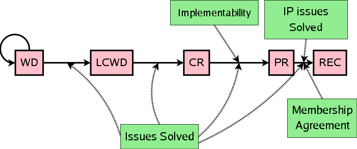
See An Inside View of the CSS Working Group at W3C for more details on all phases.
table.colortable {
  & td {
    text-align: center;
    &.c { text-transform: uppercase }
    &:first-child, &:first-child + td { border: 1px solid black }
  }
  & th {
    text-align: center;
    background: black;
    color: white;
  }
  @nest footer & {
    font-size: 0.8em;
  }
}
It’s a groundbreaking addition to CSS that I really wanted to include in the hotlist above. Unfortunately, I expect only Chromium (and maybe one other vendor) to gain support. Let’s hope I’m wrong on this one. Perhaps a preprocessor extension can open the way to actively using this one in 2022.
More info: The future of CSS: Nesting Selectors →
Relevant Issues:
- Blink/Chromium: Issue #1095675
- Gecko/Firefox: Issue #1648037
- WebKit/Safari: Issue #223497
~
# @scope
With css-cascade-5 (which introduced Cascade Layers) cut off, work on css-cascade-6 has already begun. It introduces Scoping in the Cascade, a way to scope styles to part of the DOM tree.
<div class="dark-theme">
  <a href="#">plum</a>
  <div class="light-theme">
    <a href="#">also plum???</a>
  </div>
</div>
/* When .light-theme and .dark-theme get nested, you may not get the expected result */
.light-theme a { color: purple; }
.dark-theme a { color: plum; }
/* By scoping, we can fix this, as the a elements will be styled by their nearest scope */
@scope (.light-scheme) {
a { color: darkmagenta; }
}
@scope (.dark-scheme) {
a { color: plum; }
}You can also define a scoping limit (lower boundary) for the scope.
It is currently way too early to further dig into it. I expect Chromium to experiment with it by the end of 2022.
~
# @when / @else
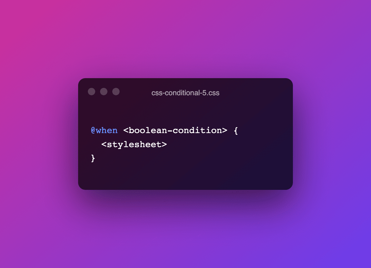
A specification that got it’s First Public Working Draft published just before the end of the year — on Dec 21st — is css-conditional-5.
🤔 Working Draft (WD)?
The Working Draft (WD) Maturity Level is the first official phase of the W3C Recommendation Track, and is considered the design phase of a W3C spec. In this phase the CSS Working Group will explore, revise and refine the contents of the module. The first published version of the WD is called the “First Public Working Draft”, which kicks off the WD phase.
From thereon a spec can become a Candidate Recommendation (CR) to finally land on being a Recommendation (REC). In between those three stages there are two transition stages: Last Call Working Draft (LCWD) and Proposed Recommendation (PR)
In visual form, the Recommendation Track looks something like this:

See An Inside View of the CSS Working Group at W3C for more details on all phases.
It includes and extends the functionality of CSS Conditional 4, adding the generalized conditional rule@whenand the chained conditional rule@else, as well as introducing font processing queries to the supports query syntax used in@supportsrules.
@when media(width >= 400px) and media(pointer: fine) and supports(display: flex) {
  /* A */
} @else supports(caret-color: pink) and supports(background: double-rainbow()) {
  /* B */
} @else {
  /* C */
}
Great addition IYAM. No signal from any vendor though — but that might be mainly due to the holidays happening right now — so I’m guessing not all browsers will include this one by the end of 2022, ergo its place in the “Not yet” list.
More Info: Proposal for CSS @when →
Relevant Issues:
- Blink/Chromium: Issue #1282896
- Gecko/Firefox: Issue #1747727
- WebKit/Safari: Issue #234701
~
# Status Quo
Sadly, I’m afraid the following features won’t move that much in 2022. Although these features are very useful by themselves, they need broader browser support before being truly usable.
~
# Scroll-Linked Animations
As predicted, the spec did undergo a massive change. The concept still stands, but the syntax has totally changed. For up-to-date information, go check https://scroll-driven-animations.style/
Thanks to the @scroll-timeline at-rule and animation-timeline property the scroll-animations-1 specification provides, you can link CSS Animations to the scroll offset of a scroll container. As you scroll up and down a container, the linked animation will advance and rewind accordingly.
/* (1) Define Keyframes */
@keyframes adjust-progressbar {
    from {
        transform: scaleX(0);
    }
    to {
        transform: scaleX(1);
    }
}

/* (2) Define a ScrollTimeline */
@scroll-timeline scroll-in-document {
  source: auto;
  orientation: block;
  scroll-offsets: 0, 100%;
}

/* (3) Attach the Animation + set the ScrollTimeline as the driver for the Animation */
#progressbar {
    animation: 1s linear forwards adjust-progressbar;
    animation-timeline: scroll-in-document;
}
Scroll-Linked Animations are currently only supported in Chromium behind a feature flag. Gecko/Firefox has already added syntax parsing support but no actual rendering yet. Although I’m a big fan of Scroll-Linked Animations and have written about them extensively, I’m afraid development will stall as the syntax is under discussion.
More info:
- Part 1: Introduction + Basic Scroll-Linked Animations →
- Part 2: Scroll-Linked Animations with Element-based offsets →
- Part 3: Practical Use-Cases →
- Part 4: Scroll-Linked Animations With the Web Animations API (WAAPI) →
Relevant Issues:
- Blink/Chromium: Issue #1023424
- Gecko/Firefox: Issue #1676780
- WebKit/Safari: Issue #222295
~
# @property (😭)
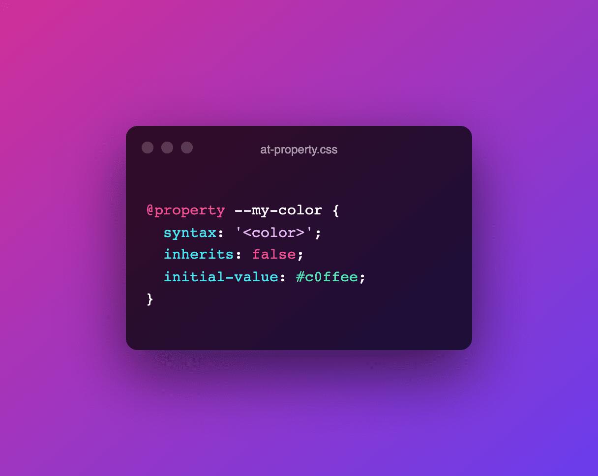
The CSS Properties and Values API is part of “CSS Houdini”. Using @property this API provides you can register your CSS Custom Properties and give them a certain type (syntax), initial value, and control their inheritance-capability.
@property --my-color {
  syntax: '<color>';
  inherits: false;
  initial-value: #c0ffee;
}
🎩 Houdini, ain't that a magician?
Houdini is a set of low-level APIs that exposes parts of the CSS engine, giving developers the power to extend CSS by hooking into the styling and layout process of a browser’s rendering engine. Houdini is a group of APIs that give developers direct access to the CSS Object Model (CSSOM), enabling developers to write code the browser can parse as CSS, thereby creating new CSS features without waiting for them to be implemented natively in browsers.
It really is magic, hence it's name Houdini. I'd recommend this slidedeck and this video to get you started
Even though I really really REALLY wish for Houdini — and specifically the Properties and Values API part of it — to be available in all browsers, I’m afraid it’ll stay as it is … the relevant WebKit and Gecko bugs simply have not moved at all the past months (years!) 😭
More info: @property: giving superpowers to CSS variables →
Relevant Issues:
- Gecko/Firefox: Issue #1273706
- WebKit/Safari: Issue #189692
~
# What about Safari?
Safari has been taking a ton of sh*t last year and is often called “the new IE6”. I’ve said this myself before, but I no longer wholeheartedly agree with this.
The Safari team has been crushing it lately (Color Functions, :has(), Cascade Layers, …) and above that they’ve been actively hiring for several positions on their team. I wouldn’t be all too surprised if Safari “caught up” in 2022 …
☝️ That still doesn’t change anything to the WebKit monopoly on iOS though, something I’m no fan of. I don’t think the Safari folks are either and can only assume that this is a decision that’s being made above their heads.
~
# In closing
I know, it’s a huge list of what’s most likely to come to CSS in 2022. Which features are you specifically looking forward to? And did I miss any CSS features? Leave a comment or hit me up on Twitter to let me know 🙂
~
To help spread the contents of this post, feel free to retweet one of the announcement tweets:
🔥 CSS Features to start learning, as I expect them to ship in all browsers in 2022:
— Bramus (@bramus) December 27, 2021
1. Container Queries
2. Cascade Layers
3. Color Functions
4. Viewport Units
5. :has()
6. Overscroll Behaviour
7. Subgrid
8. Accent Color
9. Media Query Ranges
With 2021 coming to an end, let's take a look at what we can expect from CSS and browsers in 2022.
— Bram.us (@bramusblog) December 27, 2021
🔗 https://t.co/CsTn4nvyG7
🏷 #css pic.twitter.com/rxlspa4gw2
~
🔥 Like what you see? Want to stay in the loop? Here's how:
The only big missing feature is constructable stylesheets and CSS module script imports. Color font stuff will land next year, although that’s a bit niche.
Safari have started to catch up but Firefox seems to have slowed down.
Great additions, Ollie. I mainly focus on language features in my post, so I have not included those.
Good observation about Firefox. I’ve noticed it too in certain areas (but not all).
I’m really digging the idea of native nesting, which shouldn’t be a stretch since media queries are nested. I love taking all the best parts of sass and making it native. Didn’t realize it’s only Chromium pushing for it.
Safari is still my IE mostly because of current features, not missing/future features. Things that are visually consistent in both Firefox/chrome break in Safari.
Great! thank you!