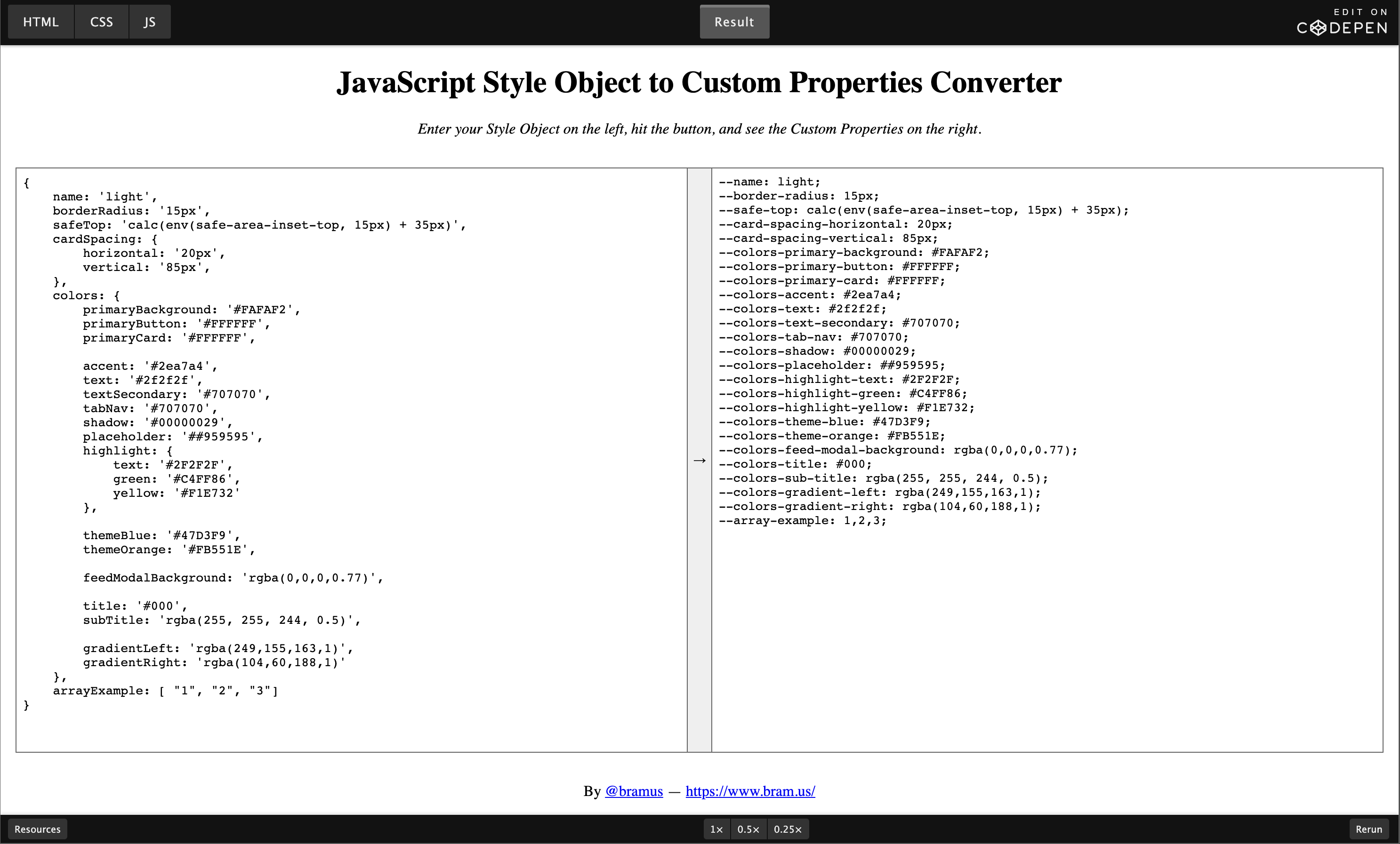
In a Next.js-based project I’m working I noticed this theme.js file which contains a JavaScript object that holds design tokens, defining what colors to use and such. As we are only using these values in CSS (via Styled Components) we decided on migrating away from it, and replace it with CSS Custom Properties. For this, I created a little helper tool.
The theme.js contents looked something like this (simplified):
const theme = {
    borderRadius: '15px',
    cardSpacing: {
        horizontal: '20px',
        vertical: '85px',
    },
    colors: {
        primaryBackground: '#FAFAF2',
        primaryButton: '#FFFFFF',
        primaryCard: '#FFFFFF',

        accent: '#2ea7a4',
        text: '#2f2f2f',
        textSecondary: '#707070',
        placeholder: '##959595',

        title: '#000',
        subTitle: 'rgba(255, 255, 244, 0.5)',
    },
};

export default theme;
Converted to Custom Properties, I want this:
--border-radius: 15px;
--card-spacing-horizontal: 20px;
--card-spacing-vertical: 85px;
--colors-primary-background: #FAFAF2;
--colors-primary-button: #FFFFFF;
--colors-primary-card: #FFFFFF;
--colors-accent: #2ea7a4;
--colors-text: #2f2f2f;
--colors-text-secondary: #707070;
--colors-placeholder: ##959595;
--colors-title: #000;
--colors-sub-title: rgba(255, 255, 244, 0.5);
~
To translate entries such as theme.colors.primaryCard to --colors-primary-card I decided to create a little helper tool. It automatically adds the required -- prefix, adjusts all camelCase occurrences to kebab-case, and plays nice with nested objects and (simple) arrays.
Perhaps this tool might also be of good use to you 🙂
~
Thank me with a coffee.
I don\'t do this for profit but a small one-time donation would surely put a smile on my face. Thanks!
To stay in the loop you can follow @bramus or follow @bramusblog on Twitter.
