For a project I’m working at, we’re building in some carousels (aka content sliders). While building a scroll-snapping carousel in itself is no rocket science nowadays, there was an extra variation that made my eyes sparkle: a full-bleed carousel that spans the entire page, with its focussed slide anchored to the center column of the page, and with the other slides “overflowing” outside of that column.
~
To jump right in, let’s take a look at the final result:
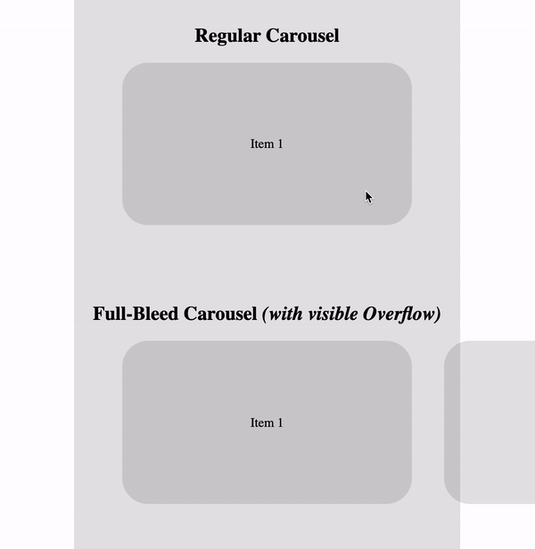
The first carousel shown is a regular/typical one: all slide-wrappers (.slidewrapper) are as big as the carousel (.slider) itself. They slide-wrappers are laid out on one row using CSS Flexbox. Because they have the same size, the carousel will only show one slide after having scroll-snapped.
The second carousel is the variation I mentioned in the intro: it also visually aligns the focussed slide with the center column — just like the first carousel — but the carousel itself does span the entire width of the page. This leaves the non-centered slides of the carousel also visible, making it look like they’re overflowing outside of the center column.
~
The code for this 2nd type of carousel uses the same markup and CSS as the 1st one, but with some CSS additions. As it’s not as easy as simply adding overflow: visible; to the .slider — as that would remove the scroll container — I adjusted the CSS as follows:
-
The carousel-wrapper (
.slider) spans the entire width of the page by means of the.full-bleedutility class..full-bleed { width: 100vw; margin-left: 50%; transform: translateX(-50%); } -
There’s a gap between each
.slidewrapper. This is done usingmargin-rightinstead ofgap, as older browsers don’t support the property in combination with Flexbox..slider.full-bleed .slidewrapper { margin-right: var(--slider-fullbleed-gap); }
And now, the key part:
-
The first
.slidewrapperis given apaddingon its left edge so that it appears centered on load. The last.slidewrapperis given apaddingon its right edge so that it appears centered watching the last item..slider.full-bleed .slidewrapper:first-child { margin-left: 0; padding-left: calc(50vw - (var(--slider-size) / 2)); } .slider.full-bleed .slidewrapper:last-child { margin-right: 0; padding-right: calc(50vw - (var(--slider-size) / 2)); }To make this work, the
.slidewrapperelements needbox-sizing: content-box;to be applied.
💡 An alternative approach would be to add this padding to the .slider itself. For that to work though — as otherwise the padding on the right will bleed out — you’ll need to lay you the children differently, using a combination of white-space: nowrap; (on .slider) and display: inline-block; (on .slidewrapper). I took this approach in my Pure CSS Cover Flow with Scroll-Timeline demo.
~
To grasp this padding-trick better and to see what’s going on, I’ve added a “Show Debug Outlines” option in the CodePen embed above. Take a close look at the green boxes that wrap the first and last slide contents.
- Slider Wrapper / Carousel Container =
.slider= hotpink - Slide Wrapper =
.slidewrapper= lime - Slide Contents
.slide= grey
I like the fact that I was able to re-use the same markup for both variations, with their only difference being the .full-bleed class. Nice and DRY 🙂
~
🔥 Like what you see? Want to stay in the loop? Here's how:
I can also be found on 𝕏 Twitter and 🐘 Mastodon but only post there sporadically.
Bram, this is amazing content, been looking for something like this for ages, thanks so much!