Don’t fiddle too much with your forms‘ look and feel. A small innocent-looking piece of CSS, even when combined with semantically correct HTML, could leave you with a degraded User Experience and make your forms less Accessible.
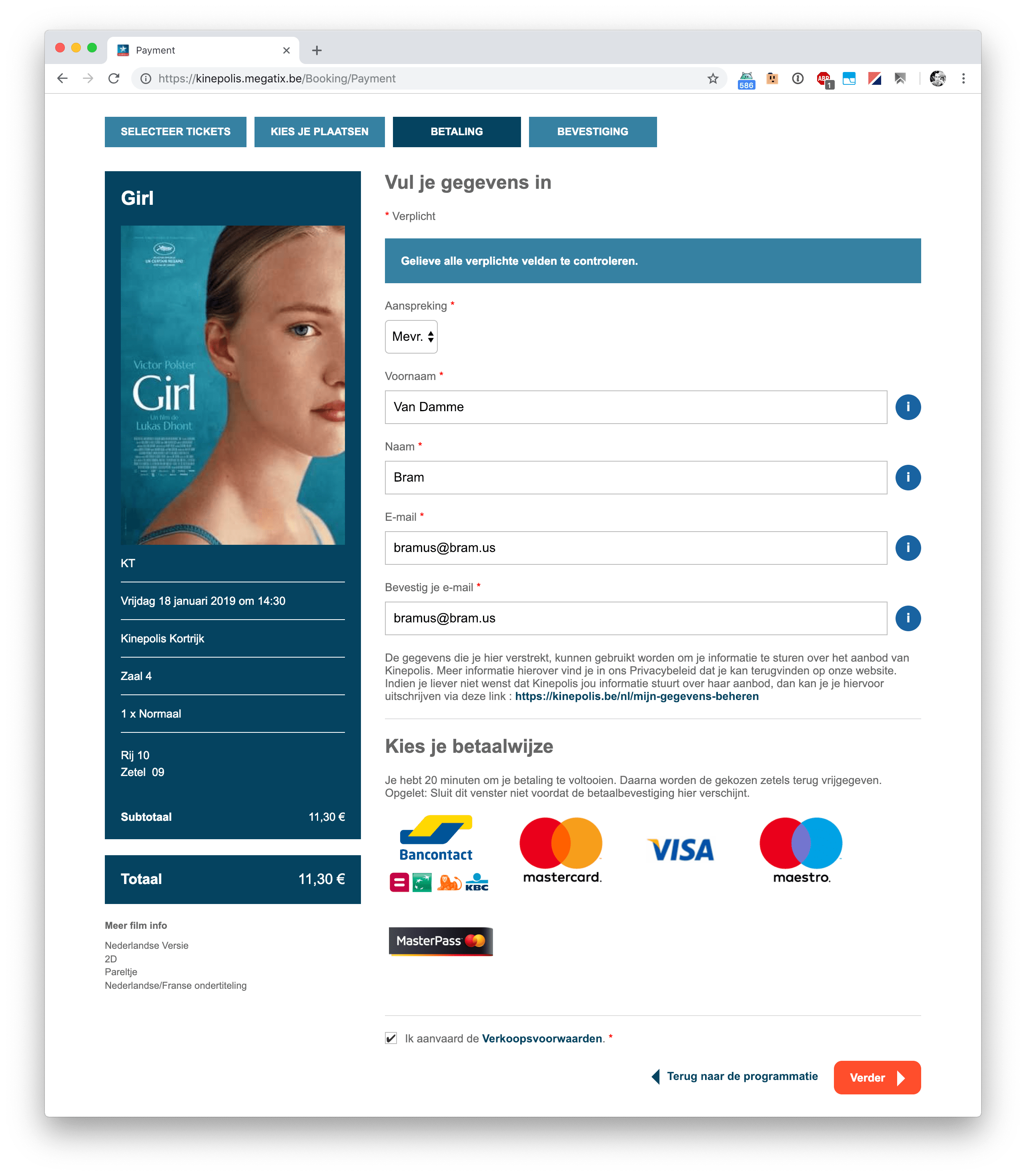
Yesterday I went to see Girl at Kinepolis. Whilst ordering tickets I ran into an issue though: after completing the payment form – or at least I think I had – it complained about some incomplete fields.

Can you spot the missing completed field(s)?
🤐 Insert sidenote here about the error message not being very distinguishable from the rest of the page, it blends in whilst it should stand out.
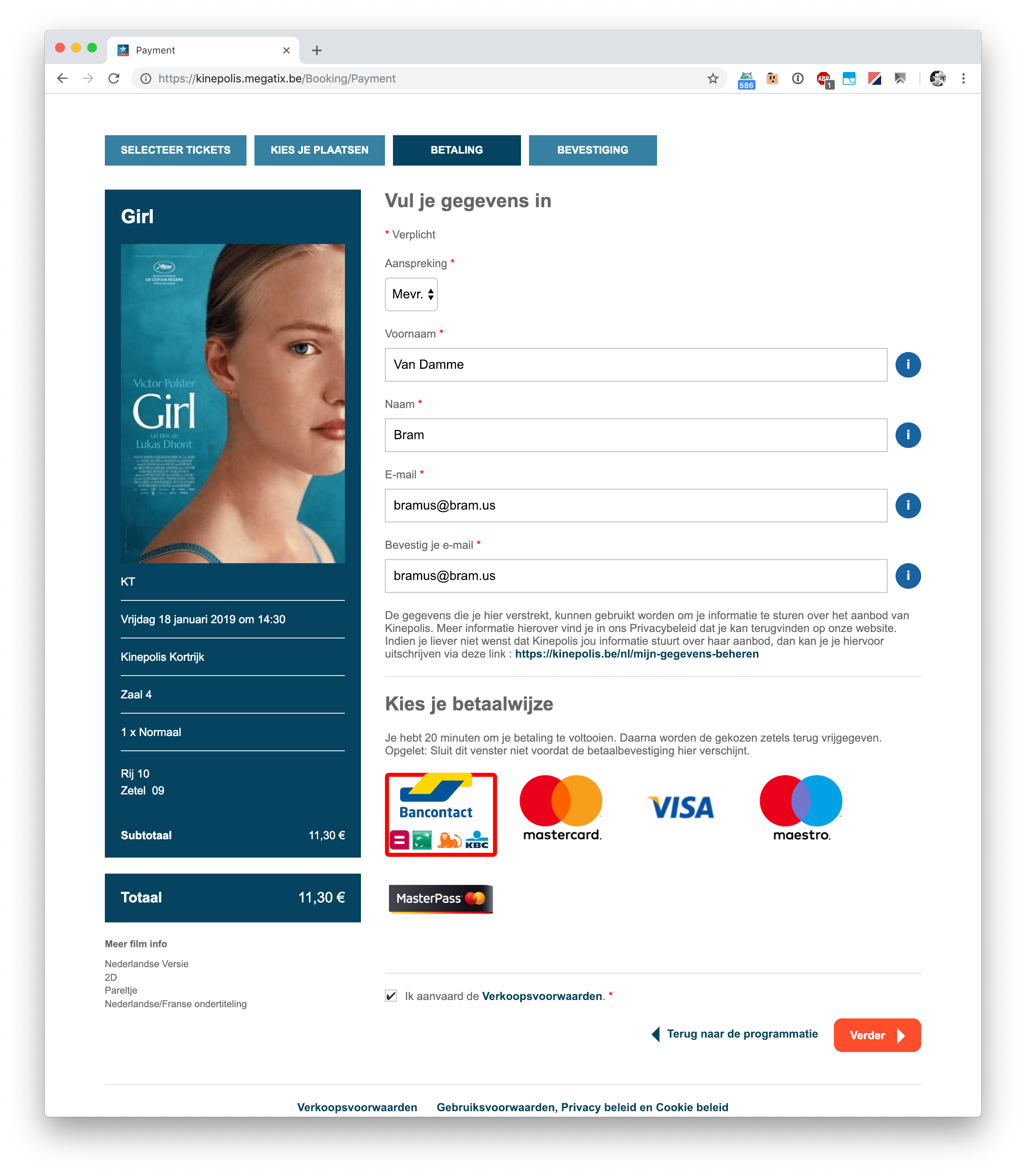
After scratching my head for a while, it turned out that I hadn’t selected a payment method. So I selected one, and could continue on forwards.

Oh, those were options for me to choose from!?
🤐 Insert sidenote here about the active payment method indicator being red, which mostly is used to visually indicate errors.
Today, the day after, I revisited the form as I wanted to know why I had missed the payment method in the first place. I work in web, so completing forms shouldn’t be an issue to me, right? I first thought they’d be using some crazy markup/JS combo, but the good thing about this form is that they’ve actually used radio buttons for the payment method selection.
<div class="method-list">
        <label class="method-list-item" data-method-list-item="">
            <input type="radio" name="PaymentMethod" value="BCMC--Ogone--CreditCard" class="method-list-item-input" required="">
            <span class="method-list-item-copy">
                    <img src="http://cms.kinepolis.megatix.be//media/1008/bcmc_combined.png" alt="BCMC">
            </span>
        </label>
        <label class="method-list-item">
            <input type="radio" name="PaymentMethod" value="MasterCard--Ogone--CreditCard" class="method-list-item-input" required="">
            <span class="method-list-item-copy">
                    <img src="http://cms.kinepolis.megatix.be//media/1030/mastercard_2017.png" alt="MasterCard">
            </span>
        </label>
        <label class="method-list-item">
            <input type="radio" name="PaymentMethod" value="Visa--Ogone--CreditCard" class="method-list-item-input" required="">
            <span class="method-list-item-copy">
                    <img src="http://cms.kinepolis.megatix.be//media/1005/visa.png" alt="Visa">
            </span>
        </label>
        <label class="method-list-item">
            <input type="radio" name="PaymentMethod" value="Maestro--Ogone--CreditCard" class="method-list-item-input" required="">
            <span class="method-list-item-copy">
                    <img src="http://cms.kinepolis.megatix.be//media/1012/maestro_2017.png" alt="Maestro">
            </span>
        </label>
        <label class="method-list-item">
            <input type="radio" name="PaymentMethod" value="MasterPass--Ogone--MasterPass" class="method-list-item-input" required="">
            <span class="method-list-item-copy">
                    <img src="http://cms.kinepolis.megatix.be//media/1023/masterpass-logo-featured-1.png" alt="MasterPass">
            </span>
        </label>
</div>
Great! As these elements are some of the basic building blocks of the web, they have built-in traits such as having the right semantics, being accessible, etc.
🏆 Extra bonus points for wrapping those inputs in a <label> by the way!
What’s going on then? Well, the “bad” thing about this form is that those radio buttons were visually hidden, as they’d been moved offscreen using a small piece of CSS — a not so uncommon technique:
.method-list-item-input {
    position: absolute;
    left: -99999px;
}
Even though the form is semantically correct (Yay! 🎉), that little piece of CSS unfortunately introduces two nasty side-effects:
[#UX]Removed Affordance: When completing a form, a user scans for form controls which they need to complete. Since the payment method selector does not seem to contain any form controls, as it looks like a “Hey, here’s some logos of the supported payment methods for ya” kind of thing, the brain skips over it.[#A11Y]Removed focus indication When tabbing through the form you don’t know that the focus has hit the payment method radio buttons, so you unwillingly skip over it as you keep tabbing. This will give one the impression that they cannot complete the form without the use of a mouse. (It took me a while to figure out how you eventually can: when you’ve hit focus on the payment method selector, hit an arrow key to select one of the options)
Here’s a recording of me tabbing through the form, unknowingly skipping the payment method controls as I didn’t know it got focus:
Now, the fix to these side-effects is quite simple: Don’t try to be smart, and leave the radiobuttons be.
.method-list-item-input {
    /* position: absolute; */
    /* left: -99999px; */
}
See what I did there?
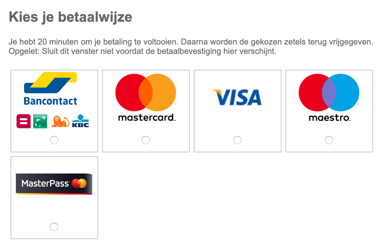
Sprinkle some CSS on top to make ‘m all a bit more beautiful (alignment, position, color) and you’re good to go:

Ah, these look like options to me!
💁♂️ Here’s the CSS I used, in case you were wondering:
.method-list-item {
    display: flex;
    flex-direction: column;
    align-items: center;
    border: 1px solid #bcbcbc;
    margin: 0.25em;
    padding: 0.25em 0.25em 1em 0.25em;
}

.method-list-item-input {
    /* position: absolute; */
    /* left: -99999px; */
    order: 2;
}
It adds an outline, adds some margin/padding, and visually moves the radio buttons below the logo (something which I personally find more pleasing). And yes, I know, those logos may be a tad smaller too …
Additionally, they could also add some extra CSS to visually indicate that the wrapping label.method-list-item has a focussed element within. This can be achieved using :focus-within (supported in all modern browsers except Edge):
label.method-list-item:focus-within {
  border-color: #2781a3;
}
Here’s a recording of me tabbing through the form with all mentioned CSS adjustments applied:
A small change, lifting this form from a 9/10 up to a 10/10, no?
For your own forms, you can use these simple tricks to quickly check them for the issues I just mentioned here:
- Tab through your forms (and your site in general) to see if you can access all controls.
- Controls should have a different look when they are focussed (e.g. so that you know they have focus)
- Think away labels and titles (or translate them to another language), and ask yourself if the meaning of the controls/elements still remain clear or not. (e.g. titles such as “Choose X” don’t indicate choice. Radio buttons / checkboxes / dropdowns do)
Of course those three won’t make a good form all by itself, as you can’t forget about other things the basics such as the use of good labels, grouping of controls, etc. — See Designing Better Forms for a good list of tips.
Here’s to good forms! 🥂
Thank me with a coffee.
I don’t do this for profit but a small one-time donation would surely put a smile on my face. Thanks!
To stay in the loop you can follow bramus on Bluesky or subscribe to the RSS feed.
schoontje
Thanks!
So much this!
Yeah. That’s why I decided to turn a few tweets on this, into a full blogpost. It’s too important.
Thanks for putting together this blog post, I found it really helpful!
🙏
Praise for better forms. This is a very linkable post 😉
Thinking more about their approach to the CC logos and hiding of labels, they have obviously taken the wrong approach from an accessibility point of view, their definitions for hiding the label visually is not good practice and makes tab focus difficult.
In your solution, you didn’t mention adding label text to describe what each input means, for screen readers tabbing through these fields would be slightly confusing and not immediately clear. Adding text with a class to hide it visually would be one approach (see Bootstrap’s sr-only class).
The border wrap might not be ideal in some cases, you would have to test whether this improves usability at all. Some users may still try and click the radio buttons only for example and not the images even though each box can be clicked. Also, the last element on its own line slightly bothers me and seems a little inconsistent, maybe they could be done as rows?
They seem to want to hide the default radio buttons for this design pattern, while not ideal in its current state they could look to improve ways to visually show that each element is selectable while providing visual feedback by clearly showing what has been selected. You can, for example, create pseudo-elements that could replace the radio buttons while keeping to their design style e.g (https://design-system.service.gov.uk/components/radios/hint/index.html) and use a visual element such as an icon.