UPDATE 2020.11.30: Aspect Ratios in CSS are no longer a hack, thanks to the new aspect-ratio CSS property!
Right now I’m in Amsterdam attending CSS Day (my fourth time already!). Earlier this morning Bert Bos and Håkon Wium Lie – yes, the inventors of CSS – were on stage reflecting on the first days of CSS and things they’d’ve done differently or turned out differently than they expected.
At the end of the talk the question came up if we, the audience, found if things were missing in CSS. Immediately aspect ratios came to my mind, as it’s something that has been bothering me for a few years by now, over, and over again (my first public musing about this dates back to 2012).
At last years’ Fronteers Conference it – for a short period of time – even became a hot topic after a demo using a spacer gif to creating aspect ratios was shown on stage. It created some outrage, yet my response to it was more nuanced:
Don’t bash the spacer gif or react, but bash the actual problem: there is no non-hacky way to work with aspect ratios on the web. #fronteers
— Bramus! (@bramus) October 6, 2016
Before going any further, let’s first take a look at the current hacks that exist to creating aspect ratios on the web.
~
Current Techniques
Technique #0: Spacer gifs
No. Just no. 1999 called. They want their IE5 back.
Here, a dancing baby if you’re feeling nostalgic:

~
Technique #1: Vertical Padding
A (hopefully) well known and longstanding hack to faking aspect ratios on the web is to abuse the vertical padding. By setting the height of an element to 0 and the padding-top or padding-bottom to a percentage based value one can force a box to have a fixed aspect ratio.
The reason to why this hack works is that the padding of an element is calculated against the width of that element (*).
The percentage is calculated with respect to the width of the generated box’s containing block, even for ‘
padding-top‘ and ‘padding-bottom‘. If the containing block’swidthdepends on this element, then the resulting layout isundefinedin CSS 2.1.
(*) The vertical padding isn’t always calculated against the width though, there is an exception … but that’s food for another blogpost which you can read about here 😉
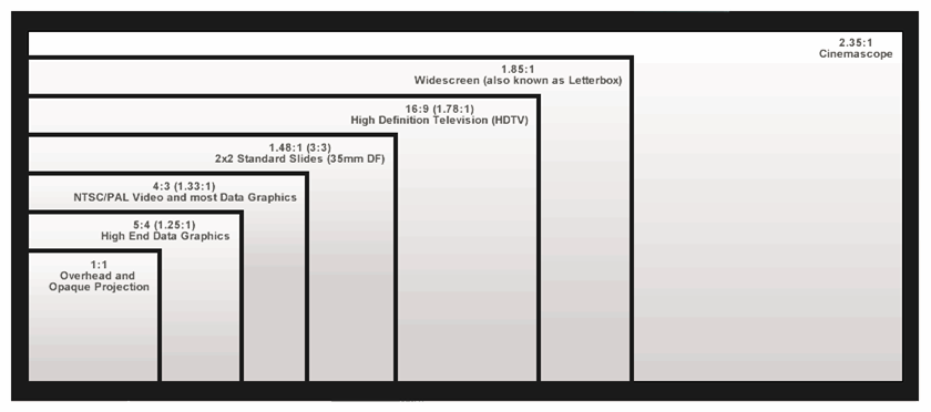
Say you need a box with an aspect ratio of 16:9. The resulting percentage to apply as a vertical padding can then be calculated via the formula 100% * 9 / 16, resulting in 56.25%. Say you want a 4:3 box, use 75% instead (100% / 4 * 3).
A generic implementation in CSS would be something like this:
<div class="aspectratio" data-ratio="16/9">
  <div>
    <p>16:9</p>
  </div>
</div>
.aspectratio {
position: relative;
height: 0;
width: 100%;
}
.aspectratio[data-ratio="16:9"] {
padding-top: 56.25%;
}
.aspectratio[data-ratio="4:3"] {
padding-top: 75%;
}You’ll need to wrap the content of .aspectratio in an extra element – a simple <div> will do – though, and sprinkle some extra CSS on top to position said element it properly inside .aspectratio:
.aspectratio > * {
  position: absolute;
  top: 0;
  left: 0;
  width: 100%;
  height: 100%;
}
See the Pen CSS Aspect Ratios, Technique #1 by Bramus (@bramus) on CodePen.
Works fine in all browsers – even good old IE2 will do – but one must admit: it’s a hack, right?
~
Technique #1b: Vertical Padding (using CSS variables)
If you’re familiar with CSS variables you can exchange the introduced data-ratio attribute from above with a CSS variable to define the aspect ratio to use:
<div class="aspectratio" style="--aspect-ratio: 16/9;">
  <div>
    <p>16:9</p>
  </div>
</div>
.aspectratio {
position: relative;
height: 0;
width: 100%;
padding-top: calc(100% / (var(--aspect-ratio)));
}
.aspectratio > * {
…
}See the Pen CSS Aspect Ratios, Technique #1b by Bramus (@bramus) on CodePen.
Same core technique, yet a tad more modern implementation 🙂
~
Technique #2: Vertical Padding with Generated Content
A similar yet somewhat different approach to the first technique is to dynamically inject some content using :after or :before, and then stretch that out:
.aspectratio {
  position: relative;
}

.aspectratio:after {
  content: "";
  position: absolute;
  top: 0;
  width: 100%;
  z-index: -1;
}

.aspectratio[data-ratio="16:9"]:after {
  padding-top: 56.25%;
}

.aspectratio[data-ratio="4:3"]:after {
  padding-top: 75%;
}
See the Pen CSS Aspect Ratios, Technique #2 by Bramus (@bramus) on CodePen.
Unlike the first technique, this technique doesn’t stretch out the .aspectratio element itself though. Only the generated content box is stretched out. This can make it quite nasty to style and rather impossible to center the contents both horizontally and vertically.
~
Technique #3: Viewport based units
A technique I’m very fond of is to use viewport based units to hack together aspect ratios. It’s really great when you’re implementing full-width layouts, independent of the size of viewport (most typical designs for, say, blogs eventually limit the width of the main column).
An element that is 100vw can be given a height of 100vw / 16 * 9 = 56.25vw to give it an aspect ratio of 16:9
See the Pen CSS Aspect Ratios, Technique #3 by Bramus (@bramus) on CodePen.
On the upside you don’t need extra elements to wrap your content in, nor do you need to alter its position. On the downside however is the fact it isn’t very usable nor portable when things start shifting around or have different widths. Because this technique relies on explicit widths (eg. vw) instead of dynamic ones (eg. %), you’ll need to explicitly define the width/height per breakpoint and element.
Huh? An element that has a width of 33vw will need to a height of 33vw / 16 * 9 = 18.5625vw to give it an aspect ratio of 16:9. An element with a width of 40vw will need a different height, even though they have the same aspect ratio.
~
Technique #4: Viewport based units + CSS Grid
In Experiments in fixed aspect ratios Stephanie Liu experimented a bit further with fixed aspect ratios involving the grid spec. By defining square grid cells – using viewport based units – she’s then able to span elements over it:
.aspectratio {
  display: grid;
  grid-template-columns: repeat(16, 6.25vw);
  grid-auto-rows: 6.25vw;
}

.aspectratio[data-ratio="16:9"] .content {
  grid-column: span 16;
  grid-row: span 9;
  background: hotpink;
}
See the Pen CSS Aspect Ratios, Technique #4 by Bramus (@bramus) on CodePen.
This technique inherits the upsides and downsides of technique 3, but also re-introduces the extra element required to wrap around the content.
What now?
As already hinted in the title and introduction I find these techniques hacks and would like to see a proper, non-hacky, way to implementing aspect ratios on the web.
The ideal technique would involve best parts of all ones mentioned above:
- Work with elements that have dynamic widths
- Don’t require an extra element wrapping the content
A to me ideal syntax would be something along these lines:
.aspectratio[data-ratio="16:9"] {
  width: 100%;
  aspect-ratio: 16/9;
}
Researching upon this topic it came to my attention that Tab Atkins started writing a proposal for this back in 2012, suggesting a likewise syntax. In it he highlighted a case where things would start to become fuzzy. What if you were to specify both the width, height, and aspect-ratio but with a wrong aspect-ratio for that width/height combination?
For example, given an element with
width:auto; height:auto; aspect-ratio: 2/1; max-height: 200px;in a500pxwide container, the element would first be set to500pxwide, thenaspect-ratiowould naively set the height to250px, which is in violation of themax-heightconstraint. Instead, the element’s height becomes200pxand the width is set to400px. If the element additionally hadmin-width: 450px,aspect-ratiowould be completely ignored, as there’s no way to satisfy it.
Given the issue above, another syntax that would please me (and bypass the issue along with that) is this:
.aspectratio[data-ratio="16:9"] {
  width: 100%;
  height: aspect-ratio(16/9);
}
Since you can’t set the height to a fixed unit, no extra calculations would need to be done. Of course you’d run into problems when setting both the width and the height to aspect-ratio(…), but that can be specced out: only the last one defined will be used, the previous ones will revert to auto.
On Twitter it was also pointed out to me that there’s a WICG repo on the issue. Greg Whitworth from Microsoft participates in the repo. The repo contains a link to a spec entitled Logical sizing properties which is also edited by Tab.
The proposed syntax is currently leaning towards this (aspect-ratio needing to be a number):
.aspectratio[data-ratio="16:9"] {
  width: 100%;
  aspect-ratio: calc(16/9);
}
~
So, can we use this “Logical Sizing” thing then? And when?
Given the fact that Tab is present here at CSSDay I’ll be asking him about it later (I’m actually sitting next to him right now, yet he’s currently busy finishing up his slidedeck on Houdini – which he’s about to present later today – so I won’t be bothering him right now 😉).
Speaking of Houdini: I’m not sure this can be fixed with Houdini but perhaps it could … another thing I’ll be asking Tab about.
A follow-up post will definitely land, once I’ve picked Tab his brain on this. To stay in the loop on this I’d recommend one to subscribe to the bram.us RSS feed, or follow bram.us on on Twitter or Facebook.
Consider donating.
I don’t run ads on my blog nor do I do this for profit. A donation however would always put a smile on my face though. Thanks!
To me, it’d be better if it was implemented as a value of the height property. What if you wanted your min-height to be defined by an aspect-ratio? This’d solve that, too.
For instance:
.element{ width: 100%; height: ratio(16:9); }
or:
.element{ width: 100%; min-height: ratio(16:9); }
agree +1
Hi Rory,
Valid remark, which does indeed give a “+1” for the
aspect-ratio()-function (or in your coderatio()-function) approach.I’ll take this into account in the follow-up post.
Thanks,
B!
Bram I’m curious what your opinion is on using JS to achieve aspect ratios? I know these are CSS based solutions – but as you’ve mentioned they are “hacks”. I was discussing this with a colleague and asked the question of what happens if Chrome for example makes a change that breaks this hack.
Completely agree with you though; this is something that has been missing from CSS far too long.
Hi Vernon,
As it’s fixable by using CSS, I’d recommend to keep using the CSS hacks for this. No need to rely on JS for this. Calculating the padding with respect to the width doesn’t look like something that will change soon, so we can safely rely on it.
Regards,
Bramus.
I like the idea of easier way to specify the aspect ratio, and I like the suggestion by rory to make it property-independent. But I don’t think specifying the ratio in 16/9 would be a good idea.
Instead, I would suggest two new units: An “h” (height) and a “w” (width) unit.
100w would be 100% of the width of the current element, whereas 100h would be 100% of its height.
Example for 16/9:
.element {
width: 100%;
height: 56.25w;
}
Example min-width:
.element {
min-width: 100h;
height: 350px;
}
Thoughts?
Nils, your suggestion of a unit that’s a percentage of the element’s width is interesting and more flexible than `aspect-ratio()`. Besides the `XXw` value for aspect-ratio, you could set an element’s margins to XXw.
Having both directions, v and w, available to authors would result in circular references. Tab Atkins explains the problem for implementors in this post about Element Queries: http://www.xanthir.com/b4PR0.
What happens if an element has these values:
.element {
min-width: 50h;
height: 50w;
}
Another variation of your #2 example is to have the element be a flexbox row container, and have the generated content with `height`, `width` and all `flex` parameters set to `0`, but with the vertical padding as before. The element takes up **only** vertical space, causing the element to maintain a minimum height as per the rules of flexbox while not interfering with any other child content. Moreover, if other content is higher than the aspect given, the box can also expand vertically. Also you can align child content any way you need to.
https://codepen.io/lunelson/pen/yXeWrX
Technique #2: Vertical Padding with Generated Content
It seems that this approach isn’t working. The container’s height stays same all the time.
Hi Lexa,
That’s exactly what I’m saying in the paragraph following the example:
😉
In your example, you’re making an assumption that aspect should always be dependent on width. However, (what landed me here) I was looking for an example where aspect is dependent on height. In that regard, how about this proposal instead:
.aspect-based-on-width {
width: 100%;
aspect-height: ratio(16:9);
}
.aspect-based-on-height {
height: 100px;
aspect-width: ratio(16:9);
}
In the case where someone uses two both aspect-width and aspect-height, whichever comes last will win out, i.e., cascade.
aspect-width would also overrule width if it comes after in order, as well, aspect-height would overrule height. Just depends on order.
I think its an interesting trick to use `padding-top` as a percentage.
NOTE: Chrome and Safari (and other Webkit based browsers) interpret this css trick differently from other browsers. They calculate the padding-top based on the PARENT or containing element’s width, where as Firefox and Edge calculate padding-top based off the SUBJECT elements width. A big difference that had me struggling to figure out what was going on. So that requires some conditional media queries to style differently based on which browser is rending the CSS. Not the best solution but it works.
I’d love to see a real spec for making aspect ratios is css, where all browsers implement it the same way. I hope this helps someone.
Another trick for the book: https://codeburst.io/keeping-aspect-ratio-with-html-and-no-padding-tricks-40705656808b
Yes – this is far better. The most sensible syntax to me would be simply:
.element{ width: 100%; height:50ew; }
Similar to 50vw, this would set 50% of the element width.