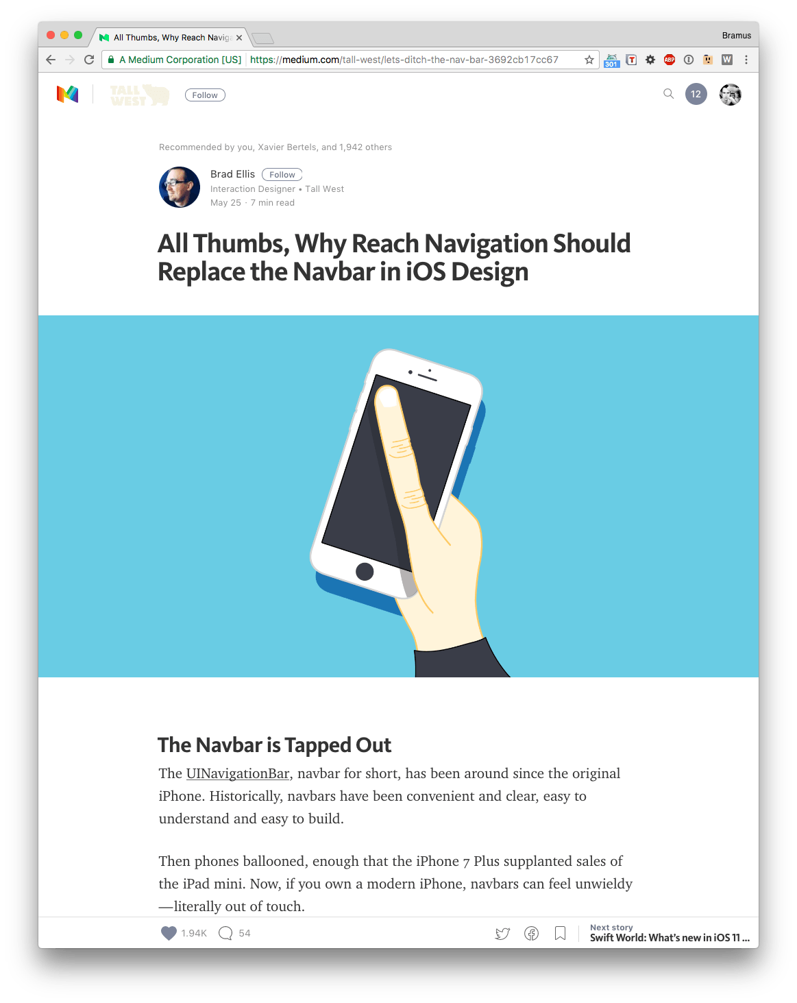
A common thing to see in a design are visuals that break out of the main content column. You most likely have already seen this kind of design over at Medium for example, where it’s common for the main visual to be full width (or “full bleed”), whilst the content remains centered.

Your typical Medium layout:
content caged in a central column + fullwidth visual breaking out of that column
Last week, whilst attending CSS Day I learnt of a technique I hadn’t seen before to solving this problem.
~
The old tried and battle tested way of doing it (or at least the way I used to do it)
Let’s start of with some HTML and a tad of CSS:
<div class="main">

    <div class="content">
      <p>Some text</p>
    </div>

    <div class="content--fullwidth">
      <img src="…" />
    </div>

    <div class="content">
      <p>Some more text</p>
    </div>

</div>
.main {
width: 70%;
margin: 0 auto;
}
img {
width: 100%;
}To make the .content--fullwidth element break out of its parent container .main, I use a technique where I stretch it out so that it takes up the outer 100% again, and then recenter it.
One can achieve just this by giving the .content--fullwidth element:
- A
widthwhich is the inverse of the width of.mainto stretch it out.
Here1 / 70%=142.857142857% - A negative translation on the X-axis equalling half of the remaining width to correctly position it.
Here(100% - 70%) / 2 * -1=-15%
In CSS that’d become this:
.main > .content--fullwidth {
  width: 142.857142857%;
  transform: translateX(-15%);
}
In case you want to verify your numbers: the product of both percentages should again be 100%. 70% * 142.857142857% indeed equals 100% 🙂
Here’s a pen demoing the technique described above:
See the Pen Breaking elements out of containers, technique #1 (inverse width + translate) by Bramus (@bramus) on CodePen.
Ow yeah 🙂
~
The new and shiny way of doing it
When using CSS Grid, you have much nicer option. Last week at CSS Day I saw Rachel Andrew give a nice demo on how to break a set of images outside of the “content column”.
We start off with the same HTML again:
<div class="main">

    <div class="content">
      <p>Some text</p>
    </div>

    <div class="content--fullwidth">
      <img src="…" />
    </div>

    <div class="content">
      <p>Some more text</p>
    </div>

</div>
To limit the width of the contents she uses a CSS Grid Layout containing:
- A fluid column, at least
1eminwidth - A main column,
70%inwidth - A fluid column, at least
1eminwidth
The containing content is then placed inside that 2nd column.
.main {
  display: grid;
  grid-template-columns:
    minmax(1em, 1fr)
    minmax(0, 70%)
    minmax(1em, 1fr)
  ;
}

.main > * {
  grid-column: 2;
}
Breaking the .content--fullwidth element out of its parent container .main now becomes rather easy, as only has to make it span all three columns.
In CSS that’d become this:
.content--fullwidth {
  grid-column: 1 / 4;
}
🤔 Huh? 4? Shouldn’t that be 3?
👉 Nopes. Remember, in CSS Grid you’re targeting lines 😉
Here’s a pen demoing the technique described above:
See the Pen Breaking elements out of containers, technique #2 (CSS Grid) by Bramus (@bramus) on CodePen.
~
If you’re using CSS Grid then Rachel’s technique will come in handy. For projects in which you need to support older browsers, you can still rely on the first one.
💁♂️ New to CSS Grid Layout? Rachel has got you covered with her excellent Grid By Example.
~
🔥 Like what you see? Want to stay in the loop? Here's how:
Leave a comment