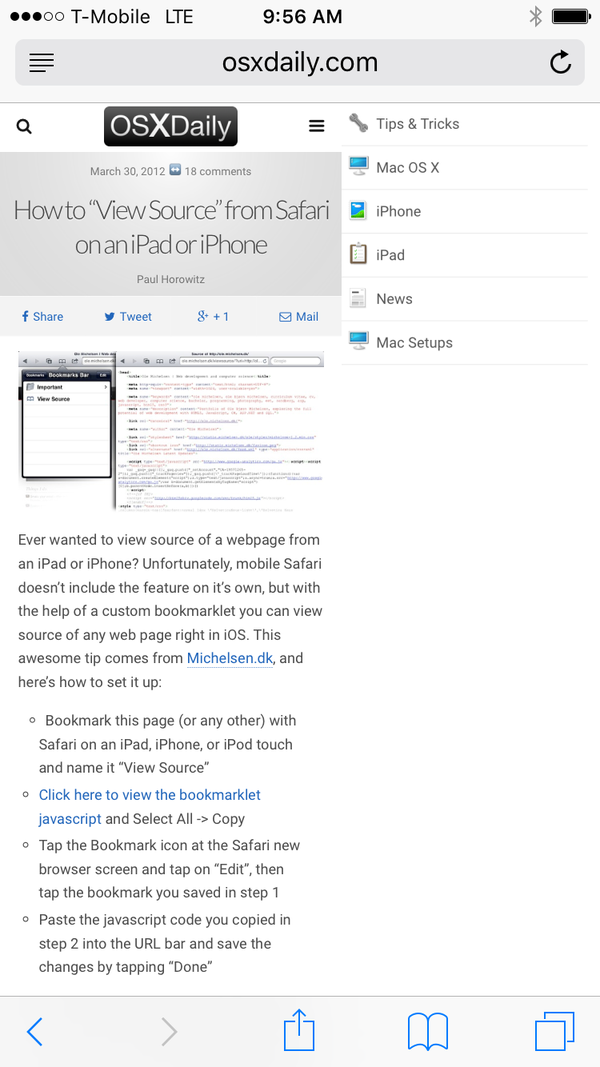
The viewport is set incorrectly when the viewport meta tag is specified with
initial-scale=1orwidth=device-width, and the page contains an element (e.g. div tag) that is wider than the desired viewport’s boundary.
In the screenshot above (courtesy @RWD) you can see that the off-screen menu actually appears on-screen in iOS9. Apple changed how iOS9 responds to width=device-width as it, according to them, got abused too much.
To fix this, append shrink-to-fit=no to your viewport meta tag, as such:
<meta name="viewport" content="width=device-width,initial-scale=1,shrink-to-fit=no">
Thanks for the post! I’ve been looking everywhere for this solution. Adding overflow-x:hidden to the body works as well, but it just seems like such a hacky solution. I wonder if shrink-to-fit=no has any side-effects? So far I haven’t seen any.
Been pulling my hair out on this for a few hours. Thank you for posting this!
Have you come across any issues in other browsers with this additional attribute? From what I can tell it looks to be Safari only.
As far as I know shrink-to-fit was introduced in Safari 9.1 (see https://developer.apple.com/library/ios/releasenotes/General/WhatsNewInSafari/Articles/Safari_9_1.html#//apple_ref/doc/uid/TP40014305-CH10-SW1) and will be ignored by other browsers (e.g. Chrome). So, no side effect.