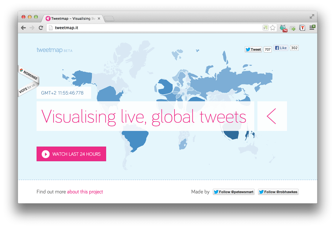
This cartogram is a real-time, live map of the world. Each country contracts and expands to proportionally represent the volume of tweets sent.
Built using d3.js
A rather geeky/technical weblog, est. 2001, by Bramus

This cartogram is a real-time, live map of the world. Each country contracts and expands to proportionally represent the volume of tweets sent.
Built using d3.js