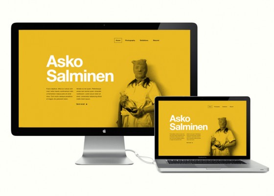
Recently I started testing how proportional scaling of bigger layouts would work in reality and if it makes any sense. It’s possible when using EM units and then changing body’s font-size when viewport’s height grows above certain point. Basically that means, that I have to change only one or two css properties between @media queries which are targeting larger screen sizes.