When using software Fitts’s Law is in effect all the time. Microsoft understands the importance of this but Apple apparently doesn’t, at least not on Windows …
~
Fitts’ what now?
Fitts’s Law is a model of human movement, predicting the time required to rapidly move from a starting position to a final target area, as a function of the distance to the target and the size of the target. Mathematically, it can be formulated as so (thank you Wikipedia):
where
- T is the average time taken to complete the movement.
- a and b are empirical constants, and can be determined by fitting a straight line to measured data.
- D is the distance from the starting point to the center of the target.
- W is the width of the target measured along the axis of motion.
Basically it comes down to this: Fitts’s Law describes a speed-accuracy tradeoff associated with pointing, whereby targets that are smaller require more time to acquire and targets that are further away require more time to acquire.
When applied to computers it’s pretty easy: a tiny button on a very big screen cannot be acquired that easily as you have a large distance to cross and need precision to target it. The other way around it’s very easy to acquire a big button on a small resolution screen (big target, small distance to cross).
~
Fitts’ Law vs. Software: Mile-High Menus and Magic Corners
A real interesting thing when applying Fitts’s Law to computers are Mile-High Menus and Magic Corners. I Read about this (and about Fitts’s Law) back in August last year on the blog of Jensen Harris, Group Program Manager of the Microsoft Office User Experience Team. In one particular post on the Office UI he gives a nice explanation on Fitts’s Law and Mile-High Menus and Magic Corners, so nice it would be a sin no to quote it (highlights added by me):
One of the most useful aspects of applying Fitts’ Law to computers is that screen size is bounded. No matter how far you move your mouse to the left, the cursor will never go farther than the left side of the screen.
In a Fitts’s Law sense, you can think of the edges of the screen as being infinitely wide.
Think about how long it would take you to move your cursor from the right side of the screen to the left edge of the screen. Now compare that to how long it would take you to move your cursor from the right side of the screen to a spot 2 pixels from the left edge.
Obviously, you would be much faster in the first case because you can literally slam your mouse to the left as fast and as hard as you want and you won’t overshoot. It’s infinitely wide.
This is the same reason that the Mac user interface has been said to have “mile-high menus.” The Mac menu bar is permanently affixed to the top of the screen regardless of what program you’re in. As a result, you only have to worry about targeting a menu horizontally. Because the top edge of the screen is essentially “infinitely” tall, you can acquire the menus very quickly.
The Windows taskbar is a mile-high menu the other direction: you can move your mouse to the bottom of the screen quickly and only worry about targeting horizontally. (If you resize your taskbar to be two rows high, of course, all bets are off.)
Wait, it gets even better. There are four places on the screen that are effectively both infinitely wide and infinitely tall. You guessed it: the four corners.
Regardless of how distant a corner is from your current mouse position, you can get to the corner in no time at all. Acquiring the corner requires very little fine motor control at all because the virtual target is so huge. In GUI terms, the corners are so good they’re often called “magic.”
The Start button in Windows is seemingly located in an ideal place for fast acquisition, and in recent versions of Windows that’s certainly true. Prior to Windows 2000, however, the Start button had a single “dead” pixel along the left and bottom sides of it in which clicking didn’t open the Start menu. The result: slower acquisition times and a startling number of missed clicks.
The Start Button in Windows indeed is a very fine example here: although visually not stuck in the bottom-left corner its clickable area extends into it making it very easy to target. With one blind mouse move into said corner you’ll have the button targetted, no matter how far you extend into the corner.
~
Fitts’s vs. any Windows application
 When having maximized any Windows application you’ll have 2 magic corners available in that window: the top left one, and the top right one.
The top right corner — with the X — lets you close the application/window. The cool part about this magic corner is that you don’t need to click the X button to close the window: the button’s clickable area extends into the far outer corner even though it visually doesn’t.
Same goes for the left corner which lets you reach the “previous format”/”minimize”/”close menu”. You can also doubleclick that corner to close the window. Really handy.
Now that I’m giving out tips: doubleclicking the titlebar (which is a mile-high / magic combo) a window can be restored to the non-maximized version if maximized, and the other way around of course too.
~
Fitts’ vs. iTunes 6 on Windows
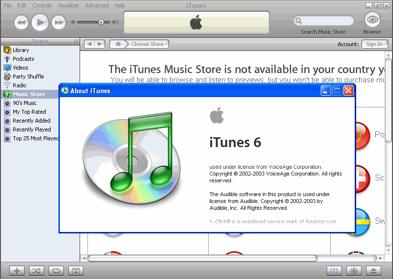
In iTunes on Windows, after maximizing the window you’ll notice that the menu isn’t a mile-high menu at all: you need to steer away about 3px from the top edge to click them. According to Fitts’s Law — and in practice — this makes them very hard to target.
Same goes for the top-left and top-right corners which should be magic corners on Windows (see section above). In iTunes however, when clicking it nothing happens as the click area for the close button only encloses the visual area it occupies — it does not extend into the magic corner.
Pitty, but it could be worse … (see next section)
~
Fitts’ vs. Safari 3 on Windows
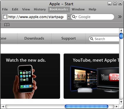
As a user being used to the magic corner behavior, combined with being a genuine Unitasker (1 window at a time, maximized) I noticed some really odd issues when automatically double clicking the top left magic corner to close Safari. Instead of Safari getting closed, the window underneath closed. * oink? *
A little investigation led me to locating the problem and writing this post: the upper left corner and upper right corner in Safari on Windows are … non-existent!
Just try it yourself:
- Launch Windows Explorer (for example) and maximize it
- Launch Safari and maximize it too
- Double click the top left magic corner of Safari
- Windows Explorer will be closed instead of Safari
- Repeat all steps and try the same for the top right magic corner: Windows Explorer will be closed again.
Because the Safari window has rounded corners, any window that sits underneath it will peek through. When double clicking any of the top-left/top-right magic corners you’re actually clicking the window that lies underneath it because of the rounder corners of the Safari Window.
~
Pinging Apple!
Dear Apple, as the behavior described above is complete odd for any Windows user out there, please fix this as it has – and I’m using some nice words here – been tickling me ever since I installed Safari. Maybe that’s something to put in Safari 3.0.3 beta? And oh, thanks for fixing those em and strong rendering issues on non-English XPs in the 3.0.2 build, now I can use Safari (in a non-user-friendly way though, but I have the feeling you guys are going to fix this any time soon).
B!


Apple has many interface problems. E.g. the single mouse button in combination of the apple key (instead of right-click). Did they ever think about people with disabilities?
On Mac, you don’t survive without the apple key. This problem can also be found in many of the Adobe applications. Compare Illustrator to Coreldraw. In Coreldraw you can copy, duplicate, scale, mirror,… your objects with smart mouse behaviours. In Adobe this can’t be done without touching your keyboard.
I also don’t understand what’s so fun about launching programs not full screen and having layers of windows overlapping each other. Interfaces of underlaying applications appear through windows of overlaying applications. How confusing is that?
But it seems to work. And user seems to get used to it.
yes i agree this is an annoying problem i have noticed myself inedvertantly. Very interesting article. i will use some of these ideas in creating aps in the future…
Hi,
The article applies Fitts’ law very nicely.
I have noticed that Apple does not take in to account some of the obvious improvements. For example the Close,Minimize buttons are so small that it is hard to close the window.
The menu bar at the top of the display in Apple Mac may not be as useful as it looks from the perspective of InfoViz. Mac disassociates the menu from applications, which is inherently an integral part of the application, introducing visual and motor discontinuity. Disassociating Menu from application also introduces unnecessary distance.
Looking at the arrangements of menu in WinX, I see that placing Menu bar on top of the title bar will increase performance.
~rAGU
UofS
Hello. Just a quick observation. I haven’t been using Windows for ages now, but as far as I remember, the Windows applications menus are not high-mile menus at all, as they have got the window title bar on top of them, haven’t they? So, you actually need to point the mouse to some pixels below the top edge of the screen, which is significantly slower than point the mouse to the edge (for the Fitts’ law, of course).