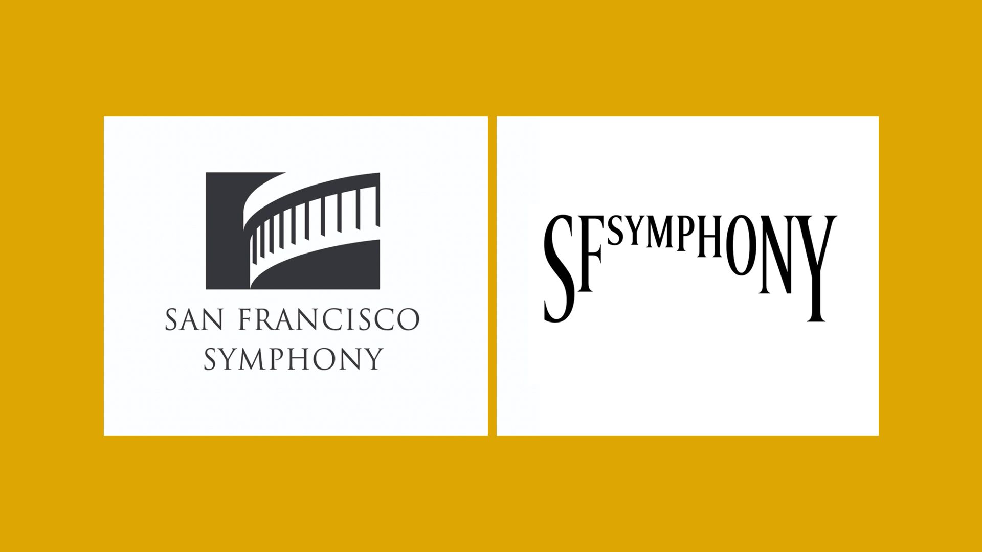
At first sight the new visual identity for the San Francisco Symphony (pictured below, on the right) looks a bit off …
Those letters sure look a bit oddly sized, no? Turns out there’s a dynamic drive behind them:
Leveraging new creative technology including variable font design, our new visual language (of which the logo is just the beginning) will use typography itself to bring the essence of sound and music to life.
Bringing typography to life through sound? The SYMPHOSIZER website let’s you do exactly that.
Let the site have access to your microphone and start making some noise!
Lifting up the hood using view-source: they use p5 to capture the audio and after some processing pass the resulting numbers to font-size, font-variation-settings, and transform: skew().
splitChars[wornum].chars[i].style.fontSize = fontSize + 'px';
splitChars[wornum].chars[i].style.fontVariationSettings = "'vrsb'" + isTop + ", 'hght'" + smoothH[i] + ", 'ital'" + smoothI + '';
splitChars[wornum].chars[i].style.transform = 'skew(' + smoothSkew + 'rad)';
SYMPHOSIZER →
San Francisco Symphony – Visual Identity →
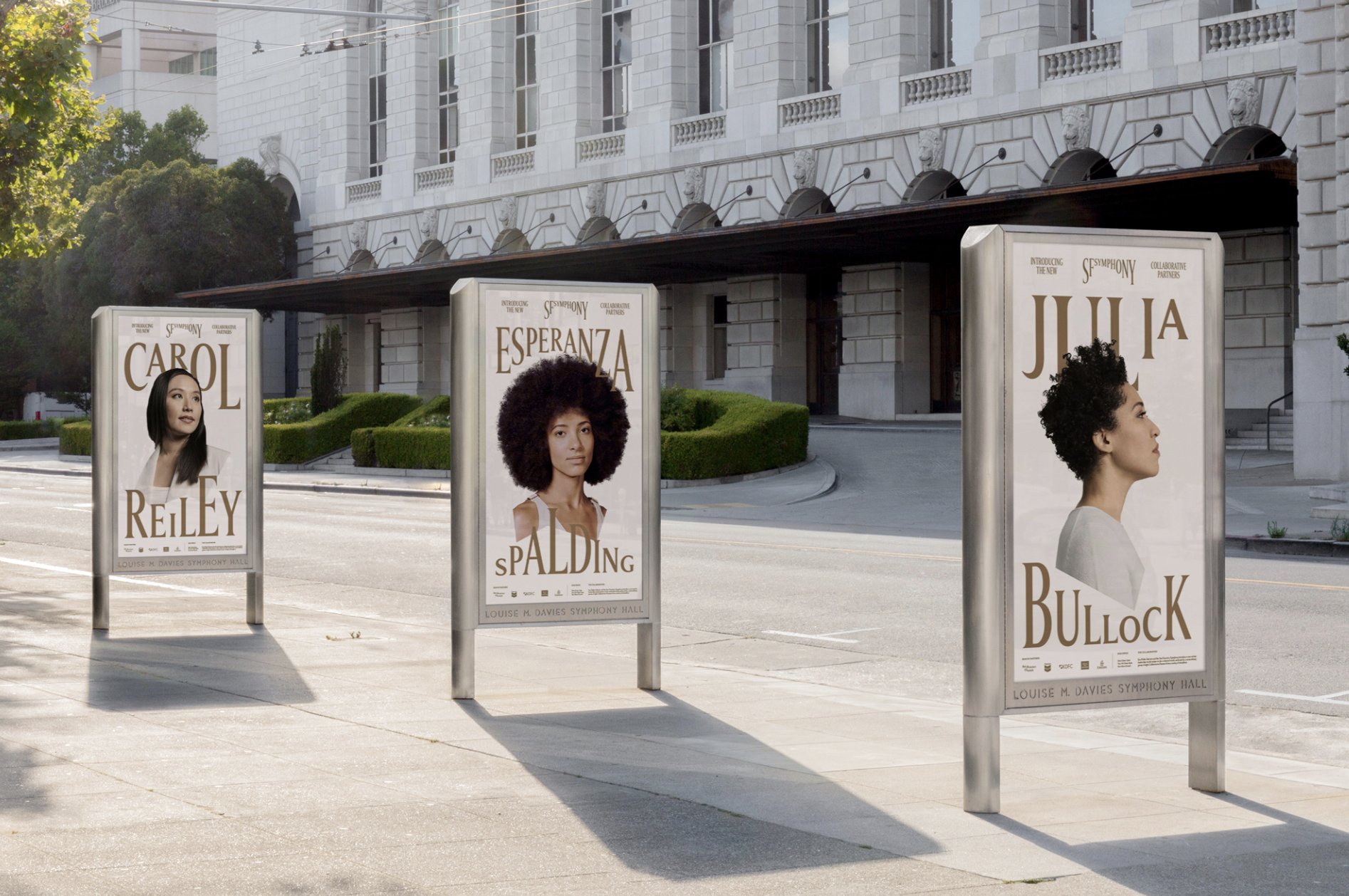
The possibilities of this new identity are endless. Take these posters for example, which look really great: