The work on CSS Toggles has been abandoned. The contents of this article are no longer relevant.

Late last week, I was very delighted to see that Chromium will start prototyping with CSS Toggles, a proposal currently only available as an Unofficial Draft, authored by Tab Atkins and Miriam Suzanne (who else?!).
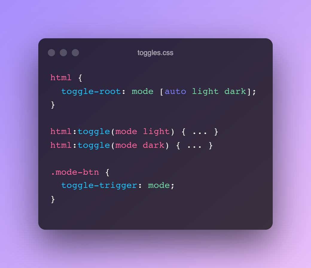
CSS toggles are a mechanism for associating toggleable state with a DOM element. This state can be defined and connected to activations through CSS properties, and can be queried in CSS selectors. This provides a declarative mechanism for specifying state that describes behaviors like the existing HTML behaviors for checkboxes or radio buttons.
The goal of this prototype phase is to experiment with the idea, verify if things would work out or not, polish the syntax, etc. — so yes, all this is still conceptual, highly experimental, and subject to change at the time of writing. Even though still a very early WIP, it’s already pretty well defined.
~
The basic use-case would be something that resembles a light switch, which can go from 0 (inactive) to 1 (active)
html {
  toggle-root: lightswitch; /* Create a toggle named lightswitch. It will cycle between 0 (inactive, default) and 1 (active) */
}

button {
  toggle-trigger: lightswitch; /* When clicking the button, toggle the lightswitch */
}

html:toggle(lightswitch) {
  /* Styles to apply when the lightswitch toggle is active */
}
Here’s a demo of this behavior, which uses a JS-polyfill:
See the Pen
CSS Toggles Example by Bramus (@bramus)
on CodePen.
🤔 Polyfill?
A polyfill is a piece of code (or plugin) that provides the technology that you, the developer, expect the browser to provide natively — What is a Polyfill?
~
But there’s a lot more to the spec than just this basic use case:
- A Toggle Root can host more than one toggle
- A toggle can have more than 1 active state, so it’s not only 0 and 1
- The states don’t need to be numbers, but can also be a set of words
- The initial toggle state is 0 by default, but you can override that
- An element can be both the
toggle-rootand thetoggle-trigger. In that case, use thetoggleproperty - The scope of a toggle value can be narrowed down to descendant elements only (instead of being visible to siblings and their descendants)
toggle-visibilityallows you to show/hide an element based on a toggle value. Think of details/summary and scenarios where you would rely on the checkbox checkbox hack. Benefit to usingtoggle-visibilityis that the contents of the element are always available to the UA for in-page-find and the like (cfr.content-visibility)- Toggles can be grouped using
toggle-group. Handy for tab interfaces, where only 1 tab can be active at the same time. - Sticky toggles can not become inactive, there will always be one item active
- State machines with transitions are being talked about
It’s pretty powerful stuff, which will take some time to wrap your head around. For me, it clicked once I saw Miriam’s demo site in action, which uses a polyfill to make things work.
Very curious to see where this headed …
~
CSS Toggles Explainer →
CSS Toggles Demo Page (with Polyfill) →
CSS Toggles (Unofficial Draft) →
Draft Spec Issues (GitHub) →
CSS Toggles Polyfill (GitHub) →
CSS WG Issue #6991: CSS Toggles →
~
🔥 Like what you see? Want to stay in the loop? Here's how:
Great stuff I’m already thinking in a lot of uses
Looks great! Will this make it easier to setup animations for mobile navigation drawers ? Like animate it coming out but also returning?
I’ve found it hard to revert an animation in css without making another animation.
This is fine