One topic that’s been sitting in my “to write about” queue for quite some time now is CSS for Dual-screen devices. Looks like I can scrap that one, as Stephanie Stimac wrote the post, which got published on Smashing Magazine
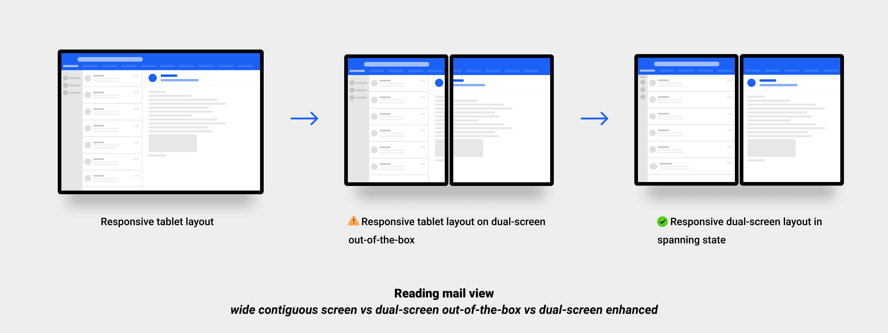
Foldable devices are available to purchase, and are currently being used by consumers today, and with it comes an opportunity where we, as developers, can start to explore this new class of device and the next evolution in responsive design.
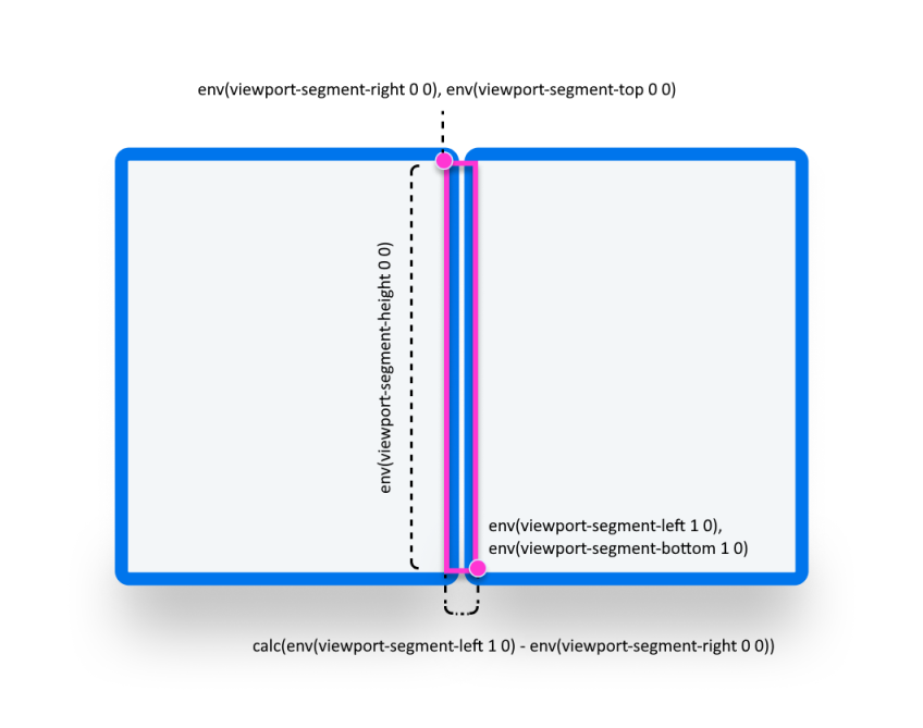
A typical use-case would be a layout such as a mail client or a navigation app, where you’d make sure the columns nicely fit on each side of the fold:
In Chromium, the DevTools allow you choose the Surface Duo as a device. With the “Toggle Dual-Screen” button at the top, you can enable/disable the dual screen.
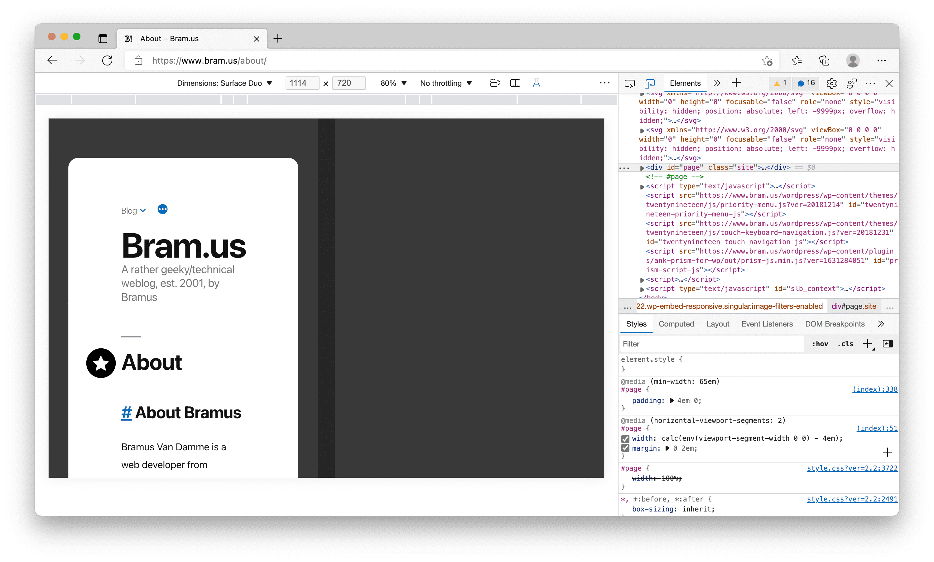
Only got the emulation to work in Microsoft Edge 99, not in Google Chrome 99, though. Looks like it’s a bug that’s already been fixed, as in Chrome Canary 101 it works fine again.