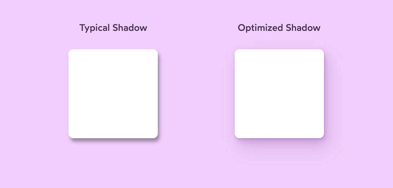
Adding shadows on the web isn’t that hard: slap a CSS box-shadow onto an element and you’re done. But as Josh W. Comeau points out, making a good, life-like, shadow is hard.
When I look around the web, though, it’s clear that most shadows aren’t as rich as they could be. The web is covered in fuzzy grey boxes that don’t really look much like shadows.
In this tutorial, we’ll learn how to transform typical box-shadows into beautiful, life-like ones.
Josh wouldn’t be Josh if there weren’t a ton of interactive widgets contained in the post.