One of the problems on mobile devices is that the keyboard can hide some of your content. The VirtualKeyboard API aims to solve this.
~
The Problem
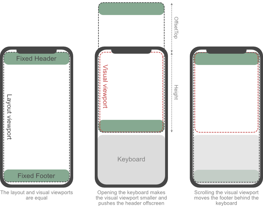
The current behavior on mobile devices in Safari on iOS is that as the keyboard gets shown, the Layout Viewport remains the same size but the Visual Viewport shrinks. Because layout items with position: fixed; bottom: 0; get anchored to the Layout Viewport, these items can become hidden underneath the Virtual Keyboard (or bleed out from the top in case they use top: 0;). To counter this, Safari offsets the Layout Viewport so that the focussed content remains in view.

Layout Viewport and Visual Viewport Behavior when the Virtual Keyboard gets shown (src).
Once once you start scrolling the page upwards again, the whole Layout Viewport will move position, and thus the item-at-the-bottom will be hidden underneath the keyboard again.
On Chrome on Android, the Layout Viewport will shrink when the keyboard gets shown, matching the height of the Visual Viewport. Chrome, as of version 108, mimics what iOS does.
~
A Theoretical Solution
To deal with this non-resizing you could use the Visual Viewport API and manually offset items once the Virtual Keyboard gets shown.
let pendingUpdate = false;

function viewportHandler(event) {
	if (pendingUpdate) return;
	pendingUpdate = true;

	requestAnimationFrame(() => {
		pendingUpdate = false;

		// Stick to top
		document.querySelector('[data-stickto="top"]').style.transform = `translateY(${ Math.max(0, window.visualViewport.offsetTop)}px)`;

		// Stick to bottom
		if (window.visualViewport.offsetTop >= 0) {
			document.querySelector('[data-stickto="bottom"]').style.transform = `translateY(-${Math.max(0, window.innerHeight - window.visualViewport.height - window.visualViewport.offsetTop)}px)`;
		}
	});
}

window.visualViewport.addEventListener("scroll", viewportHandler);
window.visualViewport.addEventListener("resize", viewportHandler);
Having played with it, I found this approach to be impractical and lacking:
- Extra Math needed to deal with overscrolling
- iOS: Only updates after scroll has finished
- Android (Emulator): Scrolling becomes glitchy
☝️ Feel free to point out if I got my demo wrong there. Test it on your mobile device using this URL: https://codepen.io/bramus/debug/ExXxOLQ
~
A Proper Solution
As mentioned in The Large, Small, and Dynamic Viewports there’s a new kid in town that can help us out here: the VirtualKeyboard API.
With the API you can programmatically — e.g. via JavaScript — trigger the Virtual Keyboard and get its dimensions, but what I find more interesting is that it also provides some CSS environment variables:
keyboard-inset-topkeyboard-inset-rightkeyboard-inset-bottomkeyboard-inset-leftkeyboard-inset-widthkeyboard-inset-height
The keyboard insets are six environment variables that define a rectangle by its top, right, bottom, and left insets from the edge of the viewport. Default value of the keyboard insets are “0px”
By default all these variables have a value of 0px. When the keyboard gets shown the value for keyboard-inset-height will change to reflect the height of the Virtual Keyboard. You can then use this as the bottom-margin on an element that’s anchored to the bottom of the Viewport:
.bottom-box {
  position: fixed;
  bottom: 0;
  margin-bottom: calc(20px + env(keyboard-inset-height));
}
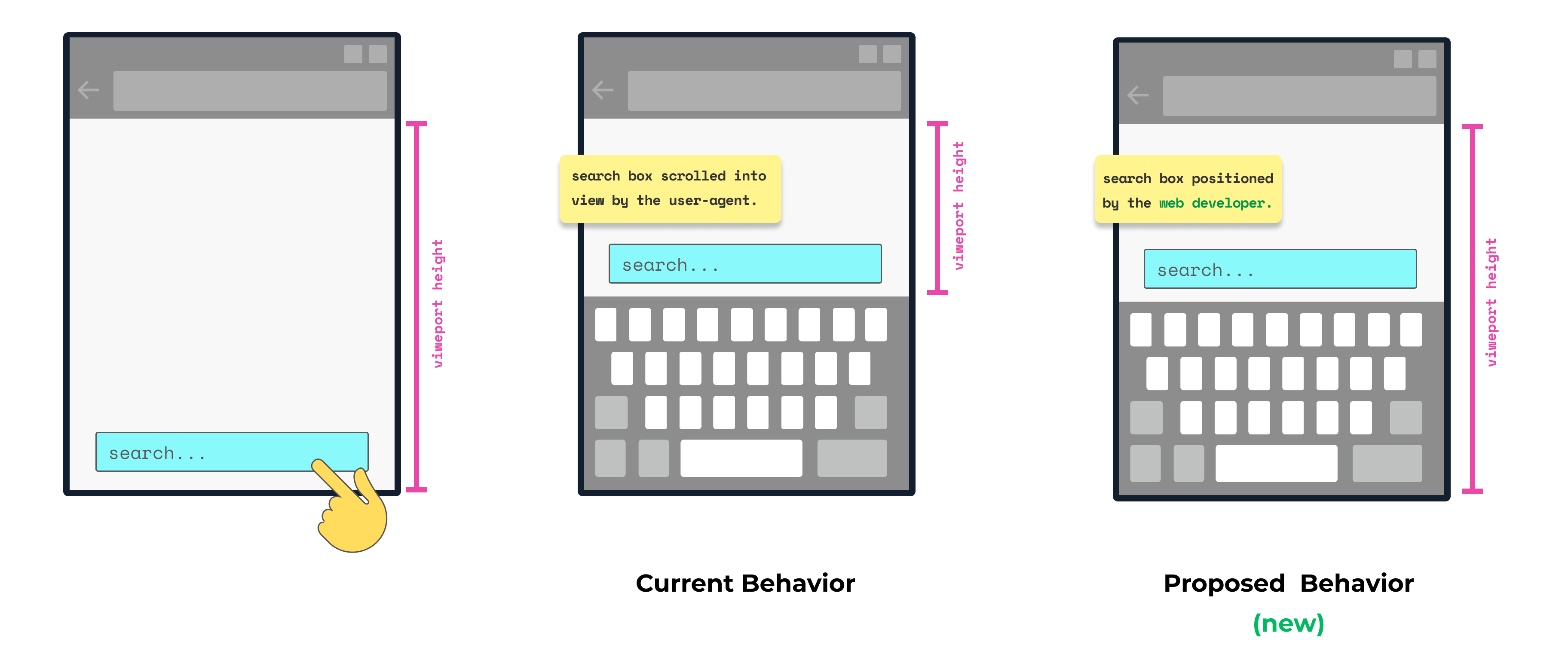
In the new behavior the both the Visual Viewport and Layout Viewport will not shrink as the Virtual Keyboard gets shown. As a developer you now have to manually take the keyboard dimensions into account to position items.
🤔 The word “Viewport” in that image indeed is confusing there, as it’s not specified which Viewport it is about. To make things clear: they’re talking about both the Layout Viewport (which iOS does not resize by default) and the Visual Viewport. I’ve filed an issue to clarify on this.
In a layout that uses CSS Grid, you can easily take this value into account to create a bottom-zone where nothing may be placed:
body {
    display: grid;
    height: 100vh;
    grid-template:
      "messages"  1fr
      "input"     auto
      "keyboard"  env(keyboard-inset-height, 0px);
}
The Grid Area named keyboard with either be 0px high or take up the size of the Virtual Keyboard, thus pushing the input Grid Area upwards as the keyboard gets shown.
~
The catch
To enable this new behavior, you need this little JS snippet:
if ("virtualKeyboard" in navigator) {
  navigator.virtualKeyboard.overlaysContent = true;
}
Personally I find this JS-requirement a shortcoming of this API. An extension to the meta name="viewport" (or perhaps a new CSS at-rule or property on <html>?) to control the behavior seems like something handier.
Something like this:
<!-- Proposal -->
<meta name="viewport" content="width=device-width, initial-scale=1.0, virtual-keyboard=overlays-content">
Or this:
/* Proposal */
html {
  virtual-keyboard: overlays-content;
}
(Names to be bikeshed but you get the point)
💭 I’ve filed an issue in the spec repo regarding this.
# UPDATE 2023.07: As of October 2022 there is a interactive-widget property in the viewport meta tag that allows you to change the resize behavior.
Accepted values are:
resizes-visual: Resize only the Visual Viewport but not the Layout Viewport.resizes-content: Resize both the Visual Viewport and Layout Viewport.overlays-content: Do not resize any viewport.
See my blogpost on developer.chrome.com for all the details on it. Example usage:
<meta name="viewport" content="width=device-width, initial-scale=1.0, interactive-widget=resizes-content">This new interactive-widget property is only supported in Google Chrome 108 or newer. Note that this excludes Chrome on iOS, as that’s essentially WebKit under the hood.
~
Browser Support
The VirtualKeyboard API is shipping with Chromium 94. Other browser vendors have not signalled any interest in it yet. Relevant Issues:
- Gecko/Firefox: Issue #1730568
- WebKit/Safari: Issue #230225
~
More Info
There’s a good post up on web.dev that goes into more detail on the JavaScript interface I quickly mentioned. Be sure to give a read if you want to use the VirtualKeyboard API with your JavaScript-based apps. It also taps into the virtualkeyboardpolicy attribute you can use along with that.
~
🔥 Like what you see? Want to stay in the loop? Here's how:
I think it was a bad idea to not resize the layout viewport when the keyboard pops up.
Thank you! This was very helpful.
Thanks for the post. I tried opening the sample codepen on my Iphone and it does not work as expected. Maybe something changed
That’s because WebKit/Safari does not support the VirtualKeyboard API. See the “Browser Support” section in this post.
Thanks for the response! Is there any workaround for this. I currently need to handle this for a usecase.
You could throw a bunch of JavaScript at it to measure the screen’s dimensions on load/rotate and then use those fixed pixel values throughout your site. But that code most likely will be quite nasty, complicated (zoom factor!), and brittle.
Thanks
I’m using so that the layout viewport resizes to be the same as the visual viewport so that all content is visible and so the layout viewport doesn’t scroll vertically. This works wonderfully in Chrome on Android, but not on Safari because it is not supported.
I’ve search and read high and low and so far can’t find a solution to get this behaviour on Safari. Any suggestions? This is for my app Clibu.app – see clibu.com for more info.
Text go lost: I’m using meta name=”viewport” content=”interactive-widget=resizes-content, …
Thank you! I spent a few days looking for a solution to this problem, your article helped me a lot!