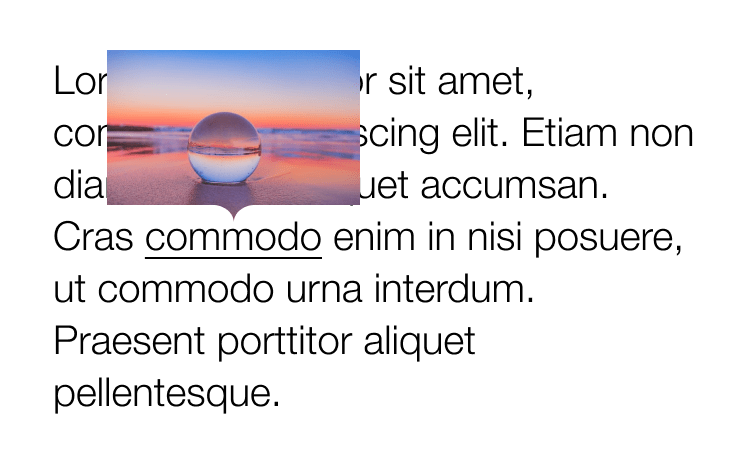
In this post Louis Hoebregts creates nice tooltips. No, not a typical triangle injected at the bottom but a nice curved one, also letting the image underneath peek through.
For it he uses mask-image consisting of two parts: one rectangle overlaying the top part of the image + one SVG arrow overlaying the bottom part.
.tooltip {
  mask-image:
    linear-gradient(#fff, #fff), /* Rectangle */
    url('data:image/svg+xml;utf8,'); /* Bottom  arrow */
  mask-position:
    0 0, /* Rectangle */
    50% 100%; /* Bottom arrow */
  mask-size:
    100% calc(100% - 18px), /* Rectangle */
    38px 18px; /* Bottom arrow */
  mask-repeat: no-repeat;
}
See the Pen
Idea #3 – Responsive complex clipping in CSS by Louis Hoebregts (@Mamboleoo)
on CodePen.
Cranking it up a notch he even creates some nice looking message bubbles.