Layouts with diagonal sections are quite popular for several years now. It is not the new hot stuff, and you will probably not find it in the articles titled “Design trends for 2020”. But I think it is here to stay. It is one tool designers can use to bring some dynamic to all the rectangular boxes with boring 90-degree angles.
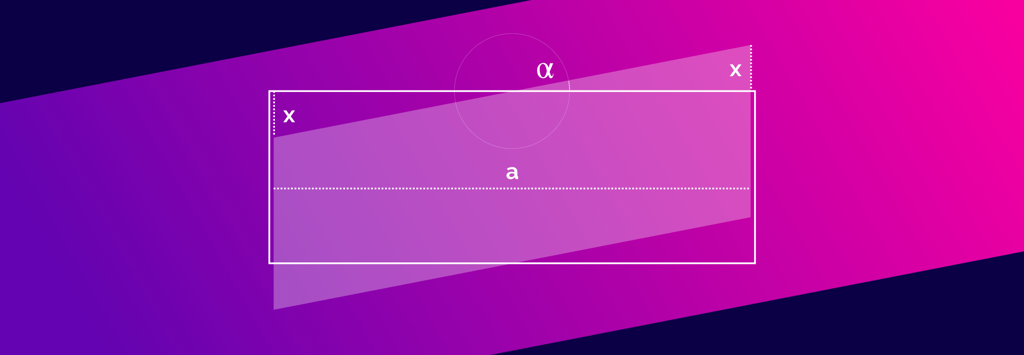
Using CSS Transforms Nils Binder implements his layout. I especially like the part where CSS Variables CSS Custom Properties are used to dynamically calculate the required padding so that the content doesn’t get clipped.
:root {
	--magic-number: 0.09719; /* tan(11°)/2 */
	--content-width: 100vw;
	--skew-padding: calc(var(--content-width) * var(--magic-number));
}

@media screen and (min-width: 42em) {
	:root {
		--content-width: 42em;
	}
}
Also: Math.