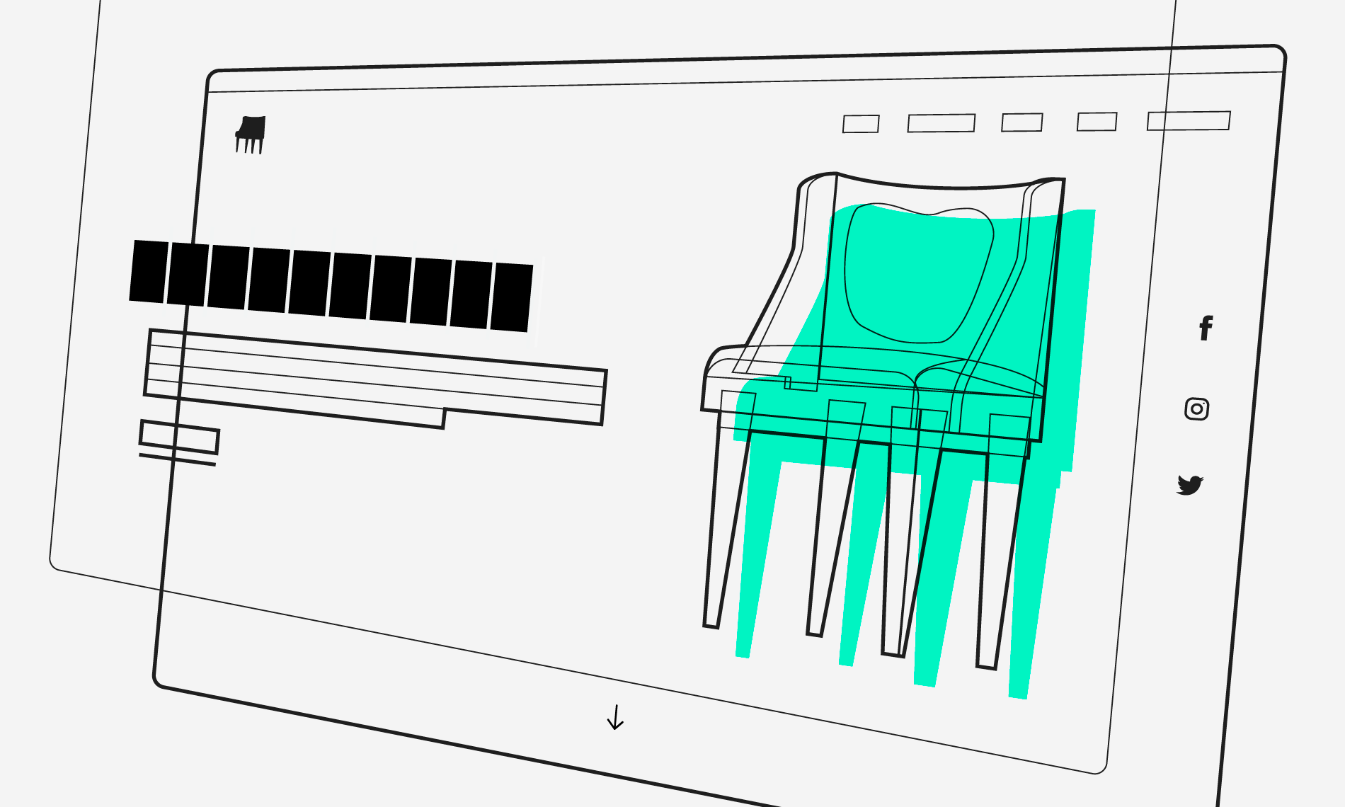
Visual hierarchy is the order in which the user process information by importance. In interface design, like in any other form of design, this concept is necessary to be functional at sight. With the correct use of hierarchy, the mind can group and prioritize elements to give them a specific order, which facilitates the understanding of what you want to communicate and the sense of achievement by the user.
Talks about seven resources to take into account to create a correct hierarchy:
- Size: The larger the element, the more it will attract attention.
- Color: Bright colors stand out more than muted tones.
- Proximity: Elements close to each other attract more attention than distant elements.
- Alignment: Any element that separates from the alignment of the others will attract attention.
- Repetition: Repeated styles give the impression that the elements are related.
- Negative Space: The more space around the element, the more attention it generates.
- Texture: Varied and complex textures attract more attention than flat ones.
Fundamentals of Hierarchy in Interface Design →
💵 This article is stuck behind Medium’s metered paywall … open the link in an incognito window to bypass that limit.