If you try to capture the subtleties of a real shadow with
box-shadowthen, well, you’re pretty much out of luck. Thebox-shadowCSS property isn’t exactly built to encourage expressiveness.But with a simple CSS technique, we can expand our range of options. If we use layered box-shadows we can get more fine-grained control over how shadows are rendered
For example:
/* Default box-shadow */
.box {
  box-shadow: 0 3px 3px rgba(0,0,0,0.2);
}

/* Create smoother box-shadows by layering multiple
 * shadows with gradually increasing radius and offset */
.shadow-5 {
  box-shadow: 0 1px 1px rgba(0,0,0,0.12),
              0 2px 2px rgba(0,0,0,0.12),
              0 4px 4px rgba(0,0,0,0.12),
              0 8px 8px rgba(0,0,0,0.12),
              0 16px 16px rgba(0,0,0,0.12);
}
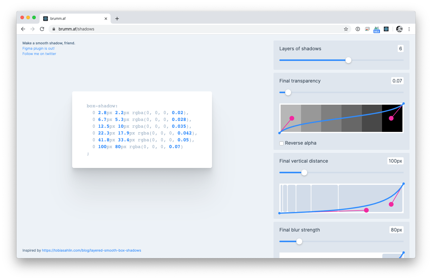
Inspired by this post, Philipp Brumm built a generator to generate such shadows:

Smoother & sharper shadows with layered box-shadows →
Shadow Generator →