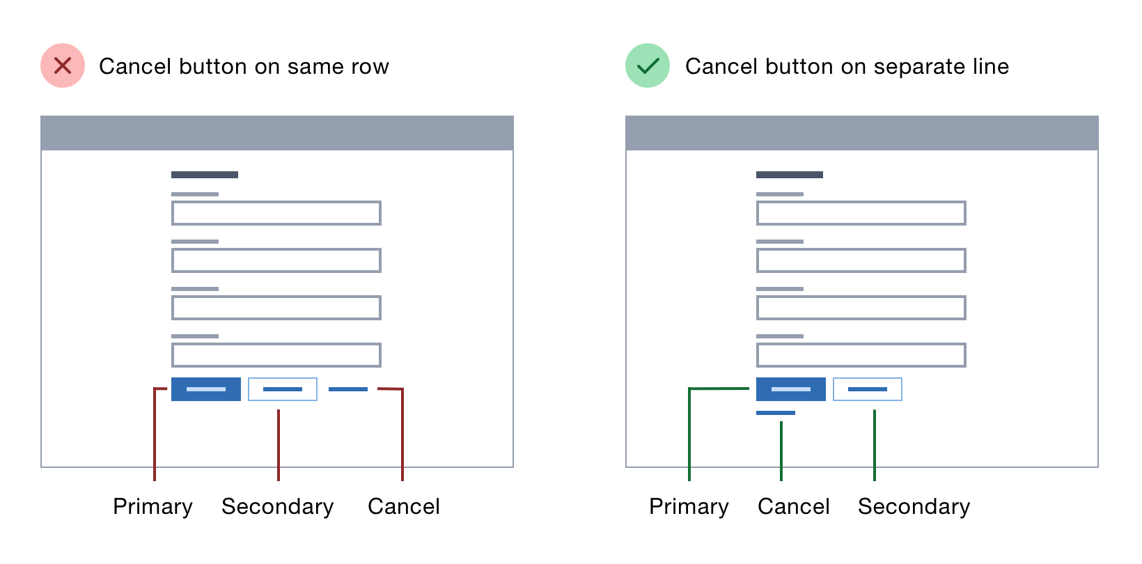
Button placement on forms is often ignored or prioritised based on what looks good.
But button placement can make or break a form, and a form can make or break a user’s experience. That’s why it’s essential to get it right.
Here I’ll explain where to put buttons across a range of different forms based on research and best practice.
Where to put buttons on forms →
🤔 I found this one highly interesting to read as I tend to do the exact opposite when it comes to placing buttons. Inspired by macOS I place the primary button on the right, the secondary button to the left of the primary one, and the cancel option at the very left.
I’m wondering what Johan (Interface Designer) and Roel (Digital Accessibility Nerd) their take is on this …
UPDATE 2019.09.18: Thanks to (requested) input by Johan/Roel/Xavier we can safely conclude that the mentioned guidelines are not perfect.
As Johan mentions in the comments below:
I agree with your take mentioned in this blog post.
When there is only a single submit at the bottom of a typical form I do agree with aligning it left (in the linked post).
Roel also chimes in on placing the primary button on the right as all OS conventions do so. He however does wonder:
But, then again: web forms are not dialog windows…
As Xavier mentions on Twitter:
It doesn’t matter how your primary button is aligned. What matters is where all of the other buttons are relative to your primary action & inputs.
I think the main gist is that:
- As the OS places primary actions on the right (in a left-to-right language that is), it’s a good idea to do so to as users are used to that.
- If you do diverge from it, be consistent (cfr. Design Principle #9)
Thanks for the input y’all!
I agree with your take mentioned in this blog post.
When there is only a single submit at the bottom of a typical form I do agree with aligning it left (in the linked post).
But reading through I think there’s some bad advice in there, like putting the reset password at the top of the form. He also gives an example of a multi add pattern where his button placement logic is weird to me.
I would not recommend this post to a UI design beginner 😉