Design Systems and CSS Grid

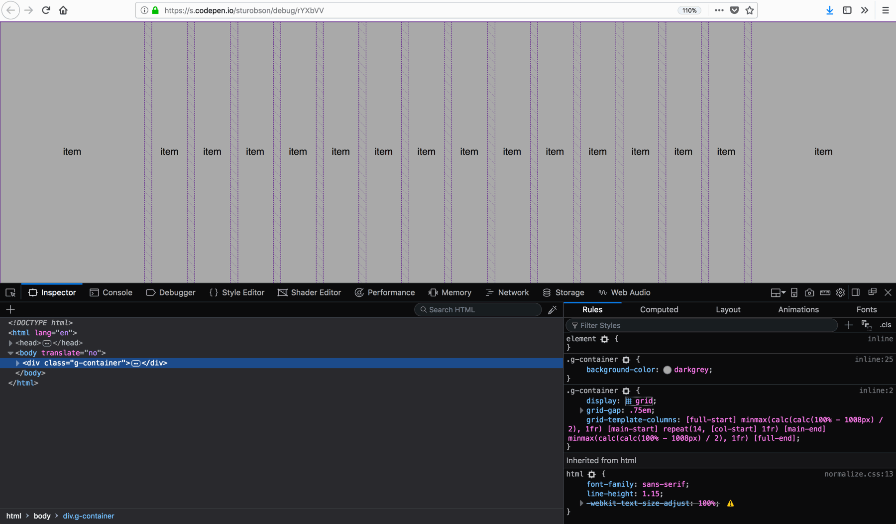
Stuart Robson uses CSS Grid for what it’s meant to be used for: creating a grid. He evens creates a faux subgrid by leveraging calc() to define the two margin-columns.

.container {
    grid-template-columns:
    [full-start]
      minmax(calc(calc(100% - 1008px) / 2), 1fr)
        [main-start]
          repeat(14, [col-start] 1fr)
        [main-end]
      minmax(calc(calc(100% - 1008px) / 2), 1fr)
    [full-end];
}

Add in some media queries to cater for other screen dimensions and you have an elegant grid system 🙂

Design Systems and CSS Grid →

Published by Bramus!

Bramus is a frontend web developer from Belgium, working as a Chrome Developer Relations Engineer at Google. From the moment he discovered view-source at the age of 14 (way back in 1997), he fell in love with the web and has been tinkering with it ever since (more …)

Leave a comment

Your email address will not be published. Required fields are marked *

This site uses Akismet to reduce spam. Learn how your comment data is processed.