In CSS, percentage-based paddings are – as per spec – calculated with respect to the width of an element. However, for flex items (e.g. items whose parent have display: flex; applied) that’s not always the case.
Depending on which browser you are using the percentage-based padding of a flex item will be resolved against its height instead of its width … and the spec is totally fine with that.
Until browser vendors agree on one behavior, be advised to not use vertical margins/paddings on flex items … and know that the CSS Aspect Ratio Hack won’t work on them.
UPDATE 2018-01-24: Microsoft has announced that they are going to implement the Blink/Webkit behavior for compat reasons and ship it in the next version of Edge.
As a result Firefox – the only browser left with the “odd” behavior, once the change in Edge ships – also decided to follow the same path. Work to implement this has already started.
Soon, this quirk will be resolved and all (modern) browsers will have the same behavior.
UPDATE 2018-01-31: The relating Firefox bug has been closed and got marked as resolved. The changes are planned to ship with the release of Firefox 60. 🎉
As detailed in “Aspect Ratios in CSS are a Hack” we can use percentage-based padding to force a box to have a fixed aspect ratio.
However, In a recent project I was working on I noticed that my aspect ratio boxes weren’t working as expected in Firefox. Where other browsers would nicely render boxes with their set aspect ratio, Firefox would do render the box with a fixed height, independent of the box’s defined width.
Digging deeper into the problem – in order to flesh out what exactly triggers this rendering quirk – I knocked up a testcase in which it became clear to me that the CSS Aspect Ratio Hack didn’t seem to work on flex items (e.g. elements that are contained inside a parent element that has display: flex; applied) — Uh oh!
See the Pen Aspect-Ratio box inside flexboxed wrapper? by Bramus (@bramus) on CodePen.
~
Interpreting the results
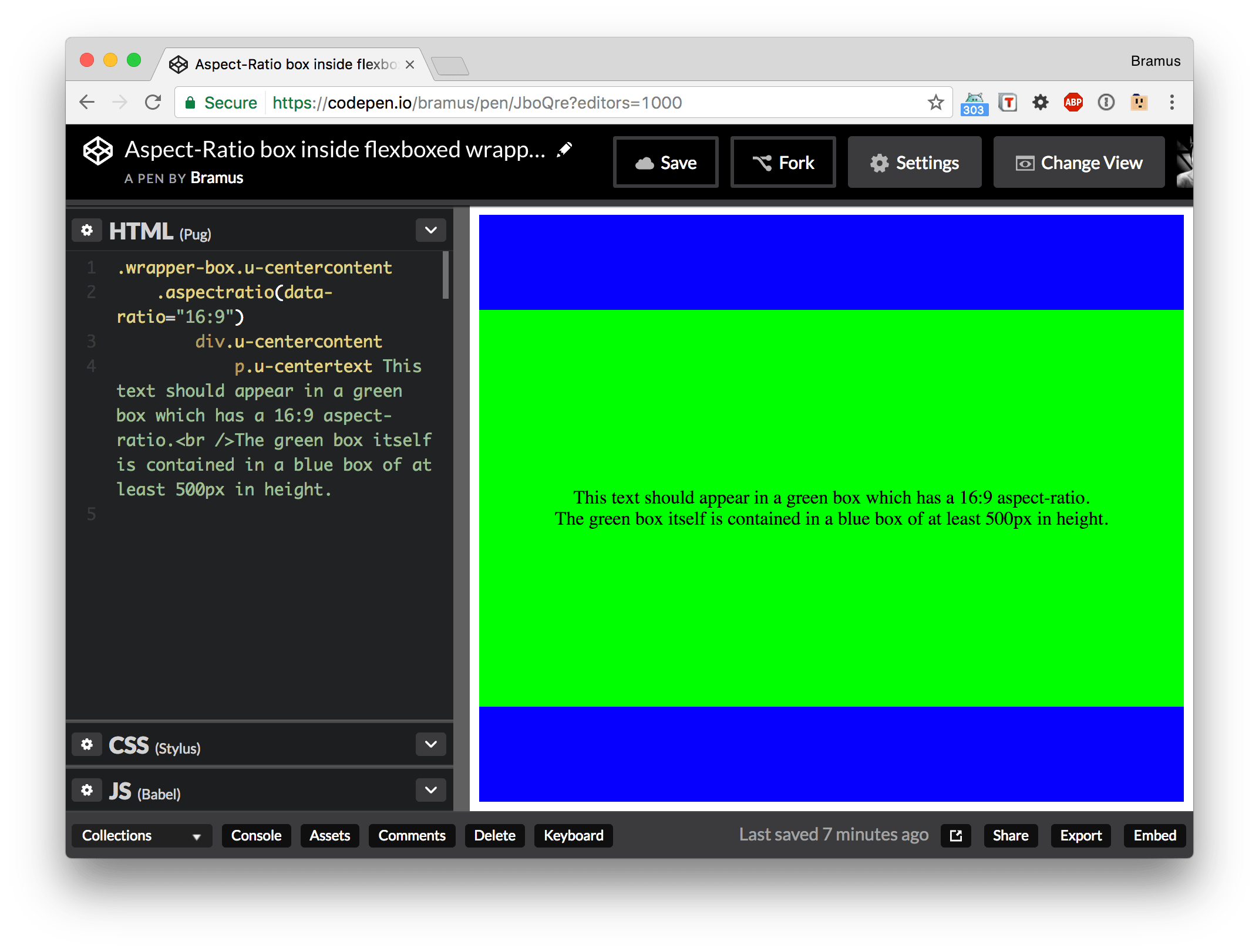
The result in Chrome, yay 16:9
The result in Firefox, not 16:9
In Chrome/Edge/Safari the green box acts as expected, and has a 16:9 aspect ratio thanks to a 56.25% vertical padding. Firefox however renders the box with a height of 281.25px, independent of its width. Running some numbers this 281.25px turns out to be exactly 56.25% of 500px, which is the height of its parent.
This must be a bug, right?
~
Filing a bug
So I set out to file a bug report for Firefox. To my surprise the issue got closed, concluding that Firefox renders things correctly … as do all the other browsers.
Huh? How can two different results both be correct? Turns out there’s some wiggle room in the spec:
Percentage margins and paddings on flex items can be resolved against either:
- their own axis (left/right percentages resolve against
width, top/bottom resolve againstheight)- the inline axis (left/right/top/bottom percentages all resolve against
width)A User Agent must choose one of these two behaviors.
— CSS Flexible Box Layout Module Level 1: 4.2. Flex Item Margins and Paddings.
Now letting browsers choose which behavior they want to implement of course isn’t ideal, and that’s also what spec writer Tab Atkins has added as a note:
Note: This behavior sucks, but it accurately captures the current state of the world. It is the CSSWG’s intention that browsers will converge on one of the behaviors, at which time the spec will be amended to require that.
~
Down the Rabbit Hole: How come Firefox behaves differently?
The “culprit” for this quirk is that an older version of the spec read this on margin/padding behavior for flex items:
Percentage margins and paddings on flex items are always resolved against their own axis: left and right margins resolve against the containing block’s width, and top and bottom margins resolve against the containing block’s height. Unlike blocks, block-axis margins do not resolve against the inline dimension of their containing block.
One might wonder why this initially specced behavior behaves different from what we are used to. As Tab Atkins put it:
The logic is that the behavior of percentage vertical padding in existing layout modes is document-focused, where width is *always* the dominant measurement; height is nearly never an input to anything. The newer layout modes (Flexbox and Grid) are different – in them, height and width are on a more equal playing field, and code written that uses percentage padding in the main axis of a flexbox should work equally well for row and column flexboxes. Similar arguments apply for Grid.
So Firefox had implemented this behavior from the start on, and kept in place as a change in the spec still accepted it.
Sidenote: In an archived mailing list message – again by Tab Atkins, the man truly is/was the thriving force behind this spec – I also found this note on the fact that speccing it in this way would nullify the existing aspect ratio hacks:
We recognize that there are some drawbacks, notably the inconsistency with existing document-focused display modes, and the loss of the ability to employ the common “aspect-ratio” hack involving vertical padding. We believe that the first is not too relevant […]. The second is unfortunate, but we plan to address aspect ratios directly in the future, and so consider the loss of this hack for now to be not significant enough to sway our opinion.
… but we plan to address aspect ratios directly in the future …
— More on that in a later post 😉
~
Feeling Curious
But why was the original spec changed in the first place? Looking at one of the responses in my initial bug report the adjustment was made because Chrome refused to implement the spec-mandated behavior
.
I can follow Chrom(e/ium)’s decision here, as us developers are already used to a vertical padding being calculated with respect to the width:
Part of the reason we’re arguing to change the spec is that all the developers we’ve heard from want the Blink/WebKit behavior because they want to do the aspect ratio hack. We’ve had no developers asking for the specced behavior.
On the other hand, one must admit that the behavior we’re used to is an acquired taste. The first time I ever set a vertical padding I thought it’d be resolved against the height and not the width.
The easy fix would be for Firefox to adjust its behavior to what other browsers do, right? In the long run however – given the history laid out here – I personally thing it might be better to follow the initially specced behavior. Why cling on to an acquired taste, and possibly limit our future possibilities?
That might explain why the spec authors didn’t just switch from one behavior to the other, but added a second behavior instead. By adding a second behavior, they left the door open for future decisions on the matter. For example: the day native aspect ratio methods arrive in browsers, this part of the spec can be reevaluated (and hopefully one of both behaviors can be chosen).
~
What now?
For now, be advised to not use percentage-based values paddings/margins when it comes to flex items as there’s still some ongoing discussion going on about this. This is also noted in the spec:
Advisement: Authors should avoid using percentages in paddings or margins on flex items entirely, as they will get different behavior in different browsers.
The fact that the bug reports on this are still open for both Chromium and Firefox tell me that there’s more to come concerning this. The longer they remain open though, the more sites that might break though once a consensus has been reached.
In case you do want to use any of the current hacks to creating aspect ratios with CSS in combination with flex items, don’t apply the styles on one and the same element but use separate elements for them.
See the Pen Flex Items + Aspect Ratios by Bramus (@bramus) on CodePen.
It’s things like this that make the simple thing called CSS not easy 😉
Consider donating.
I don’t run ads on my blog nor do I do this for profit. A donation however would always put a smile on my face though. Thanks!
Very helpful, very cool, as everything on your blog! Thank you very much.
I don’t really see too much of an issue here actually in regards of voiding the aspect ratio hack – to my understanding, it is mostly used in connection with a nested position:absolute child to keep the ratio fixed.
If it’s not the case then you’re probably using the “minimum aspect ratio” variant of the hack with a floated “:before” element, which will work fine in flexbox.
Setting this :before element to display:block and nesting the content in a wrapper should make the hack work fine inside flexbox, regardless of the padding calculations of flex items.