Finding the Right Color Palettes for Data Visualizations

1-wgvwormxteQ6jdT4De63Hg

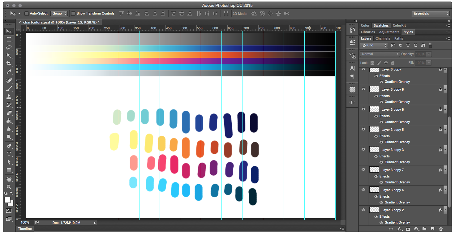
While there are an increasing number of good color palettes out there, not all of them are applicable to charts and data visualizations. Our approach to visualization color palettes is to make natural gradients that vary in both hue and brightness. By doing this, our palettes are accessible by people who are color blind, obvious for others, and works with anywhere from one to twelve data series.

Finding the Right Color Palettes for Data Visualizations →

Published by Bramus!

Bramus is a frontend web developer from Belgium, working as a Chrome Developer Relations Engineer at Google. From the moment he discovered view-source at the age of 14 (way back in 1997), he fell in love with the web and has been tinkering with it ever since (more …)

Leave a comment

Your email address will not be published. Required fields are marked *

This site uses Akismet to reduce spam. Learn how your comment data is processed.