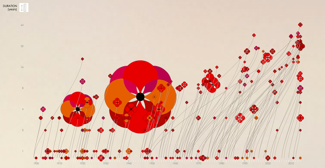
What I like about this visualisation is that it represents 3 dimensions into 2: conflict startdate (X-axis), conflict duration (Y-axis), and number of fatalities (size of the flower). Another interesting thing is that the duration of the conflict is actually visualised in two ways: next to the Y-axis the length of the stem represents that very same piece of data. Clever use of a logarithmic scale too.
Poppy Field – Visualising War Fatalities →
(Scroll to the 4th pane, and click “Explore”)