One of the key differences between our new beta site and the current Guardian site is the way we approach content curation and presentation.
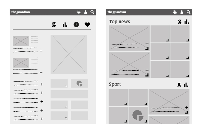
From the outset we knew we wanted to create a modular system. However we were wrestling with how we could maintain a consistent hierarchy of stories across desktop, tablet and mobile whilst still allowing a rhythm and pace as you move through the site, something we felt was lacking in other responsive sites. Initially just a rough sketch on a whiteboard our definition of a container became the following:
- A container is a full width horizontal element which contains a collection of content.
- Pages hold a series of containers which are stacked on top of each other, the most important at the top and the least important at the bottom.
- Containers are self sufficient -and as a result can easily appear in multiple locations in a variety of combinations.
- As the screen size gets smaller or larger, the content inside adjusts to the width of the screen.
I was fortunate to see Oliver Reichenstein (from iA) talk about this at the recent Responsive Day Out 2.
The container model and blended content – a new approach to how we present content on the Guardian →
The Guardian Beta →