We can use billions of public Tweets to detect events and visualize the synchrony they generate at a large scale.
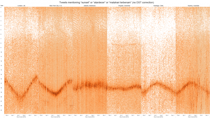
Tweets about sunsets spike when there’s a sunset. We can use this pattern of Tweets to visualize how the time when the sun sets differs by season, as well as to compare how these lines of activity in 2012 differ among cities below the equator, closer to the equator, and above the equator.
The graph above holds graphs of 6 cities next to each other. The X-axis plots the months (1-12), and the Y-axis the hour of the day (23 – 0). You can clearly see which cities are above the equator (notice the V pattern) and below the equator (the Λ pattern).
Some more interesting patterns in the linked blogpost.