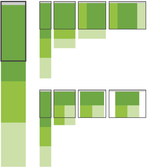
Through fluid grids and media query adjustments, responsive design enables Web page layouts to adapt to a variety of screen sizes. As more designers embrace this technique, we’re not only seeing a lot of innovation but the emergence of clear patterns as well. I cataloged what seem to be the most popular of these patterns for adaptable multi-device layouts.
Also comes with a follow-up article that focusses on off-canvas layouts. A fine example of this is Facebook where the navigation is hidden off-screen (off-canvas) until you summon it on-screen.

Multi-Device Layout Patterns →
Off Canvas Multi-Device Layouts →