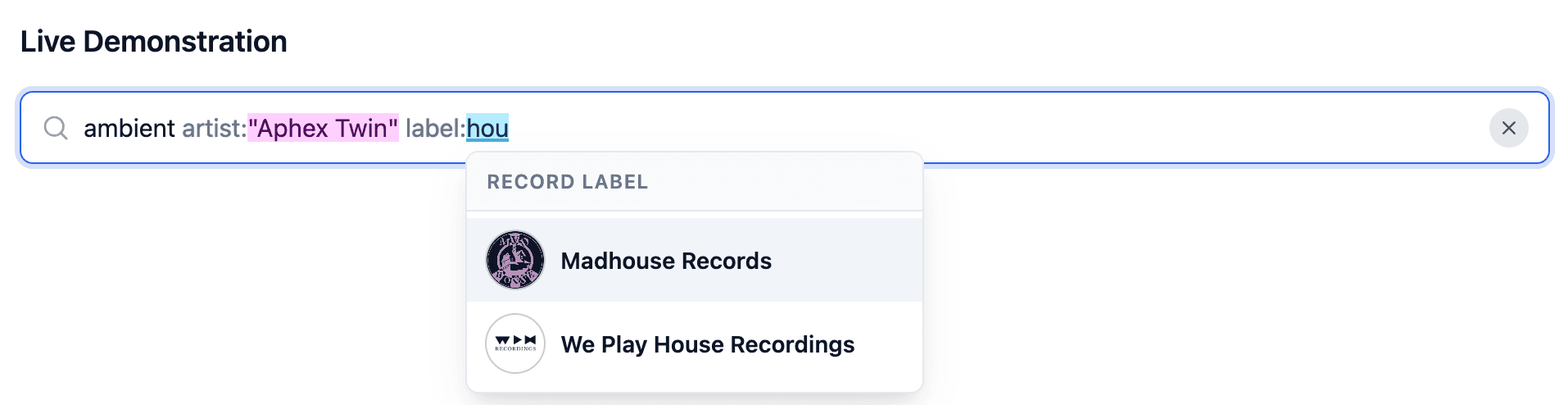
<rich-input> in action~
While working on a side-project to better navigate and search through my record collection, I found myself in need of a rich search input: one that accepts free-form text alongside structured filters like artist:“Aphex Twin” or label:“Warp Records” — You know, like the one you see on GitHub when searching/filtering issues.
When I quickly realized a standalone custom element for this didn’t exist yet, I nerd sniped myself into building curating one.
~
# The need for a rich search input
If you have ever used search fields on GitHub, Gmail, or modern music databases, you know the pattern: you can type regular free-text words, but you can also narrow things down using structured key:value pairs. For my record collection side-project, I wanted exactly that kind of search engine-grade filter intelligence.

author:I wanted to be able to type queries such as ambient artist:"Aphex Twin" label:"Warp Records"; year:2024, complete with autocompletion for both the filter keywords and their allowed values. On top of that, I wanted in-input syntax highlighting for the structured filter values, without relying on heavy frontend frameworks or breaking standard form behaviors.
Looking around a bit, it seemed like an easy-to-use, standalone custom element providing this out of the box simply did not exist yet. So I nerd sniped myself into creating one: <rich-input>.
~
# What is <rich-input>?
<rich-input> is a standalone Web Component that gives you smart, keyword-aware search fields. You configure it completely declaratively by nesting standard HTML <datalist> elements inside it:
<script type="module" src="https://cdn.jsdelivr.net/npm/rich-input/index.js"></script>

<rich-input placeholder="Search music catalog...">
  <!-- String filter with rich autocomplete options -->
  <datalist id="label" label="Record Label">
    <option value="Warp Records">
      <img src="assets/warp-records.png" height="50" width="50" alt="Warp Records">
      Warp Records
    </option>
    <option value="Ninja Tune">
      <img src="assets/ninja-tune.jpg" height="50" width="50" alt="Ninja Tune">
      Ninja Tune
    </option>
  </datalist>

  <!-- Numeric filter -->
  <datalist id="year" label="Release Year" data-type="number">
    <option value="2026"></option>
    <option value="2025"></option>
    <option value="2024"></option>
  </datalist>
</rich-input>
With just that markup in place, the component gives you:
- Dual Autocompletion: It automatically suggests filter keywords when you start typing a word (e.g. typing
lsuggestslabel:, typingysuggestsyear:) as well as the values for that keyword (typinglabel:“WsuggestsWarp Records). - Full-String Suggestion Filtering: The suggestion dropdown filters against the full token string rather than a naive slice at the caret position. Whether your caret is at
label:“W|arp Records”or right between the colon and quotes atlabel:|“Warp Records”, the dropdown cleanly matches the actual value. - Rich Option Markup: You can embed
<img>logos or avatars inside your<option>tags. The component extracts them into the autocomplete popover and exposes::part(suggestion-image)so you can style them (e.g. as circular avatars). - Validation & Squiggly Underlines: If you enter an unrecognized keyword or a value that is not part of the configured
<datalist>, the component marks it as invalid with a wavy red underline via::highlight(rich-input-invalid)once your cursor moves away or the input loses focus. - Native Form Participation: It uses
formAssociated = true, so it seamlessly submits via standard<form>elements and works withFormData.
Try it out here:
~
# Powering it with the OpaqueRange API
I knew this project would be quite easy to build thanks to the new OpaqueRange API (as recently covered by Ollie Williams), available in Chrome 152+.
Historically, doing any kind of rich interaction inside a native <input> — such as measuring exact caret coordinates to position a popover, or applying styling to substrings within the input — was a notorious exercise in pain. You had to resort to brittle “mirror div” hacks: an off-screen or invisible <div> styled with the exact same font, padding, border, and scroll offsets, replicating the input’s text to measure coordinates.
With OpaqueRange native text inputs gain first-class range capabilities. You can call input.createValueRange(start, end) to get an OpaqueRange representing any text slice inside the control. This unlocks two massive superpowers:
- Anchoring popovers: You can call
range.getBoundingClientRect()directly on anOpaqueRangeto get the exact viewport coordinates of the active token or caret, allowing the autocomplete popover to anchor precisely to the start of the token. - Custom Highlights: You can register the ranges with the CSS Custom Highlight API via
CSS.highlights.set(keyword, new Highlight(range)). That means you can style each keyword’s value directly in your CSS stylesheet!
/* Style record label values */
::highlight(label) {
  background-color: oklch(0.92 0.08 240);
  color: oklch(0.28 0.14 240);
  text-decoration: 2px underline solid oklch(0.5 0.15 240 / 0.5);
}

/* Style release years */
::highlight(year) {
  background-color: oklch(0.93 0.1 85);
  color: oklch(0.35 0.14 85);
}

/* Style invalid tokens with a wavy red squiggly */
::highlight(rich-input-invalid) {
  text-decoration: underline wavy #ef4444;
  text-decoration-skip-ink: none;
}
Because these are native highlights, text selection, copy-pasting, undo/redo stacks, and caret navigation continue to work 100% natively without any layout shifts or DOM synchronization glitches.
~
# The Cross-Browser Fallback
Because OpaqueRange is still brand new and currently only supported in Chromium 152+, the component also comes with a built-in fallback strategy. When OpaqueRange is not supported, the component internally swaps the native <input> inside its Shadow DOM for an adapted, single-line [contenteditable] element and resorts to regular CSS Custom Highlights to do the highlighting — a technique I pioneered in https://brm.us/syntax-highlighting.
For some reason the Custom Highlights do not cross into the Shadow DOM in Firefox and Safari. To fix that, the component also copies over document’s custom highlights from document.stylesheets into the Shadow DOM. Also accepted is a <style> element nested directly inside the <rich-text>.
~
# AI-Assisted with Google Antigravity
Just like my previous two custom element projects (<hic-pageflip> and <mermaid-element>), this component was built with AI assistance using Google Antigravity.
I used stock Antigravity powered by Gemini, configured with the Modern Web Guidance skill and the Chrome DevTools MCP server.
In my prompt, also explicitly pointed Antigravity to my two previous repositories, instructing it to replicate their project layout, demo structure, and styling. Finally, I also included links to resources about OpaqueRange, including Ollie’s post. You can check my initial prompt here:
Create me a rich search component `<rich-search>` that can automplete values for keyword-bases searches.

The component is and acts like a regular `<input type=text>` so you can type in just text. But when typing in specific keywords it should add suggestions for those keywords. Those keyword-searches are in the form  of `keyword:value`

As an example, some keywords and values one could entere for a music application are:
- genre:"<string>"
- style:"<string>"
- year:<number>
- label:"<string>"
- artist:"<string>"
- mix:"<string>"
- mixid:<number>
- playlist:"<string>"
- playlistid:<number>

An example search string could be something like `label:"We Play House Recordings" year:2026 playlist:"WPH Classics"`.

The search field should be able to autocomplete:
- The keywords. E.g. when I type in `m` at the start of a new word, it should suggest `mix:` and `mixid:` which I can choose from a list of suggested options.
- The values for those keywords. E.g. when I start typing `label:"K|` (with | being the current cursor position), then it should suggest the labels “Kranky” and “Keinemusik”.

The configuration of all this happens through `<datalist>` elements that are placed inside the `<rich-search>` element. E.g. this could be the list that suggest values for `label`:

```html
<datalist id=label label="Record Label">
  <option value="Defected"></option>
  <option value="Keinemusik"></option>
  <option value="Kranky"></option>
  <option value="Ninja Tune"></option>
  <option value="We Play House Recordings"></option>
  <option value="XL Recordings"></option>
</datalist>
```

Technically, implement this using the OpaqueRange API. Check these resources for info:
- https://chromestatus.com/feature/6297362687066112
- https://github.com/MicrosoftEdge/MSEdgeExplainers/blob/main/OpaqueRange/explainer.md
- https://olliewilliams.xyz/blog/opaquerange/

Styling of the values using the Custom Highlights API should be possible (e.g. `::highlight(label)` can be used to style the value set in label:"We Play House Recordings"). Styling of the input itself should be done using `::part()`.

Follow the project structure as seen in the projects https://github.com/bramus/hic-pageflip and https://github.com/bramus/mermaid-element. Also use the same demo structure and style.
Antigravity handled this prompt very well. Like, it came up with adding a little leading icon, added a “clear input” button, added keyboard navigation, added the getParsedQuery() API, etc. all without me asking 🙂
(Later on I renamed it from <rich-search> to <rich-input>, added support for images, added the fallbacks, etc.)
~
If you take a look at the commit history on GitHub, you’ll notice that most commit messages include the exact prompt I used. One commit I really liked is the one where I asked it to generate a visual similar to the one Una made for Customizable Select.
The result (after two extra nudges that got squashed into the commit) is this nice visual:

~
# Get the package
You can use <rich-input> right now or drop it into your own projects:
To install it via npm:
npm install rich-inputOnce imported, the custom element is ready to use (the package registers the component all by itself)
import rich-input;Alternatively, you can load it directly in HTML from a CDN such as jsDelivr:
<script type="module" src="https://cdn.jsdelivr.net/npm/rich-input/index.js"></script>~
# Links and Resources
Check out the following links for more info and demos:
- 🚀 Project Homepage & Live Demo: https://rich-input.netlify.app/ →
- 📦 NPM Package:
rich-inputon npm → - 💻 Source Code:
bramus/rich-inputon GitHub →
~
# Spread the word
Feel free to reshare one of the following posts on social media to help spread the word:
~
🔥 Like what you see? Want to stay in the loop? Here's how:
I can also be found on 𝕏 Twitter and 🐘 Mastodon but only post there sporadically.
