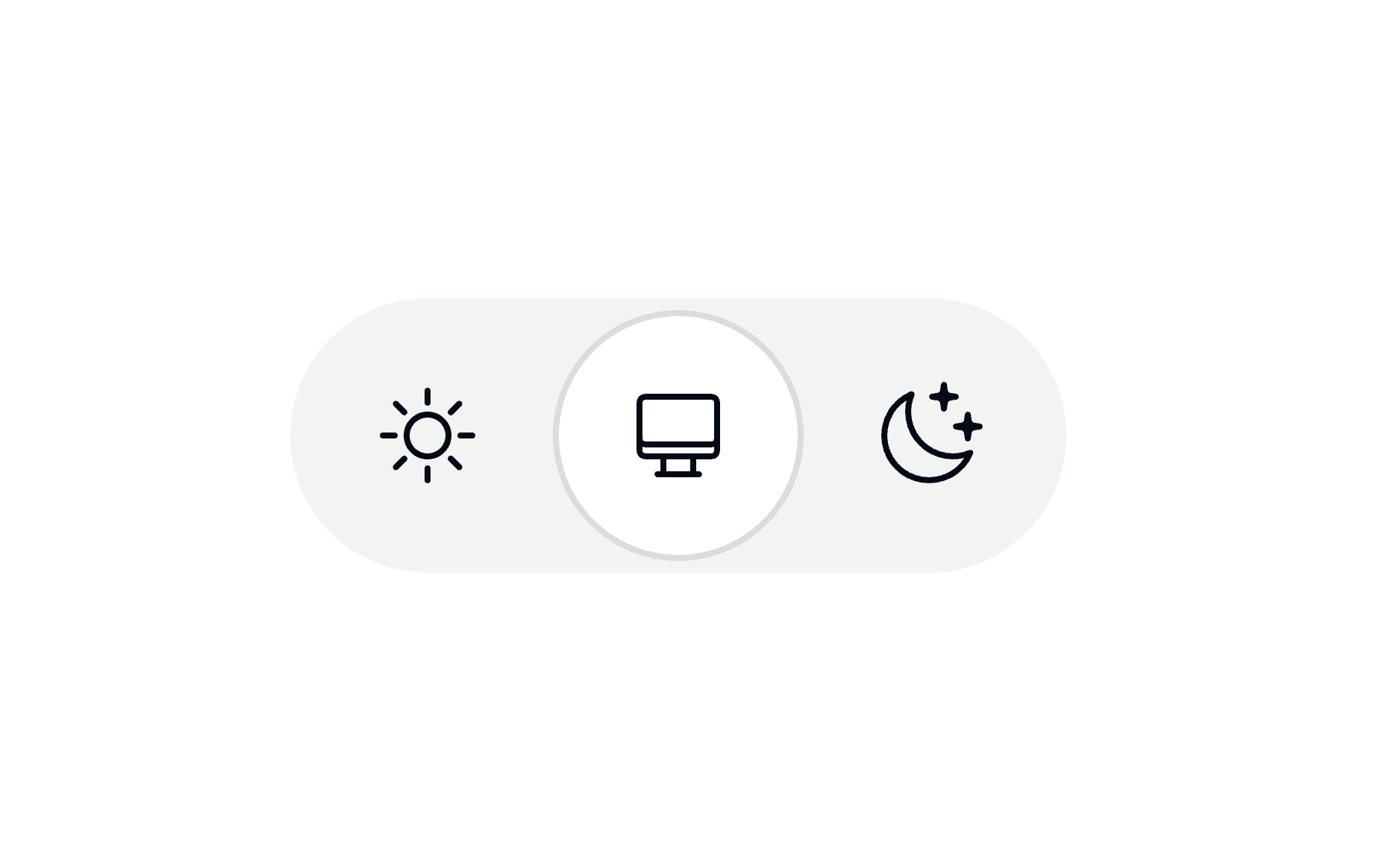
Adding a Dark Mode toggle to your website is a nice touch that many users appreciate. When implementing one, the default instinct for many developers is to reach for a simple binary switch: Light on one side, Dark on the other.
While a two-state control might seem like the most straightforward solution, I firmly believe it’s flawed from a user experience perspective. Instead, we should all be using tri-state controls. Let me explain why.
~
A raised eyebrow
The whole thing started about two weeks ago. While browsing through Modern Web Guidance’s guides, I noticed that the dark mode guide advises authors to use a two-state control when offering a Dark Mode toggle to their users.
Use a two-state control
This had me raise my eyebrow, as I strongly believe that these type of controls should be a tri-state control.
Here’s what I wrote back in 2020 when I recreated a Dark Mode toggle by Josh W. Comeau using Vanilla JavaScript:
🤔 One thing that I personally find missing from Joshua’s implementation is a way to reset the override. To not diverge too much from his implementation I’ve added the reset option via a separate link. What ideally could be done is to use radio buttons (instead of a checkbox) or a dropdown to change between auto, light, and dark.
So, I went on and quickly filed GoogleChrome/modern-web-guidance-src#1182 to get the MWG guide fixed. I didn’t add too much reasoning, as I (wrongly) assumed this was a well lit path. A bit later, guide author Lea Verou replied, pointing to the UX motivation part of the guide, which reads:
DON’T expose all three states (system, light, dark). While the rationale is plausible — “Follow system (currently dark)” is a distinct user intent from “Always dark” — it provides suboptimal UX:
- Users cannot meaningfully express intent for problems they don’t currently have. A manual toggle is a temporary comfort adjustment (“it’s too bright right now”), not a long-term preference (“make sure this never changes”).
- Two of the three options always produce the same visual result, violating the principle of feedback.
I’m not really convinced of that argumentation, because:
A manual toggle is a temporary comfort adjustment
→ Why shouldn’t it be a long term thing? The chosen option is persisted after all …Two of the three options always produce the same visual result, violating the principle of feedback.
→ While the whole page might not change indeed, the selected option does change so there is local visual feedback.
Furthermore, solely focusing on the feedback part is ignoring other benefits of the tri-state control, including predictability and clarity — “Don’t Make Me Think”
~
The F2F, The Debate, and The Data
Coincidentally, the week after I filed the issue, the CSS Working Group Face-To-Face (F2F) took place in Berlin, where both Lea and I were present.
We spent some time trying to convince each other of our respective views, but quickly realized we couldn’t convince each other and also needed some numbers to back up our claims. Lacking some broader research about this topic, we both turned to social media to ask folks for their input.
I posted the following on Bsky and Mastodon:
QQ about Dark Mode Toggles on websites
How many options do you show to users?
- Three values: System, Light, or Dark
- Two values: Light, Dark (with one of them mapping to “System” behind the scenes).
Why the one or the other?
(I have an opinion about it, but I’m looking for external input)
Tallying up the results after about 24 hours, the answers were overwhelmingly in favor of a tri-state approach, with some of the replies even including some good arguments for their choice as well:
- Tri-state: 43
- Two-state: 7
(Note: 4 folks also answered that they don’t offer a control at all, and strictly follow the system preference — to me, that is the minimum you should do)
Simultaneously, Lea also ran a poll, asking if folks ever clicked on the override that matches their OS
. While it’s good to try and get data, I found the question to be incomplete.
A bit later, Lea whipped up a case for a two-state control which she published on her blog: Dark mode toggles: two states are enough (you should read the whole thing).
However, after reading it, I still disagree. I firmly believe a tri-state control is the way to go.
~
The Problem with Two-State Controls
In short, I don’t believe that being able to force a site into a specific mode should be dependent on the time of the day.
The two-state approach highlighted in Lea’s post urges you to either store system or “the computed opposite of system” (i.e. light or dark — whichever is the opposite of the OS is) when using the control. If you carefully think about this, you’ll quickly realize that this runs into a very specific UX problem when the user’s OS is set to auto-change from light to dark based on the time of the day.
Consider this scenario:
- The user’s OS is set to auto-switch Light/Dark based on the time of day.
- They visit a website during the day, so they see the Light theme.
- Using the site’s two-state control, they try out the Dark theme. They decide they don’t like it, so they revert it back to Light.
- They visit the site again at night.
Because the two-state toggle maps one of its values back to “System” behind the scenes, the site is now dark, although they explicitly chose light the last time they interacted with the control. You may now expect an incoming bug report for the control not properly working …
“Yeah. I’m not buying it.” (*)
Lea has a dedicated section on this confusion in her post: “What if the user gets confused?”, but I am not convinced of her argumentation:
This control is entirely tangential to the actual user goal for visiting the website
→ When a user wants to change the theme (for whatever reason), their goal temporarily changes, and they should have a clear control to do so in any case.A tri-state control introduces permanent UI complexity
→ There is nothing complex about a tri-state control, as it — unlike a two-state control — clearly communicates what each button does.Additionally, color appearance is not just a pure function of color …
→ That seems irrelevant when it comes to making the case for a two-state or tri-state control.The title and icon could make the state clearer
→ With that I do agree (see further down) but the post is not pushing for that solution.Even if there is an ingenious UI that exposes three states
→ There is nothing ingenious about showing three buttons for three states. It’s the Dumbest Approach™ one could possibly take here.
Furthermore Lea mentions that a tri-state control has its place in a separate settings panel. However, many — if not most — sites don’t even have such a settings panel so that seems a lot ot require from a webdeveloper …
(* That’s a Scrubs Reference there 😀)
~
Doing Two-State Right (with caveats)
Now, to be clear, I am not entirely against two-state controls. They can work, as long as they clearly communicate to the user what is actually going on.
If you really want to offer a two-state control, here are a couple of ways to do it:
1. Explicitly label the system state
Include a label like “auto” (or an equivalent icon) on the value that follows the OS. This still carries the problem that the user can’t fixate their current OS preference, but at least the behavior is clearly communicated.
I actually took this approach in my chrome-dark-mode-toggle POC extension, which adds a Dark Mode toggle button to Chrome. It has one icon to click which toggles between System and Computed Opposite of System. Crucially, there is a clear “Auto” label present on the control so you know when it’s deferring to the OS.
2. Write explicit values to storage
Opposite to Lea’s recommendation, write the actual values (an explicit light or dark, never system) to storage so that you can actually force both states persistently.
However, if you do this, you inevitably need to offer a “reset” option so users can go back to following the system … at which point you might as well just make the control a tri-state one.
~
The Sweet Spot?
Another approach I’ve seen recently is Vale’s take on things, which shows two controls while still offering three states.
By default, when the site is following the OS preference, neither of the options are highlighted. This implicitly acts as the “System” state. When a user explicitly clicks Light or Dark, the UI highlights the choice, representing the two extra states that write explicit values to storage. When clicking the chosen value again, you end up back with no option selected.
See the Pen
Light/Dark/System Theme Setting by Declan Chidlow (@OuterVale)
on CodePen.
I really like Declan’s approach. It’s clean, and doesn’t sacrifice functionality.
~
Clarity over Brevity
When building these types of control, I think that one of the main goals here should be to keep things predictable for users. Once a user has interacted with a control, they have mentally set it to the specific state they have chosen. Things then changing based on the time of day are an unexpected surprise.
Three explicit options (System, Light, Dark) for a Dark Mode Toggle (or Vale’s clever UI trick) don’t come with this type of unexpected surprise. As Erik Kroes perfectly put it in his reply on Mastodon:
“Tri-state” prioritizes clarity over brevity.
And when it comes to user interfaces, clarity is exactly what users want most 🙂
~
🔥 Like what you see? Want to stay in the loop? Here's how:
I can also be found on 𝕏 Twitter and 🐘 Mastodon but only post there sporadically.


Still, it seems like you’ve missed the point. Your imaginary scenario is an edge-case scenario, was covered by Lea, and is solved by one extra click. That next click sets the theme to what user explicitly wants. The whole point is that user seeks to click only when they want to change the theme, meaning they are not ok with the current one.
It also worth noting that two states switch is a light switch on every page all over the site (usually somewhere in header). Lea doesn’t oppose you to make a specific three-states switch on the settings page. Quite the contrary she advices to do so.
The scenario isn’t imaginary and not all sites — if not most! — have a settings page.
I just referred to your words:
> Imagine this scenario:
Still, it’s a real edge-case for something like 1% of 1% users seeking to change theme. And the solution is that simple as just another click to finally set the theme user wants.
I now realize how that was a bad word to choose. “Consider” would be the better fit here.
(FYI: I’m a non-native English speaker. Still learning new words and sentence-structures on a regular basis.)
As a user, I don’t want an extra click. It should be set it and forget it. Furthermore, I don’t quite accept that argument because what about websites that you don’t visit regularly? I don’t remember every setting I’ve ever changed on a webpage.Clarity and predictability always beat an “overly” clever approach.
Read Lea’s article thoroughly. It’s not a problem in most cases (like 99.9%). So, there is no need for overcomplications. Therefore, if you really want to spend your time and efforts to make complex things, consider making a settings page, if you haven’t done it already.
I had to think about another 3-in-2-state button: The screen lock on smartphones. If it’s deactivated, the screen turns from portrait to landscape automatically as I turn my phone (“system”). If I lock it, the state (portrait/landscape) depends on the situation when I activate the button (like with “dark”/“light”). I’m not sure if this comparison helps in any way, just a thought.