Recently the CSS Working Group approved to start work on the css-variables-2 specification. First planned addition is support for “Custom Units”. Let’s take a look.
~
👨🔬 The CSS features described in this post are still being developed and are not finalised. It might take a long time before this lands in any browser.
~
# Variable Units 101
The idea behind Variable Units – first suggested by Jonathan Neal in this tweet and now specced by Tab Atkins – is to allow authors to define custom properties which can be used as units.
For example:
:root {
  --size: 8px;
}
Here the Custom Property --size is set to 8px. To use it in your CSS, you would need to write this:
elem {
  width: calc(4 * (var(--size))); /* = 4 times the --size = 32px */
}
Thanks to Variable Units, this can become shorter and easier to write. Just like how you can use the em unit, you use the --size property as a unit, like so:
elem {
  width: 4--size; /* = 4 times the --size = 32px */
}
Much shorter to write, and once you know how to read it, it’s fairly easy 🙂
~
# Digging deeper
Because you can put just about anything in Custom Properties, you can make Variable Units a tad more complicated than the simple 8px from before.
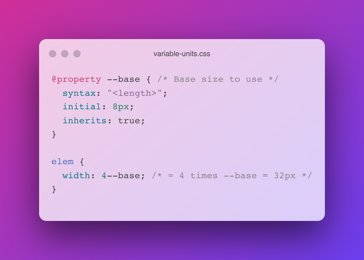
:root {
  --fem: clamp(10px, 1vw + 1vh, 1rem);
}
Throw in @property to register your Custom Property, and you don’t need to define the property on :root anymore + you will be able to animate the value. Furthermore it will fallback to the initial value, should you assign a non-<length> to it.
@property --fem { /* "fluid em" */
  syntax: "<length>";
  initial: clamp(10px, 1vw + 1vh, 1rem);
  inherits: true;
}

.fluid-type {
  font-size: 1.2--fem; /* Won’t get smaller than 12px, or larger than 1.2rem. */
}
~
# Polyfilling New Units
The cool thing about this feature is that also opens up the way to polyfill new units, should a browser not support them yet. Take this fictitious brm unit for example:
-
Alias the new unit to its
--counterpart. Browsers with support forbrmwill use the initial value.@property --brm { syntax: "<length>"; initial: 1brm; /* browsers with support for `brm` will use this */ inherits: true; } -
In case of no support for that new
brmunit, have a JS polyfill calculate the length to use instead, and set that the initial value -
Use the custom unit throughout the code
height: 100--brm; /* Will use the real brm unit, or the polyfilled version if no support */
~
# In Closing
If you want to follow along, or have some feedback on the syntax, you can do so at these links:
~
# Spread the word
To help spread the contents of this post, feel free to retweet the announcement tweet:
The Future of CSS: Variable Units, powered by Custom Properties
🏷 #css #CustomProperties pic.twitter.com/yxhHs8OIEb
— Bram.us (@bramusblog) July 7, 2022
~
🔥 Like what you see? Want to stay in the loop? Here's how: