Ink: A Responsive Email Framework

ink

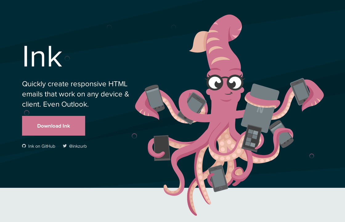
Reach out your tentacles to a broad range of people who subscribe to your emails. Our CSS framework helps you craft HTML emails that can be read anywhere on any device. Gone are the days where you had to choose between Outlook and email optimized for smartphones and tablets. Ink’s responsive, 12-column grid blends flexibility and stability so your readers can view your emails perfectly from wherever they may be.

From the creators of ZURB Foundation

Ink: A Responsive Email Framework →

Published by Bramus!

Bramus is a frontend web developer from Belgium, working as a Chrome Developer Relations Engineer at Google. From the moment he discovered view-source at the age of 14 (way back in 1997), he fell in love with the web and has been tinkering with it ever since (more …)

Leave a comment

Your email address will not be published. Required fields are marked *

This site uses Akismet to reduce spam. Learn how your comment data is processed.