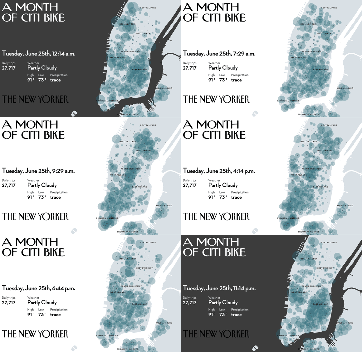
It’s been nearly two months since New York City rolled out its bike-sharing program. To see how it’s faring, we used live data, provided by Citi Bike, to map where people rode for one month. As the month progresses, the circles on the map grow or shrink according to the number of available bikes at each station. Viewed together, they show New Yorkers finding new ways to navigate through the city.
A Month of Citi Bike (Article) →
A Month of Citi Bike (Data Visualization) →