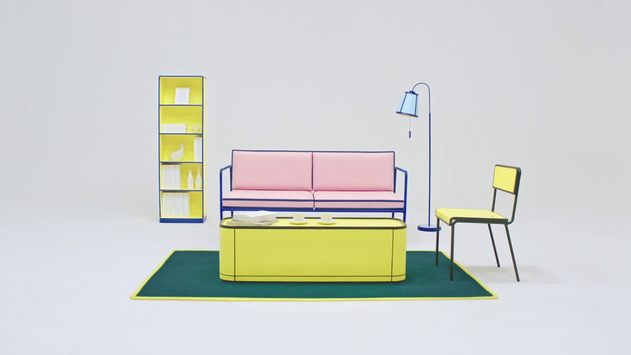
The collection precisely uses a 7:1 color contrast ratio, a contrast level that makes a visual most accessible to people with disability. We use an international vision enhancement method by W3C organization, which makes a content or object visible at Level AAA standard (a highest level of visibility). Must say I find them visually quite …