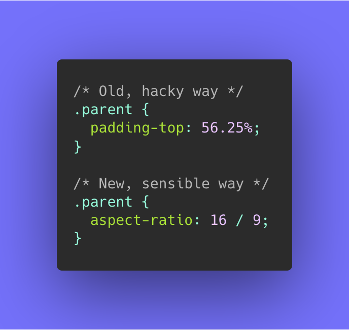
Old vs. New. Image by @una.
Back in May 2020 I was very delighted to read that the first Working Draft of the CSS Box Sizing Module Level 4 got published, as it featured an addition to CSS that I’ve been wanting for a long time now: native support for aspect ratio boxes through the new aspect-ratio
CSS property.
With Chromium 89 (current Canary) and Firefox 85 (current Nightly) already supporting aspect-ratio
unflagged, it’s time to start playing with this new addition and start thinking about dropping all those nasty hacks to mimic aspect ratios in CSS. Let’s take a look …
🤔 Working Draft (WD)?
The Working Draft (WD) phase is the first phase of the W3C Recommendation Track, and is considered the exploring phase of a W3C spec.
From thereon a spec can become a Candidate Recommendation (CR) to finally land on being a Recommendation (REC). In between those three stages there are two transition stages: Last Call Working Draft (LCWD) and Proposed Recommendation (PR)
In visual form, the Recommendation Track looks something like this:
See An Inside View of the CSS Working Group at W3C for more details on all phases.
⚠️ Note that the current implementations in both Firefox Nightly and Chrome Canary are not finalised yet. You can track these bugs to stay up-to-date:
~
~
# Welcome aspect-ratio
In short, the aspect-ratio
property allows you to define a preferred aspect ratio on elements:
.box {
width: 20vw;
aspect-ratio: 16 / 9;
}
In the example above the .box
will have a preferred aspect ratio of 16:9
. Since its width
is set to 20vw
, the resulting height will be 20vw / 16 * 9
= 11.25vw
. Easy, right?
🤞 Psst, further down this you can find a demo that includes a fallback for browsers that don’t support aspect-ratio
😉
~
# Allowed values for aspect-ratio
The value as set in the example above for aspect-ratio
is of the <ratio>
type:
- It typically consists of two numbers separated by a
/
. The first parameter targets the width and the second one the height. - It’s also allowed to pass in just a single number. In that case the second number will be we considered to be
1
. E.g. a<ratio>
of2
will translate to2 / 1
. - Passing in a
0
for either of the numbers is not allowed. - The spaces around the
/
are not required, so2/1
is also a valid<ratio>
value.
Another allowed value for the aspect-ratio
property — which also is the default — is auto
. This indicates that the box has no preferred aspect ratio and should size itself as it normally would.
🙋♂️ Hold up! How come images already behave correctly, without needing to define an aspect-ratio
?
Images may be commonly used, but they are a quite uncommon type of HTML element:
-
Images are replaced elements:
A replaced element is an element whose content is outside the scope of the CSS formatting model, such as an image or embedded document. For example, the content of the HTML
<img>
element is often replaced by the image that itssrc
attribute designates.Just check your DevTools: the browser will make an extra HTTP request for any image and fetch its contents separately. Once loaded, the browser will replace the original
img
tag with the actual image contents. -
Images have an intrinsic aspect ratio:
The intrinsic dimensions represent a preferred or natural size of the object itself; that is, they are not a function of the context in which the object is used.
Each photo that you take with your phone results in an image that has a certain width and height, which is referred to as the intrinsic or natural width/height. The intrinsic aspect ratio is the ratio between the intrinsic width and intrinsic height.
When the browser has fetched the image and needs to draw it on screen it will take its intrinsic aspect ratio into account to know how big it should be drawn.
-
When you define
width
andheight
attributes on animg
, the browser will take those into account when drawing the image on screen. Nowadays browsers even internally map those properties to CSS sizing properties.
☝️ Do note that you can still set an aspect-ratio
on an element that has an intrinsic aspect ratio. In that case your defined aspect-ratio
will override the intrinsic aspect ratio.
~
# The fine print
# Aspect of what?
Depending upon which of width
or height
you set, the box dimensions will be calculated against that.
.box {
width: 20vw;
aspect-ratio: 16 / 9; /* Dimensions will be calculated against the width,
yielding a height of 11.25vw (20vw / 16 * 9) */
}
.box {
height: 20vw;
aspect-ratio: 16 / 9; /* Dimensions will be calculated against the height,
yielding a width of 35.55vw (20vw / 9 * 16) */
}
# aspect-ratio
+width
+height
= 🚫
Setting an aspect-ratio
won’t have effect on elements that have both a CSS width
and CSS height
set to a value other than auto
. Only one of width
or height
can be explicitly set, and the other should remain set to auto
.
.box {
width: 20vw;
height: 20vw;
aspect-ratio: 16 / 9; /* won't have any effect! */
}
# aspect-ratio
+ percentage based width
/height
In case one of the width
and height
should be set to a percentage based value such as 100%
, the targeted box will take a look at the direct parent element’s dimensions to define its value upon that.
.parent {
height: 100px;
}
.parent .box {
height: 100%;
aspect-ratio: 1 / 1; /* .box will be 100px by 100px */
}
There’s some more edge cases here too, but let’s not get too deep into the spec 😉
# aspect-ratio
sets a preferred aspect ratio
Setting an aspect-ratio
will tell the browser that this is a preferred aspect ratio. Should the content of the box be larger, then the box will simply grow.
div {
aspect-ratio: 1/1;
/* 'width' and 'height' both default to 'auto' */
}
+----------+ +----------+ +----------+
| ~~~~~~~~ | | ~~~~~~~~ | | ~~~~~~~~ |
| ~~~~~~~~ | | ~~~~~~~~ | | ~~~~~~~~ |
| ~~~~~~~ | | ~~~~~~~~ | | ~~~~~~~~ |
| | | ~~~ | | ~~~~~~~~ |
+----------+ +----------+ | ~~~~~~~~ |
| ~~~~~~ |
+----------+
To maintain the aspect-ratio
, you can set overflow
to auto
so that a scrollbar will be shown should the contents be larger:
div {
overflow: auto;
aspect-ratio: 1/1;
}
+----------+ +----------+ +----------+
| ~~~~~~~~ | | ~~~~~~~~ | | ~~~~~~~~^|
| ~~~~~~~~ | | ~~~~~~~~ | | ~~~~~~~~ |
| ~~~~~~~ | | ~~~~~~~~ | | ~~~~~~~~ |
| | | ~~~ | | ~~~~~~~~v|
+----------+ +----------+ +----------+
What also works, is setting min-height
Overriding the
min-height
property also maintains the 1:1 aspect ratio, but will result in content overflowing the box if it is not otherwise handled.
div {
aspect-ratio: 1/1;
min-height: 0;
}
+----------+ +----------+ +----------+
| ~~~~~~~~ | | ~~~~~~~~ | | ~~~~~~~~ |
| ~~~~~~~~ | | ~~~~~~~~ | | ~~~~~~~~ |
| ~~~~~~~ | | ~~~~~~~~ | | ~~~~~~~~ |
| | | ~~~ | | ~~~~~~~~ |
+----------+ +----------+ +-~~~~~~~~-+
~~~~~~
~
# Demos
# Using aspect-ratio
with a fallback for older browsers
Thanks to the powerful @supports
it’s possible to add a fallback for browsers that don’t support aspect-ratio
. In the demo below (based upon this demo by Una) a fallback using the padding-top
hack is applied:
# Using aspect-ratio
with CSS Variables
By introducing a CSS Variable CSS Custom Property it’s possible to make your code more generic and extract away a .aspect-ratio
class.
To use it, add apply the .aspect-ratio
on the element you want, and pass in a --aspect-ratio
CSS Custom Property:
<div
class="aspect-ratio"
style="--aspect-ratio: 16/9;"
>I am an aspect ratio box</div>
The code is written so that it will use the value for --aspect-ratio
in both the fallback and the modern version.
# Automatically setting aspect-ratio
on iframe
s and the like
When you embed an iframe
you most likely set its width
and height
HTML attribute.
<iframe
src="https://www.youtube.com/embed/e7BkmF8CJpQ"
width="560"
height="315"></iframe>
It’s possible to use the values of these attributes to automatically set the aspect-ratio
.
iframe[width][height] {
aspect-ratio: attr(width) / attr(height);
}
Heck, you could even target [width][height]
if you’d want!
💁♂️ FYI: This is also what browsers nowadays do for images: they map the values from the width
and height
HTML attributes from images to a aspect-ratio
in order to prevent Cumulative Layout Shift.
Firefox’s internal stylesheet for example looks like this:
img, input[type="image"], video, embed, iframe, marquee, object, table {
aspect-ratio: attr(width) / attr(height);
}
marquee, lol 😆
🐛 I’ve noticed that reading the width
/height
attribute values using attr()
to pass them into aspect-ratio
doesn’t seem to work in current Chromium. To cater for that I’m also passing their values by means of a CSS Custom Property …
<iframe
src="https://www.youtube.com/embed/e7BkmF8CJpQ"
width="560"
height="315"
style="--aspect-ratio: 560 / 315"
></iframe>
🙋♂️ Why doesn’t this iframe demo have a padding-top
fallback injected using :after
?
Just like images, iframes also are replaced elements. It’s not possible to inject contents using :before
/:after
on replaced elements.
If you really need to have a fallback, you need to wrap the iframe
in a container and apply the aspect-ratio
on the container. See Embed Responsively and adjust were needed.
~
# In Closing
After 8 years of wanting this feature to land in CSS (ref) I’m very happy to see this addition make it into the spec. It’s still a Working Draft right now, but that doesn’t stop me from being excited about it already. I hope you are too 🙂
📚 This post is part of a series called The future of CSS. More posts in this series:
- The future of CSS: Higher Level Custom Properties to control multiple declarations December 30, 2020
- Native Aspect Ratio Boxes in CSS thanks to
aspect-ratio
November 30, 2020 - CSS
leading-trim
– The Future of Digital Typesetting August 22, 2020 - Colors in CSS: Hello Space-Separated Functional Color Notations April 27, 2020
- Firefox 72: Individual CSS Transform Properties January 9, 2020
- How the CSS
:is()
selector will simplify things December 15, 2019 - The future of CSS: Nesting Selectors March 17, 2019
🔥 Like what you see? Want to stay in the loop? Here's how: