A media feature like width can take its value from a range. When used, we prefix these with min- or max- to express “minimum condition” or “maximum condition” constraints.
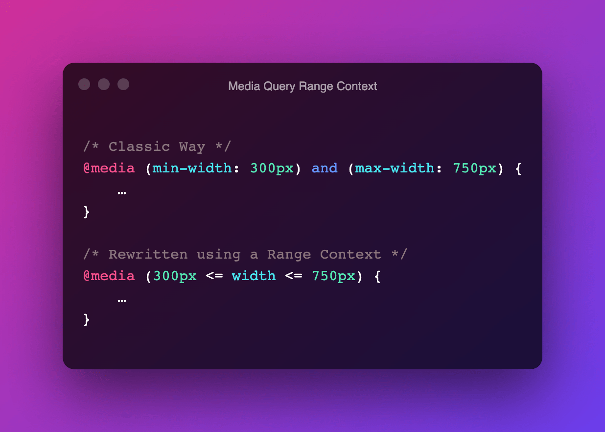
@media (min-width: 300px) and (max-width: 750px) {
	…
}
In CSS Media Queries Level 4 these type of Media Features can now be written as a “range context”, which uses ordinary mathematical comparison operators.
@media (300px <= width <= 750px) {
	…
}
The syntax might seem a little bit odd at first, but for me the trick is to read it as “the width sits in between the two values”
Also works with single values. This example will most likely be more readable to anyone who has (basic) programming knowledge:
/* Old Way */
@media (max-width: 750px) {
	…
}
/* New Way */
@media (width <= 750px) {
	…
}
~
At the time for writing, only Gecko/Firefox supports Range Contexts (ever since Firefox 63). There was some (minor) movement in the Blink/Chromium issue in September, but progress seems to have stalled. No word on WebKit/Safari.
💡 Although this post was originally published in October 2021, the list below is constantly being updated. Last update: Nov 16, 2023.
- Chromium (Blink)
-
✅ Shipped in Chrome 104
- Firefox (Gecko)
-
✅ Shipped in Firefox 63
- Safari (WebKit)
-
✅ Shipped in Safari 16.4
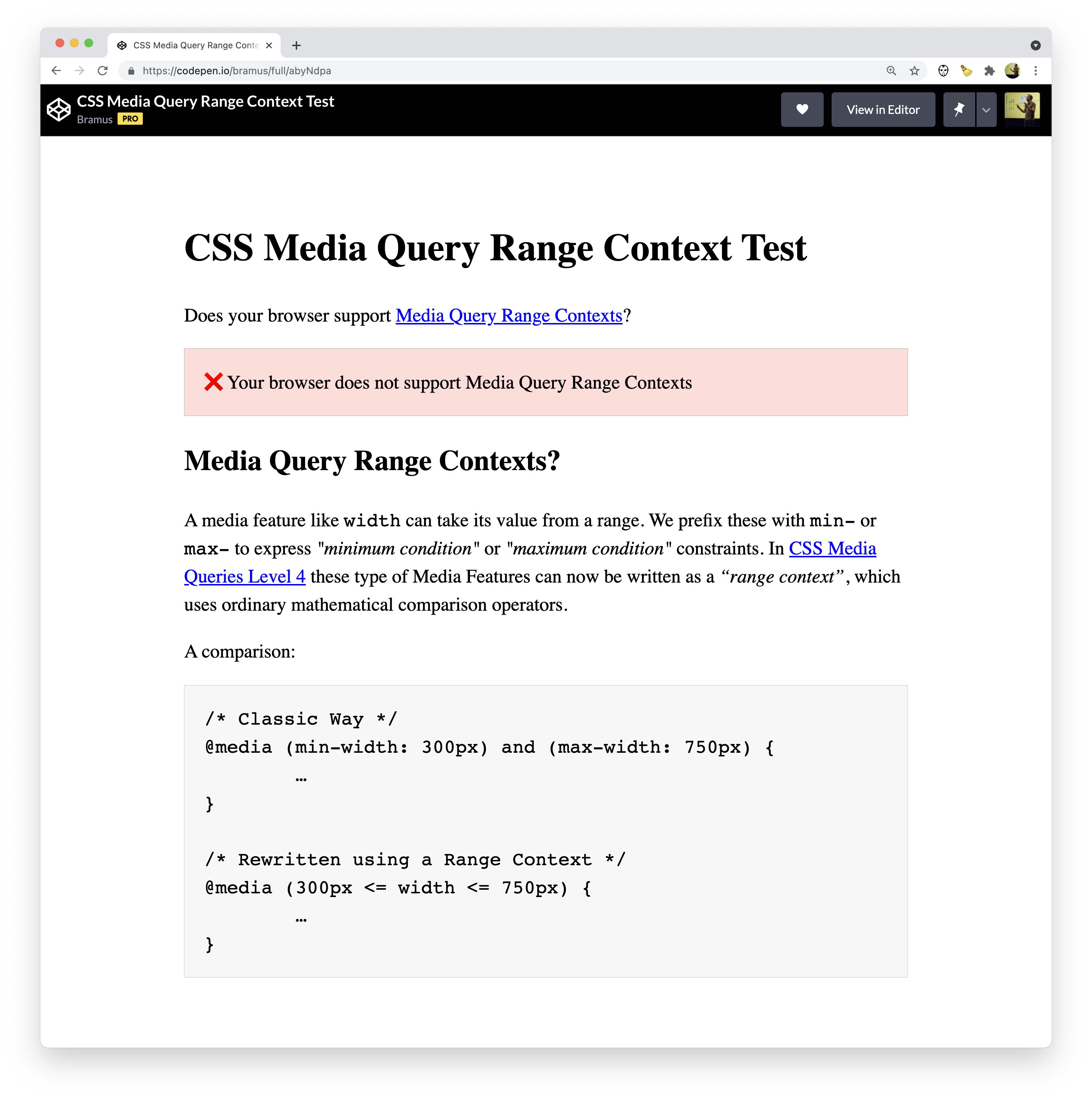
The pen embedded below will indicate if your browser supports Media Query Range Contexts or not:
~
If you’re using PostCSS, you can use the postcss-media-minmax processor to already write Range Contexts:
npm install postcss-media-minmaxvar fs = require('fs')
var postcss = require('postcss')
var minmax = require('postcss-media-minmax')
var css = fs.readFileSync('input.css', 'utf8')
var output = postcss()
.use(minmax())
.process(css)
.css
console.log('\n====>Output CSS:\n', output) ~
🔥 Like what you see? Want to stay in the loop? Here's how:

Leave a comment