~
Early 2000s’ Pixel Perfection
If you, like me, were building websites back in the early 2000s, you’ll undoubtedly remember the absolute headache that was cross-browser compatibility.
What didn’t help back then in this era of Internet Explorer, Netscape, and Firefox was the stubborn, widespread belief that websites needed to look exactly the same in every single browser. Pixel perfection was the (flawed) holy grail.
Thankfully, the web community eventually came to its senses by embracing Progressive Enhancement. The single-purpose website dowebsitesneedtolookexactlythesameineverybrowser.com that just displayed a giant, resounding “no” on the screen, was a great way to spread the word.
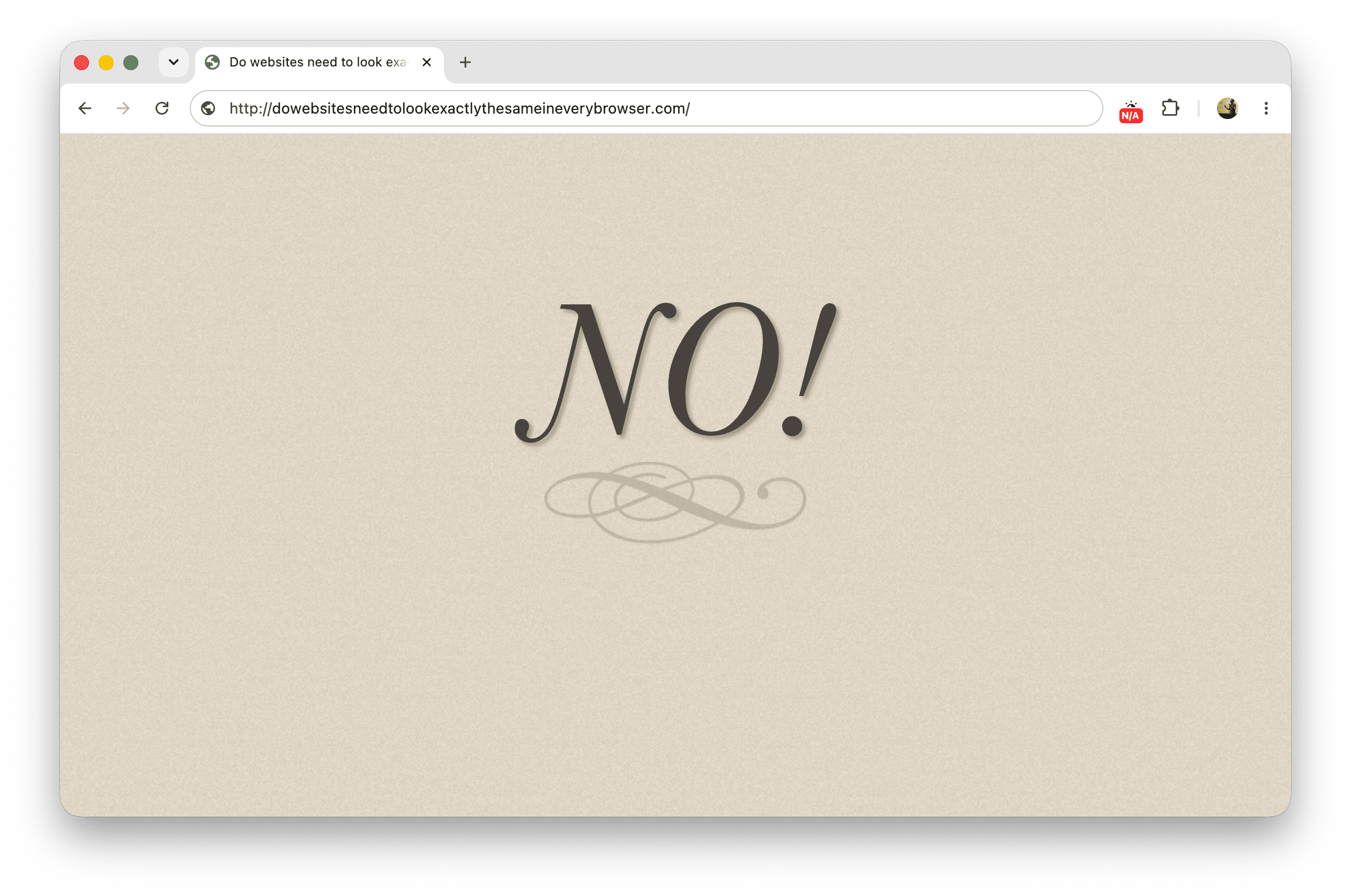
dowebsitesneedtolookexactlythesameineverybrowser.com website.The site was featured in quite a lot of conference talks, such as Jeremy Keith’s talk from border:none 2013 (at the 39:18 mark):
But still, it took years to shed that misconception. And while we’ve now accepted that websites don’t need to look the same everywhere, we seem to be stuck on a new hurdle: the idea that websites need to function the same everywhere.
(Spoiler: No, they do not.)
~
A shifting paradigm
A lot has changed since those early days. Safari and Chrome came into existence and practically took over. The iPhone arrived and set the baseline for what a mobile device with a “breakthrough internet communicator” should be. Today, browsers run on just about everything: laptops, phones, tablets with styluses, tablets with keyboards, smartwatches, you name it.
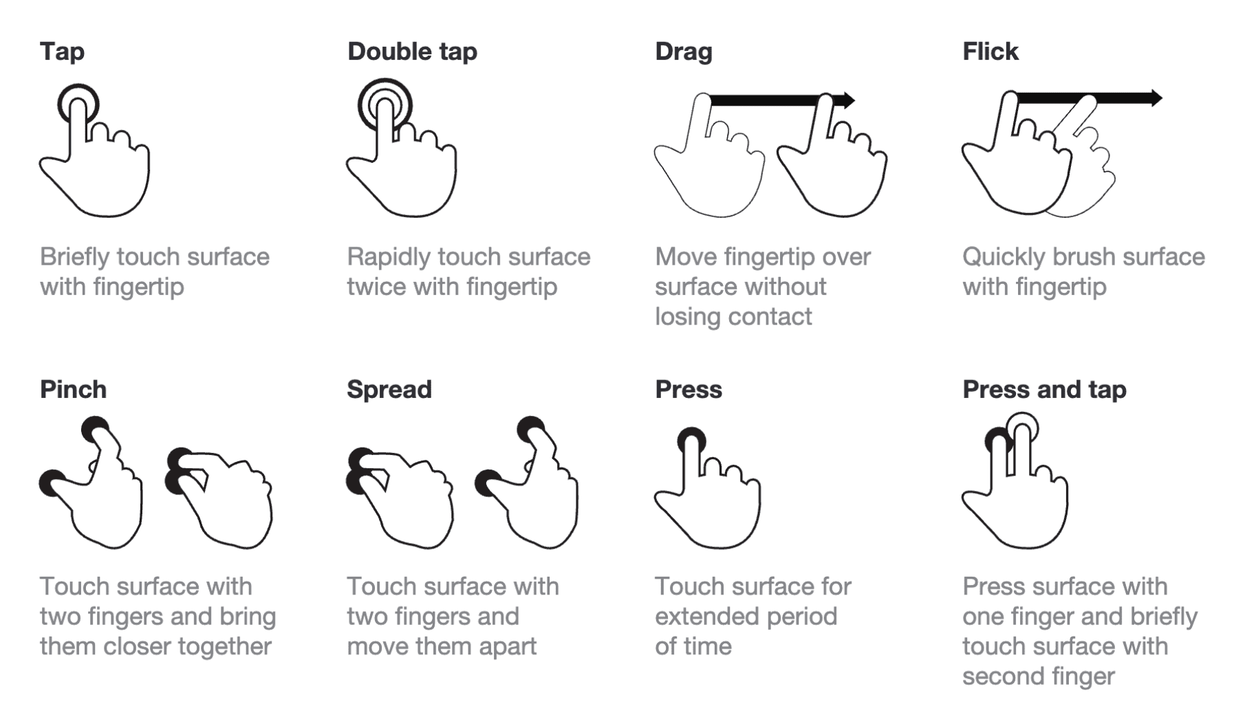
Each of these devices comes with its own input methods and interaction paradigms. On a desktop, you typically scroll with a mouse wheel. If you can’t use a mouse, you use the keyboard. On touch devices, you swipe with one finger and pinch-zoom with two fingers. And on spatial computing devices like the Vision Pro, you can scroll using your hands or just using your eyes.
Sidenote: Interestingly some of the paradigms bleed out from one platform to the other, and the lines blur. For example, I often catch myself wanting to click and drag a scroller on desktop, similar to how I scroll on a touch device. This actually led me to file Issue #9811 on Draggable Scrollers at the CSSWG in 2024.
~
Embracing input-specific features
One of the things I like about a lot of modern web apps out there is that they have added keyboard shortcuts to their UI. Sites like YouTube, GitHub, Gmail, and Feedly all offer them. The de facto standard now is to press the ? key to bring up a dialog detailing all available keyboard shortcuts.
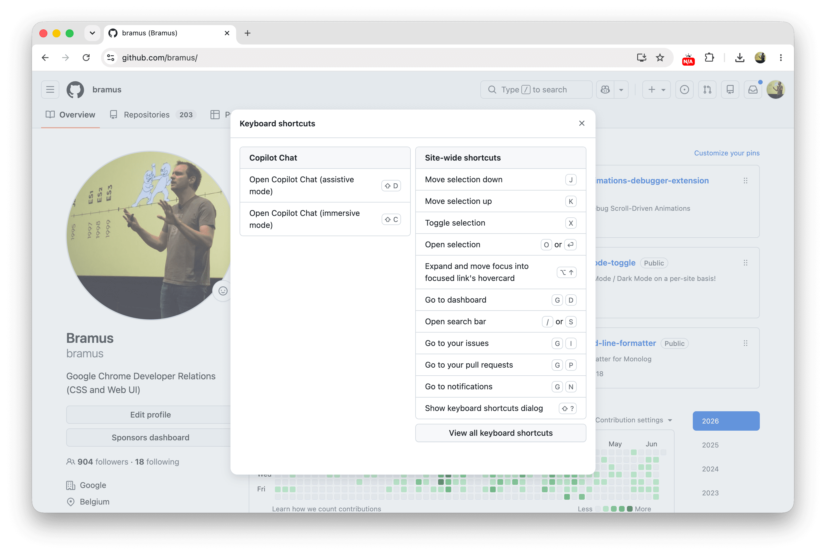
These shortcuts are an extra way to reaching a specific goal. On YouTube for example, you can hit the f key on your keyboard to fullscreen the currently playing video. Because this extra type of activation is strictly limited to the keyboard input method, it is unique to that input method. When there is no keyboard available, you can’t use it, and you still have to locate and click the fullscreen icon in the UI.
I like to use these shortcuts as the perfect example to show that it is perfectly fine for sites to offer different, alternative, functionality based on what the platform and input method can offer:
- Got touch? Great, you can now swipe and pinch-zoom on things.
- Got a keyboard? Great, you can focus elements by tabbing into them.
- Got a pointer device? Great, things can now happen on hover.
- Using a keyboard? Great, you can use handy shortcuts.
A practical example here is a modal dialog that is getting shown: depending on which platform and input mechanism combo you are using, you can close it by flinging it away, hitting the ESC key, doing a back swipe, tapping the backdrop, or by activating the close button.
~
The impact on Web Platform features
These aren’t just abstract observations. The friction between platform-specific capabilities and the desire for universal functionality is actively bottlenecking very hot topics currently being developed for the web platform.
~
Interest Invokers
For the past 1.5 years, there has been a lot of discussion on how interest invokers should work on touch devices. On touch devices, the de facto standard to express "interest" in an element is to long-press it. But browsers on touch devices already use that long press to reveal the system context menu (*). This clash forced the Open UI folks to explore more options. Chrome is currently prototyping the ::interest-button pseudo-element option behind a feature flag, but it’s already becoming clear that it’s not a good solution.
(* Unless you do the proprietary -webkit-touch-callout: none on iOS)
Sidenote: there is a misconception making rounds that “Chrome has shipped this ::interest-button” ([1][2]). This is not the case, as the feature is only available behind a feature flag, for testing. So let it be clear: Features behind a feature flag have not shipped.
~
Overscroll Actions / Areas
Overscroll Actions / Areas is another feature currently being explored at Open UI. A major sticking point is discoverability on desktop devices. Some folks are arguing that there must be a visible button in the UI to reveal these overscroll areas on desktop. My take? There shouldn’t be. People naturally try out swipe/scroll gestures on trackpads nowadays, and just like keyboard shortcuts, this is simply an extra means of reaching a goal, not the only one. Your UIs should already be accessible without Overscroll Areas.
~
Document Picture-in-Picture
Picture-in-Picture (PiP) is a well-established paradigm for video. The newer Document Picture-in-Picture API extends this functionality, allowing you to pop any HTML content into a floating window. It’s brilliant for things like tabbing away from a Google Meet call and keeping the call controls and participant videos visible. Yet, WebKit formally opposed the API, stating it is a paradigm that doesn’t map well to all platforms.
They specifically called out that on iOS and iPadOS, system-level picture-in-picture is specifically designed for video content
… which seems like a “you-problem” IMHO.
(For completeness: they also mentioned being concerned about the user experience implications of giving websites the ability to create always-on-top windows
but in the same spirit I also have my concerns about the color property because developers can create light-text-on-a-light-background experiences that also implicates UX …)
~
Moving Forward
The main theme across all these discussions, debates, and oppositions is a lingering belief that web features must work the exact same way on all platforms.
If we as a community (and as platform engineers) started accepting that websites do not need to function exactly the same on every platform, these feature discussions could have been finished a long time ago (or would at least go down easier), allowing web developers to just build better, progressively enhanced experiences for their users.
Singling out the Interest Invokers use-case: if the long press is a no-go, then perhaps the answer is to not have them do anything on a touch interaction? Like, I wouldn’t really mind not seeing an info card on GitHub or Wikipedia when using touch as the input mechanism, because the info show in those cards is available on the next page anyway. This would keep the feature limited to hover and keyboard focus, and perhaps that’s fine …
~
🔥 Like what you see? Want to stay in the loop? Here's how:
I can also be found on 𝕏 Twitter and 🐘 Mastodon but only post there sporadically.