As an experiment to see if Modern CSS is up to the task, I recreated the Google Antigravity website with Modern CSS.
~
Recently, Google Antigravity was released along with its website. I haven’t used the application myself yet, but I did check out its website. Besides being visually appealing, one of the first things that caught my eye is that the scrolling felt “off”. Opening DevTools confirmed that my hunch was right: the site is using scroll-jacking, which makes the scrolling feel uncanny. Hmmm.
Digging further in, I also noticed that the site does not use any of the latest Modern CSS features, even though the site is packed with patterns that can be done with CSS nowadays. Now, I do get why that team might have chosen not to lean on those recent CSS capabilities: the website is a marketing tool, so they want need it to look and behave – including all the visual flair – exactly the same in every browser. I get it. But it does feel like a missed opportunity from my “Chrome DevRel for CSS/UI” point-of-view.
~
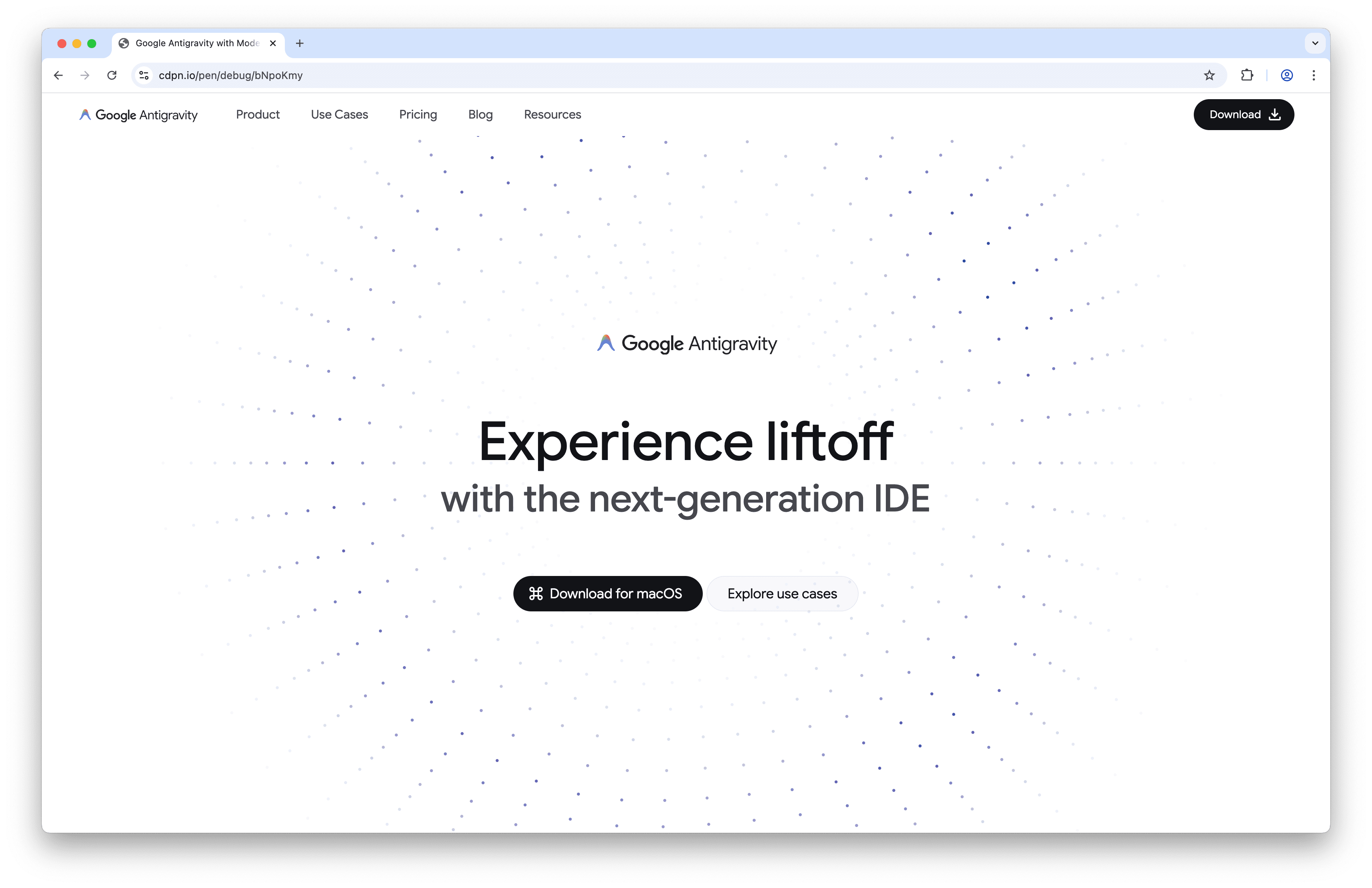
So as one does, I nerd sniped myself into recreating the website using Modern CSS Features. The goal of my experiment wasn’t to make an exact copy of the Antigravity website, but more to see if Modern CSS would hold up throughout building it.
A few nights of burning the midnight oil, and this is what I landed on:
To get to that result, I leaned on these Modern CSS features:
- CSS
@starting-style - A Houdini PaintWorklet for the ring particles.
- CSS Container Queries
- CSS Scroll Snapping
- CSS
@scope - CSS Anchor Positioning
- CSS Carousels
- CSS
overscroll-behavior: contain;on a non-scrollable scroll container - CSS
scroll-state(scrolled: …)scroll queries to create a hidey bar - CSS Scroll-Triggered Animations (which is admittedly a bit buggy in Chrome Canary right now)
- CSS
sibling-index()(would have loved to userandom()but that’s not available in Chrome) - CSS Scroll-Driven Animations
(Not included in this list are things I consider basic nowadays: Responsive Design, Cascade Layers, CSS Nesting, Custom Properties, …)
The only bit of JavaScript used is the registration of the PaintWorklet, and a tad of JS to sync the cursor’s position to two custom properties for the CSS to use.
~
The recreation I built is embedded below, but you should check it out on CodePen as the website is responsive. You must use Chrome Canary to see the latest niceties in action.
If you are not using Google Chrome Canary (or not using Chrome at all) don’t worry: the site was built with Progressive Enhancement in mind and everything – except @scope 😔 – is feature-detected with @supports. So even if your browser understands only a fragment of the Modern CSS that is used, everything can be viewed perfectly fine 🙂
The rest of the CSS is admittedly a bit messy, as I quickly threw this together during some late night coding sessions. Like, the grid approach could be done much better. I also didn’t get to code up all parts of the site (such as the mega menu or the footer) as this is merely an after-hours POC.
TIP: Go disable the @layer named moderncss in the Style Sheet to force the site into its “basic” view. The easiest way to do so, is to change @layer moderncss to @slayer moderncss and you’re done.
~
All in all, I would say Modern CSS held up very nicely here. There are still a few rough edges I encountered:
- Using
@scopefrom a progressive angle is difficult, because you can’t feature detect it. We really needat-rule()to become a thing. - When determining the gap for a flex or grid layout, I want to have different gaps for the rows and columns.
gap: inline-gap block-gapwould be handy. - Getting the pointer’s x and y position on an element should not require JavaScript – I filed w3c/csswg-drafts#6733 for that a long time ago
- When using scroll-snapping to, for example, snap to the center of a horizontal scroller, the first item can’t really snap to that edge because it is the first item in that scroller so it’s stuck to the left edge. You can fix this by adding some virtual padding to the scroller, but that involves manually calculating the size of it.
- It feels like the CSS snapped state query is triggering while it is still scrolling – so a bit too early. I needed to delay the entry transitions a bit (magic number!) to sync things up.
- In the mobile view, I am using the checkbox hack to show the menu. Ideally this would need to be a button, but then I think I would need JS to update the
aria-pressedof it. AFAIK there is no “toggleable button” I can use for this. - In CSS Carousels, there is no wrapper around the two
::scroll-button()s, so I had to diverge from the original design. - Grid blowouts still catch me off guard and subgrid sometimes leaves me headscratching, but that’s most likely just PEBKAC.
- There is no way to disable an entire cascade layer. You have to slayer it.
- I could use something like an
animation-speedto control how fast the strip of icons should slide in (also see w3c/csswg-drafts#5091 (comment)). Now I have to adjust the time in a media query, whereas “100px per 0.1s” would automatically adjust things.
All the rest went pretty smooth 🙂
If you haven’t done so already, go check out “Google Antigravity with Modern CSS” on CodePen.
~
🔥 Like what you see? Want to stay in the loop? Here's how:
I can also be found on 𝕏 Twitter and 🐘 Mastodon but only post there sporadically.
Hi!
Really love the work. Congrats! I only have one question, you have another work at codepen that I think is more “accurate” for the hero section. “CSS Houdini Ring Particles” is a smooth and nice way to represent the hero, why you did not use it? Again, amazing job and congrats!
I am using that in the demo. The parameters could use some further tweaking, perhaps.