 Time for some shameless commercial plug for this weekend’s "place to be" + creation process of the poster …
This Sunday, April 30, we – the Scouts from Deinze – will be throwing a party. Not our whole Scoutsgroup will “host” the party, but only the eldest members/division of it, named "jin" (jij-ik-noodzaak in dutch, you-me-necessity in english). The party is named "Jinfusion" which is derived from "Trancefusion".
Trancefusion is the party we organise yearly with our scoutsgroup to gather (financial) resources. About 5000 people attend it, many dj’s are present, and all this in "De Brielpoort" + 2 tents (so you get 3 parties in 3 rooms for the price of one).
Jinfusion will be sth like Trancefusion, but then smaller … way smaller, since it’s location is "Brieljant" which can attend 150 ppl max (or is it more?). On the menu are Fré & Niels (dudes you find way too often in the "Clues" (local pub)), Kaïz & Sundance Dimi (two young, talented deejays, although they’re quite unknown) and Red D (famous from "We Play House" (Décadance) and the "Clues"). They will spice up the party with excellent deep house beats, along with some other nice tunes which have an extremely high "I want to party ‘n go wild" level … expect a lot, especially from Kaïz & Sundance Dimi since their demo blew me away!
The reason I’m writing about this is that this kinda kept me busy the last few months … collecting all sorts of information and permissions (liquer, sabam, etc.), finding deejays (although Red D ain’t that hard to find if you live in Deinze), finding and creating decoration (thanks to my dad for programming a PLC which will steer our video-wall), etc. The one thing I’m most proud of is the poster of the event … yes, I created it. It actually is my first ever poster I created "for real". No little minor things like a birthday invitation or some other stuff, but a real thing which is seen by everyone. Above that I’m more of a coder than a designer, so the process of creating it was exciting on its own. Anywho, here it is:

The idea for the poster was achieved very fast … I wanted a burst of rays (click to see howto) which are used very often nowadays and the clouds were inserted after seeing it somewhere on the net; just draw some circles, duplicate them and change the opacity of each layer … plain.easy and done in half an hour! Since I’m hooked to grunge type fonts, I quickly added the needed text and a first version was born. After showing it to some people the title was made bigger and the content placed below, resulting is this pic below:
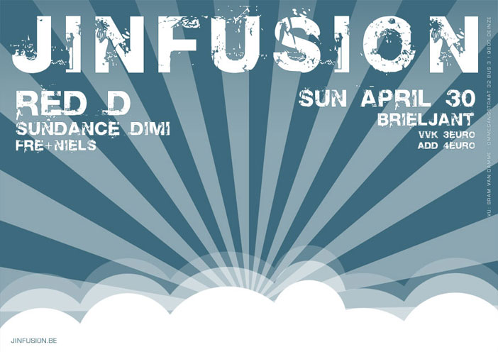
Though, something was missing in the center of it all. I passed the poster on to Thomas, who did some major changes, but forgot one thing: the poster could only consist of 1 colour (Magenta Cyan in this case). He did add some brushes in the center though (some trees), but I wasn’t satisfied with it. This resulted in the fact that all his hard work was for nothing … except for one layer I kept from him. He added a layer which he set to “multiply” to give the burst of rays some colour variation on the way, which I liked; so I just kept it (with some minor adjustments).
Above that the idea of his brush in the middle of it all wasn’t forgotten … and then, all of the sudden, it hit me: it’s the sky … so I wanted a bird or heck, even an eagle! After googling a bit, the thing was found, imported into Photoshop and a path was drawn around it to make it "non-pixelated" since the poster is created at 300 DPI.
Still, the poster wasn’t finished since the font didn’t look good (as Manuel said from the beginning!), so I started my quest on DaFont for a grungy font, which was readible. After searching for quite some time I finally came up with "Dirty Headline". The smaller text (jinfusion.be link (site quickly knocked up in half an hour) and "responsible author") was placed in "Union Agrochem" which is nice too.
Then the poster was converted to greyscale to delivered it to the printer. The requirement of this greyscale is that the poster would be printed in Magenta Cyan, and that the greyscale would act as a "channel" for it. The more black, the bluer; the more white : the more transparent (lighter blue). I said I wanted “that kind of blue”, but that wasn’t quite possible since we only could use Magenta Cyan … the pressman was kind enough to do us a favor and used an old-skool trick: he added some black to his Magenta Cyan toner! This resulted in a print which is nearly exactly like the colour I designed it in!
Above that the poster got featured on the first page in a local gazette published by my former employer. Normally we would have appeared with a very small print of the poster somewhere near the end of that edition, but some things got mixed up. The week of that edition was our "40 years of comité behind the scouts"-celebration-weekend (see my previous post) by which our scoutsgroup got an article on the first page. The dude who put together the first page thought that my poster was part of that weekend’s event, so he added it. Now I must say, thanks! That’s like an awesome piece of promotion!

Anywho, time to get some sleep by now … nearly midnight by now (again).
Tata,
B!
Blue = cyan, red = magenta 😛
Nice poster by the way !
Cheers!
D’oh!
That’s what one gets from writing stuff around midnight 😛