I can’t seem to find any mention of this in the Media Queries Module specification, but apparently it’s allowed to nest media queries, as shared by Šime Vidas:
Apparently, nested media queries are a thing https://t.co/2L2pEWy2JW
— Šime Vidas (@simevidas) January 10, 2021
That’s … awesome! 🤯
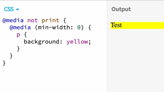
Fiddling with it a bit more, turns out this snippet also works as expected:
@media not print {
	@media (min-width: 350px) {
		p {
			font-weight: bold;
		}
		@media (max-width: 1200px) {
			p {
				text-decoration: underline;
			}
		}
	}
	@media (max-width: 750px) {
		p {
			background: yellow;
		}
	}
}
You can play with this CodePen demo to try it yourself.
See the Pen
Nested Media Queries by Bramus (@bramus)
on CodePen.
💁♂️ Don’t confuse Nested Media Queries with CSS Nesting, an upcoming feature of CSS, which allows you to nest selectors.
UPDATE: Thanks to reader Vadim Makeev for pointing out that support for nested @media blocks was added to Opera 12.50 back in 2012! Its syntax is defined in the CSS Conditional Rules Module specification.
🔥 Like what you see? Want to stay in the loop? Here's how:
Wow. That is good to know! \o/
I’ve done this many times in SCSS, always just assuming that it would be converted to a single statement for native CSS