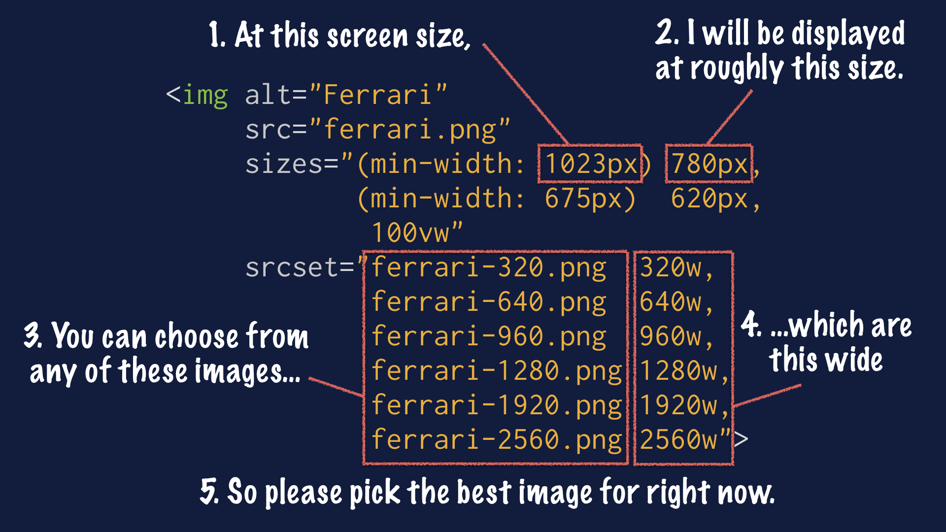
The logic behind displaying an image responsively is complicated. It involves determining how large the image will be displayed, as well as understanding whether the user is on a high-resolution display, among other things. Thankfully, the browser is better equipped than we are to handle this logic. All we need to do is give it some hints. We’ll use the
srcsetattribute to provide a list of image assets to choose from, and thesizesattribute to tell the browser how large the image will display at various breakpoints.
Yes, the syntax is still the same as in 2014, but it’s good to be remembered of it … I always find myself looking things up again when it comes to Responsive Images 😬
Leave a comment