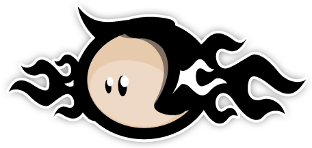
 After quite a few evenings of designing; One evening of slicing/building markup/creating stylesheets; And 2 evenings of porting the sliced up design to WordPress (first time I ever did that actually) by breaking The Loop, stripping content from Pages and tucking them in The Sidebar and spending lots of time on and around The Codex I load upon thee the 3rds.be website along with its dazzling Mascot dubbed Mister Sideburns!

3RDS Mascot: Mister Sideburns, designed by Bouncy
Everything should be in place over at 3rds.be. If not, feel free to inform me 😉 And oh, as you can see I moved away from the rather dark damask pattern and ended with a nifty wood-texture (no trees were harmed).
What are you waiting for? Go check out 3rds.be!
(Tired yet satisfied) Bramus!
Congrats! It’s definitely a site with personality. Good luck with 3rds (not that you’ll need it).
great! and the mascot really is zuper da puper 🙂
get some t-shirts printed!
congratulations! nice job with the porting!
have a few things i would like to mention though 😉
first look: its a bit heavy on the eye (different colors for the fat underlines? links bold AND underlined?).
the mascot looks pretty cool, but whats that white tribal looking thing there? a grey 40+ sideburn part? and imo its a bit too big there: call it a mascot and place it as one where appropriate, but dont make it the main logo. i am only looking at that guy al the time when i visit your site.
put the 3RDS logotype where the guy is.
decide how you type: always lowercase or proper. after that check the (–> tiny) menu top right in the header.
at content area: i like the 37signals style “whats this about in 1 sentence” part thats centered! but i would make the about part full width and then put news and referencies below it giving both 50% width.
anyways, we both knew i would reply in such a way 😀
congratulations again my friend 🙂 🙂 🙂 🙂 🙂
oh i should mention that i have no clue whats s’posed to be lowercase and capital in .be 😀 sorry
Looking great! Good luck with the new business!
@ all : tnx!
@ manu :
– site looks quite ‘light’ on a whoop ass monitor. On 1024×768 it’s tight indeed.
– That white tribal thing is a gray part indeed … think it looks great though (again tnx Jared!).
– treatment of the mascot indeed could better. First planned on going for a onepage folio site, but ended up with wordpress (plenty of options already in it!) thus had to use a multipage version.
– placement of the about part is again due to the onepage inheritage. Must say that that doesn’t bother me as the first text (which you like) gives a direct insight in what it’s all about. The part on the right gives is into more detail, but can be skipped as the news follows directly underneath the intro.
– capitalization : quite different from Germany indeed, and quite mixed up on 3RDS indeed. Still need to tweak that 😉
Ciao!
well, this is 1600×1200, but do people really browses in full screen? check this (http://img224.imageshack.us/img224/2518/sideburningat1.jpg) — is that light?
you know that i am just saying, i dont want to be an ass 🙂
the white part looks great indeed (love the “tribal tatoo”-style-makes-a-sideburn idea), but i think its a lil bit “toooo much” to look at (in a “a short story with too many words turns into a novel” kinda way).
mascot again: i caught myself clicking on the mascot several times to go back to start. make the 3rds the logo! and treat the poor elvis as a mascot as promised! noone told him that he came for work, cut him some slack! :p
pfew, that felt good 😀
sorry if that pisses anyone up, big love 2 jared and brambi 🙂
always knew you were a pixelfucker 😀